
“Windy City Rehab” Is Back on HGTV as Legal Battles Continue

For Sale: A Cottage That Got a Makeover on HGTV’s “Home Town”

What Happened to Contractor Eric Eremita on “Love It or List It”?

Chip & Joanna’s New Carriage House Rental Near Waco

Joanna Gaines Designed This New Modern Farmhouse For Sale in Texas

HGTV Is Giving Away This Dutch Colonial They Remodeled in Cincinnati

The Tiny Shotgun House from “Fixer Upper” For Sale in Waco

Lauren Liess Has a New Show on HGTV: “Best House on the Block”

A Drunk Driver Crashed Into This Former “Fixer Upper” in Waco

“Home Town:” Giving a Small House Southern Charm with a New Porch

The Scoop on HGTV’s Ratings and New Shows This Year

LOVE IT OR LIST IT Lawsuit: Couple Calls Renovations “Disastrous”

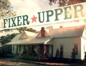
10 Things You Wanted to Know About “Fixer Upper” on HGTV

Flip or Flop: Are Tarek & Christina’s Real Estate Seminars Legit?
What It Was Like to Film the Pilot for “Home Town” on HGTV

6 of the Scariest “Trading Spaces” Makeovers
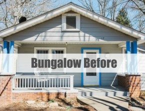
A Bungalow Makeover in Asheville: HGTV’s Urban Oasis 2015

What It Was Like to Be on “Love It or List It”
HGTV Behind the Scenes: Chip & Joanna on “Fixer Upper”

“Love It or List It:” New Season, New Country, New Crew

“Fixer Upper:” Chip & Joanna’s Farmhouse Outside Waco

The Property Brothers at Home in Las Vegas

You Asked: Has “Rehab Addict” Been Canceled?