Hooked on Houses
A Fun Place to Get Your House Fix
Home
TV & Movies
Recent Houses Onscreen
Search Entire List A-Z
Celebs
HGTV
Cottages
Farmhouses
Before & After
Real Estate
About
Celebrity Houses
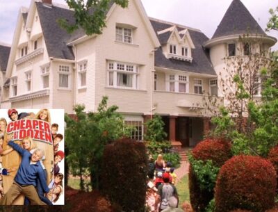
Kat Von D Selling “Cheaper by the Dozen” House and It Has a New Look
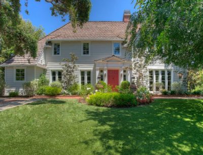
Winona Ryder Selling Dutch Colonial in San Francisco with Bay Views
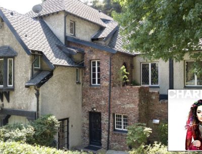
Singer Charli XCX Lists English Tudor Revival in the Hollywood Hills
Chris Meloni Is Selling the Former “Ozzie and Harriet” House
Dick Cavett’s Shingle-Style Summer Cottage in Montauk
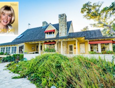
Inside Doris Day’s Sunny Yellow House in Carmel
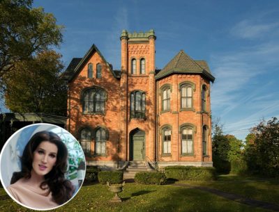
Christine McConnell Bids on Seymour Mansion in New York
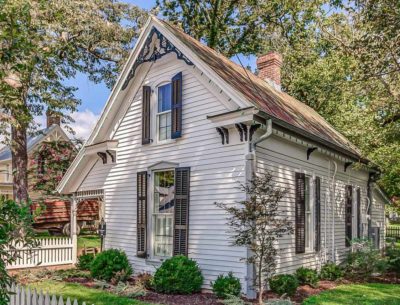
You Can Rent This Cottage Decorated by Holly Williams
Jeff Bridges Is Selling His Serene Retreat in Montecito
Sandra Bullock’s Beach House on Tybee Island in Georgia
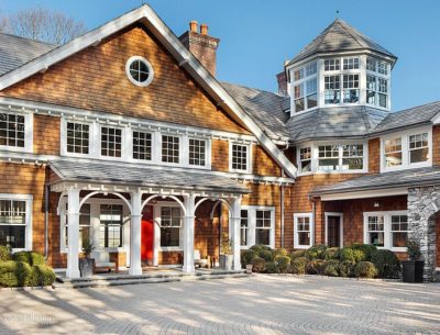
Bruce Willis Selling His Shingle-Style Country House in New York
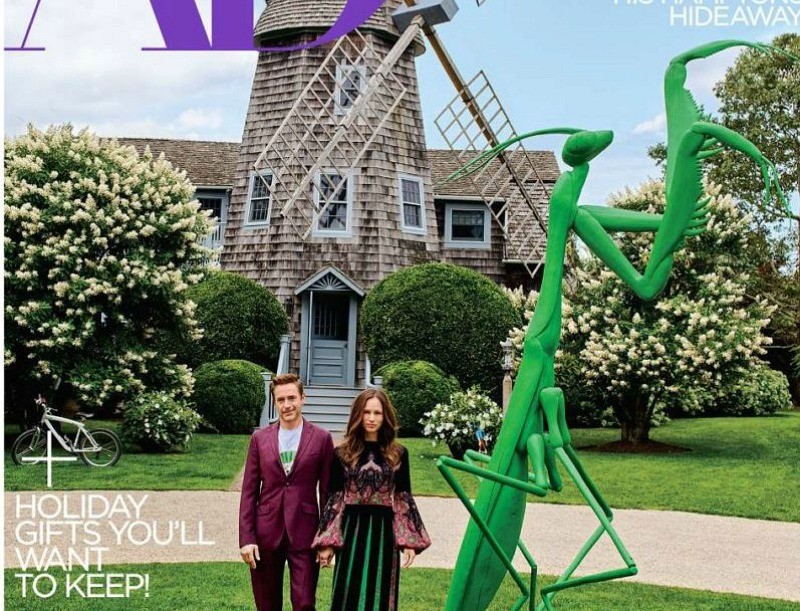
Robert Downey Jr.’s “Windmill House” in the Hamptons
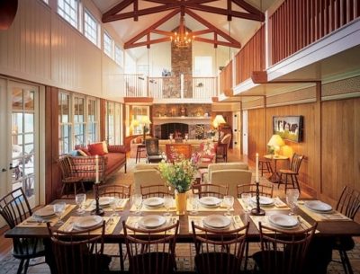
Michael J. Fox & Tracy Pollan’s Country House in Connecticut
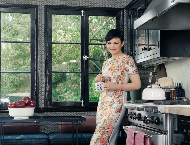
Ginnifer Goodwin’s House in the Hollywood Hills
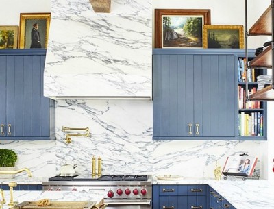
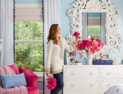
Brooklyn Decker’s Blue Kitchen
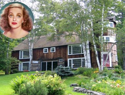
Bette Davis and Her Beloved Butternut Farm in New Hampshire
Brooke Shields at Home in the Hamptons
Singer Holly Williams at Home in Nashville
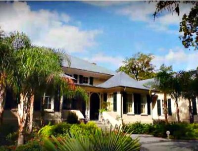
Paula Deen’s Waterfront Home in Savannah For Sale
Patrick Dempsey’s “Tin House” in Malibu
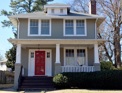
Shirley MacLaine & Warren Beatty’s Childhood Home in Virginia
Tommy Hilfiger’s “Pop Art Meets Disco” Beach House
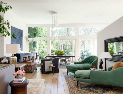
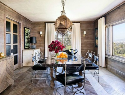
Ellen Pompeo’s House Redesigned by Martyn Lawrence Bullard
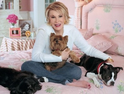
Looking Back at Joan Rivers’ Country House in Connecticut
1
2
Next Page »
View All Celebrity Houses, in Alphabetical Order by Last Name
Here
About Me
Privacy Policy & Disclosure
Contact Julia
MENU
Home
TV & Movies
Recent Houses Onscreen
Search Entire List A-Z
Celebs
HGTV
Cottages
Farmhouses
Before & After
Real Estate
About