Hooked on Houses
A Fun Place to Get Your House Fix
Home
TV & Movies
Recent Houses Onscreen
Search Entire List A-Z
Celebs
HGTV
Cottages
Farmhouses
Before & After
Real Estate
About
Real Estate
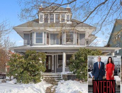
Beautiful Brooklyn Home Seen in “The Intern” For Sale
A Storybook Cottage Built by Hugh Comstock For Sale in Carmel
Winona Ryder Selling Dutch Colonial in San Francisco with Bay Views
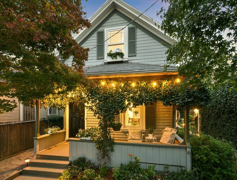
A Small Farmhouse from 1908 For Sale in an Oakland Neighborhood
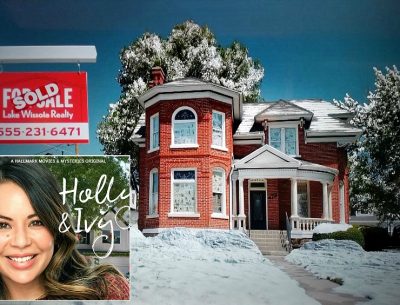
The House from the Hallmark Movie “Holly & Ivy” Is For Sale
Forget Candy: Bid on This Haunted Castle in New York for Halloween
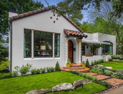
A Charming Spanish Revival Bungalow For Sale in Austin
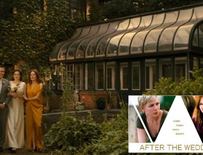
Julianne Moore’s House in “After the Wedding” For Sale
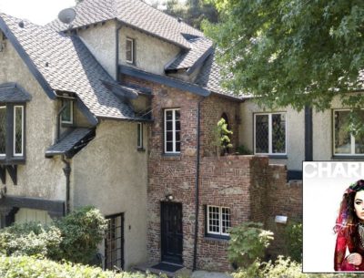
Singer Charli XCX Lists English Tudor Revival in the Hollywood Hills
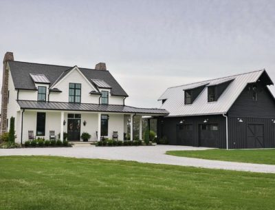
A Modern Southern Farmhouse For Sale on 20 Acres
A Small Tudor-Style Cottage For Sale in California
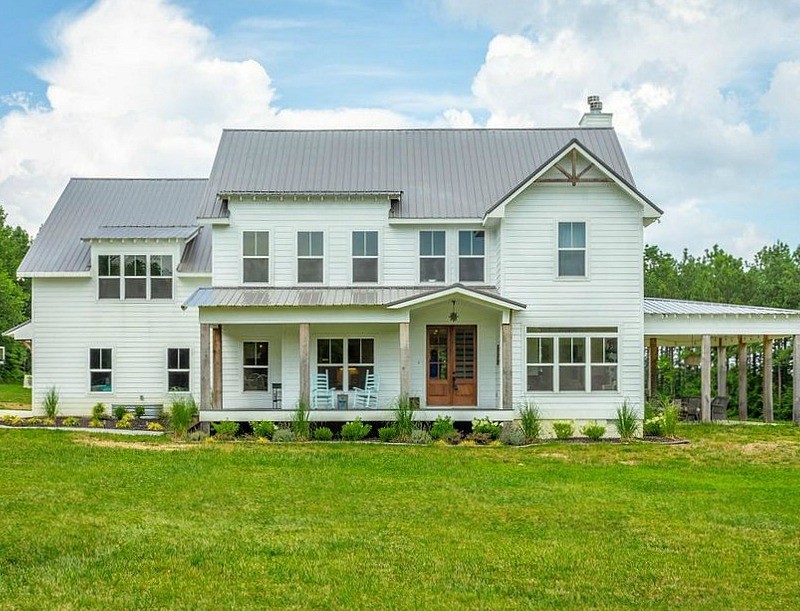
A Modern Farmhouse For Sale in Signal Mountain, Tennessee
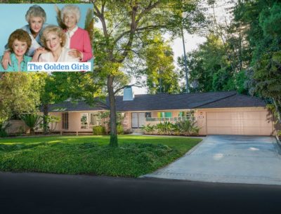
“The Golden Girls” House Is For Sale: See Inside!
Dick Cavett’s Shingle-Style Summer Cottage in Montauk
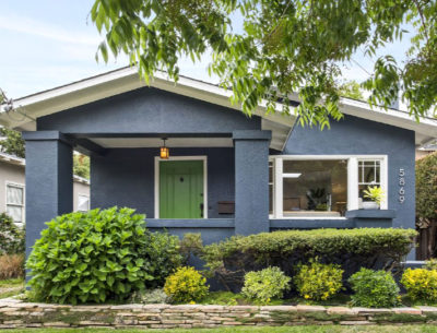
An Updated Stucco Bungalow For Sale in Rockridge
A Light-Filled Little Bungalow with a Fresh New Look in Berkeley
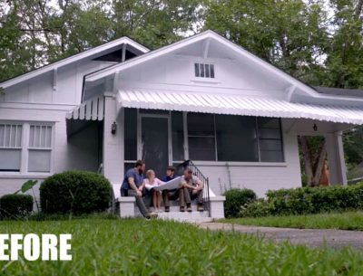
For Sale: A Cottage That Got a Makeover on HGTV’s “Home Town”
A Painted Lady on Postcard Row Is For Sale and Ready for Restoration
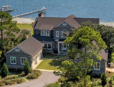
A Tour of Brandi’s Beach House on Big Lagoon For Sale in Pensacola
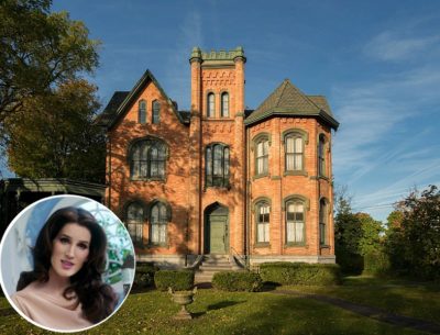
Christine McConnell Bids on Seymour Mansion in New York
A Craftsman Cottage For Sale in California
Cedar Winds Farmhouse For Sale in Tennessee
Chris Kauffman’s Converted Church House For Sale
Gosherd Valley Cottage For Sale on 80 Acres in Missouri
1
2
3
…
5
Next Page »
About Me
Privacy Policy & Disclosure
Contact Julia
MENU
Home
TV & Movies
Recent Houses Onscreen
Search Entire List A-Z
Celebs
HGTV
Cottages
Farmhouses
Before & After
Real Estate
About