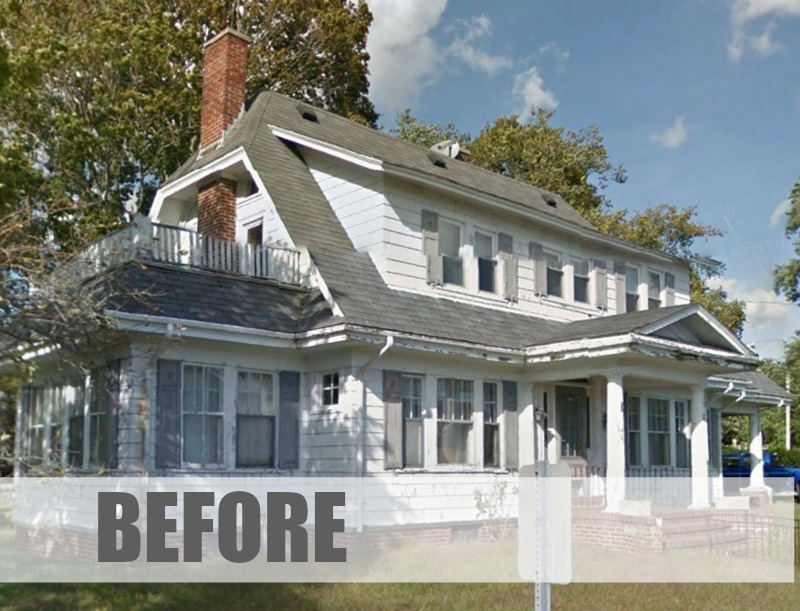
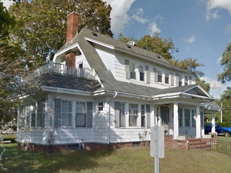
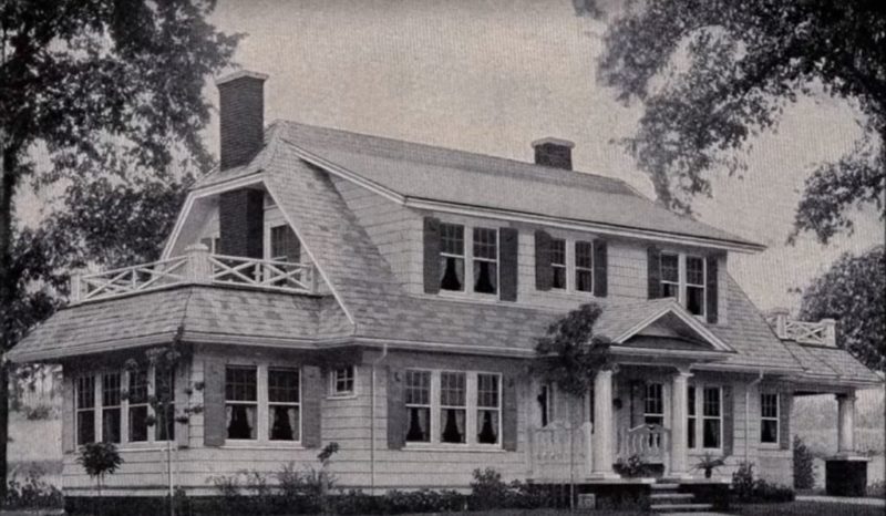
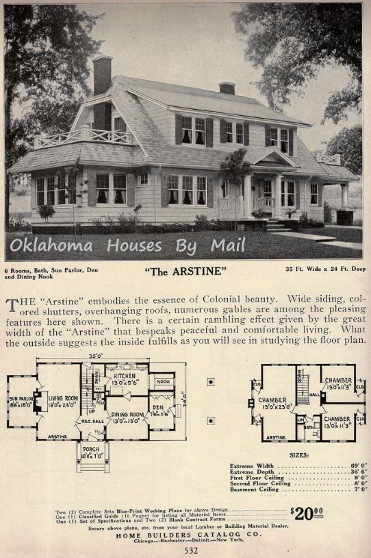
This broken-down and neglected old house in Massachusetts, was built from a plan found in the 1926 Home Builder’s Catalog called “The Arstine.”
Thanks to Tom and Cathleen of CT Properties Southcoast, it looks better than it probably did when it was new. Take a look!
![]()
“The Arstine” in the Home Builder’s Catalog 1926
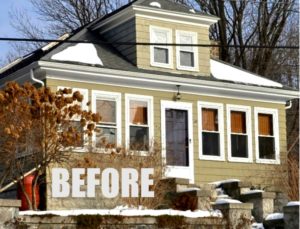
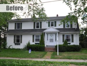
Here’s how the house was looking before its recent makeover:
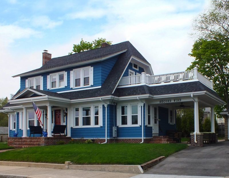
The House Today, After the Remodel:
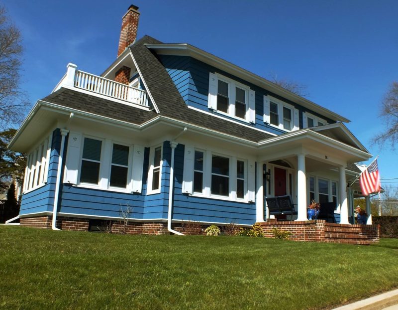
Tom Morette wrote me about their project, saying it’s locally known as the Arthur T. Hammond House.

“Everything seemed broken or worn out, but all that could be saved was saved,” including the front door:

The Staircase Before:
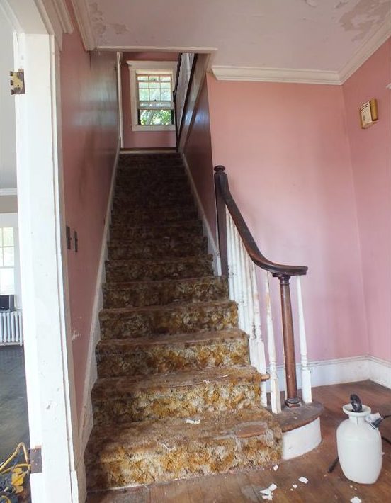
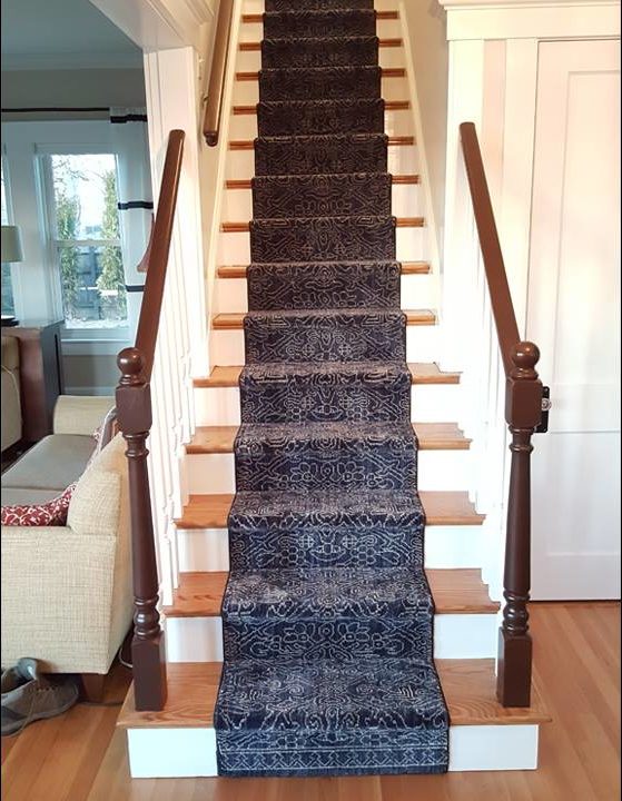
They added a coat closet in what had been an empty space beside the stairs:
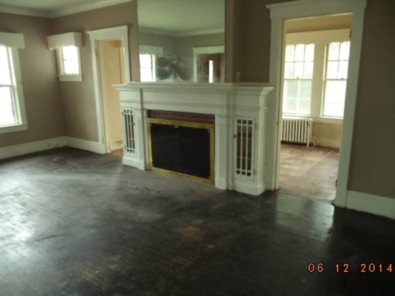
The Living Room Fireplace Before:
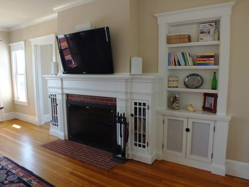
The Living Room Fireplace After (with new built-in bookshelves that look original):
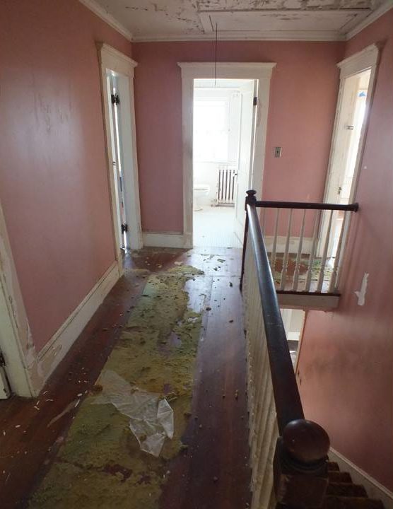
The Upstairs Hallway:
“All door hardware was reconditioned and refinished.”

“41 originally located and now 43 total windows flood this home with light and water views. Unfortunately, the original windows were beyond salvageable, so the replacement windows at least help to complement the insulated integrity and provide ease of use.”
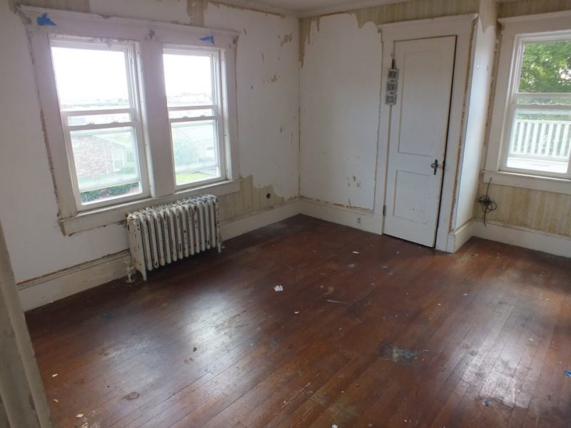
A door was put in place of the window to the balcony and the closet was widened:
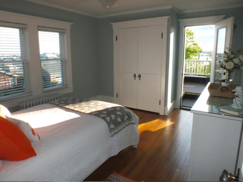
“The original balcony roofs were not accessible or legal, so we dropped the roofs and added doors from each bedroom; the city water views are wonderful and the way we did it maintained the original profile from the street,” Tom explains.
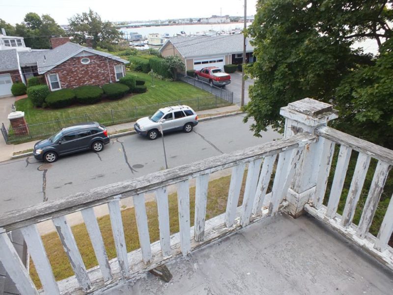
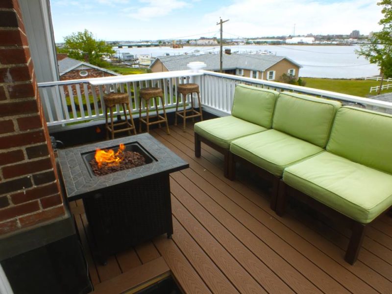
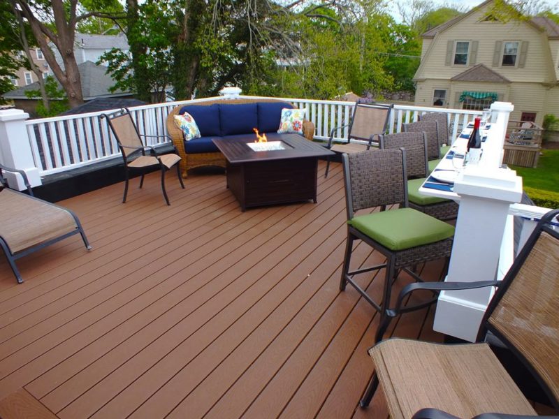
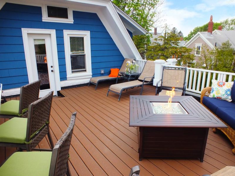
New decks on each side of the house are accessible from the second-floor bedrooms:
Cathleen described the project to This Old House, saying they bought it through an online auction with intentions to flip it, “but the more we did, the more we fell in love. Two weeks prior to listing, we gave in to this beauty, and renovations started all over again.”
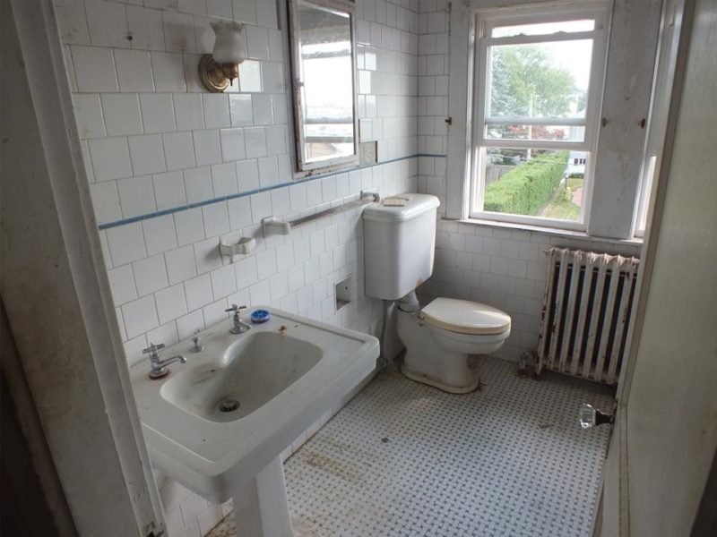
The Original Bathroom:
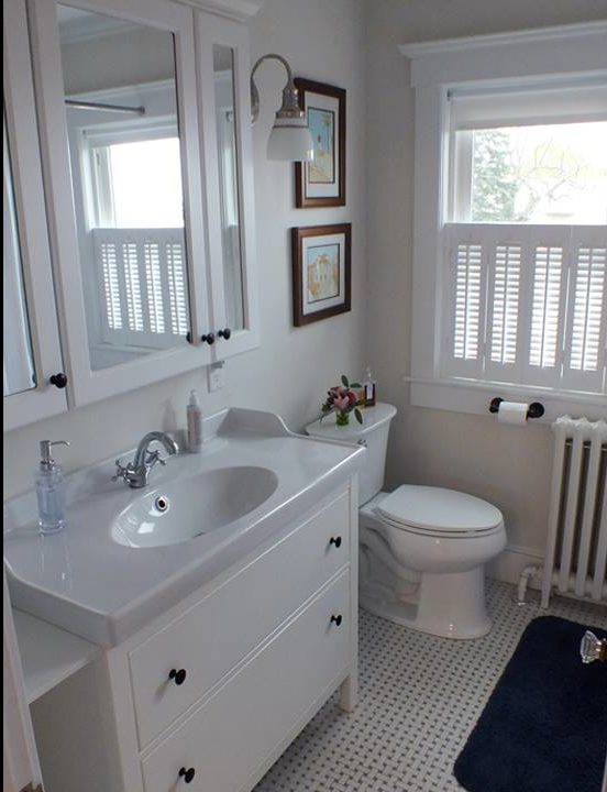
The Updated Bathroom:
The house had been “virtually untouched” since it was built in the 1920s.
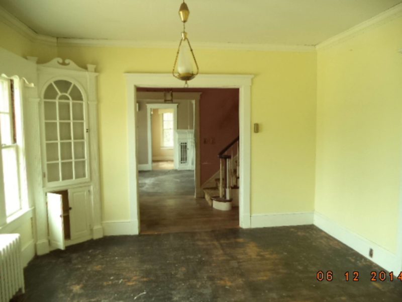
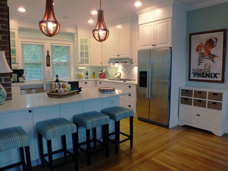
The original dining room and kitchen were combined to make one large eat-in space:

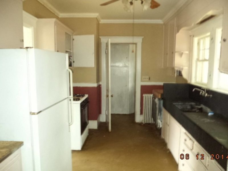
The original kitchen was dark and narrow:
They left the original brick of the chimney exposed:

“The original owner was a carpenter as well as a firefighter. Subsequently, all interior walls of this balloon framed structure are continuously fire stopped at the floor lines with solid masonry.”

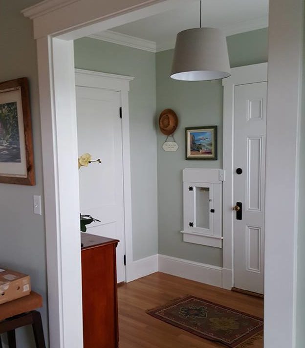
They kept the original mailbox slot in the side entry. The walls were painted Valspar’s Sparkling Sage:
Car Port Before and After:
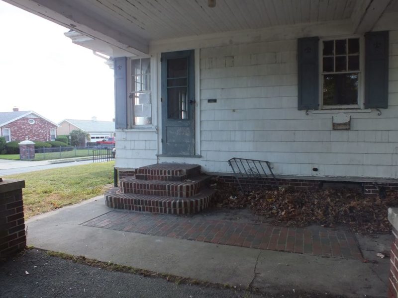
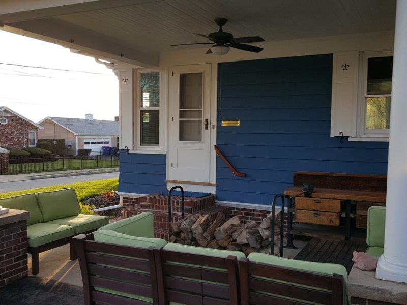
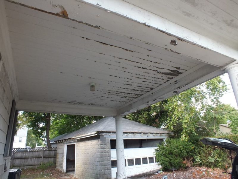
The garage got a much-needed makeover, too:
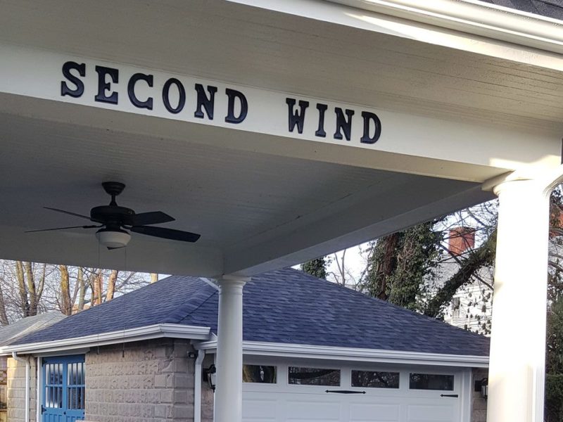
They renamed the house “Second Wind.”
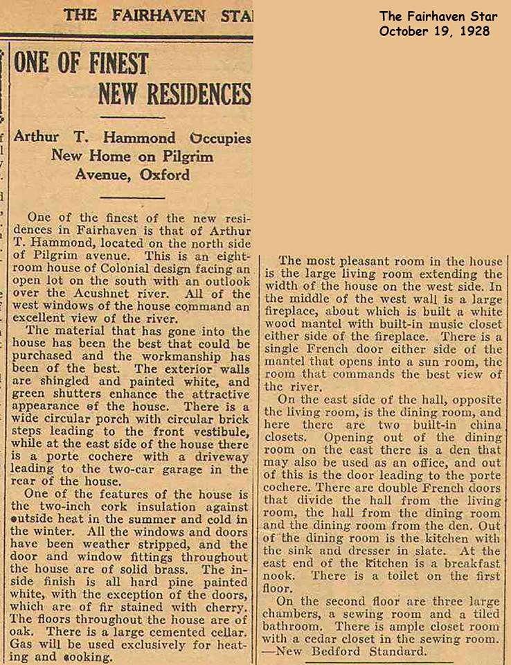
This article about the house appeared in the Fairhaven Star in 1928:
How the house was depicted in the 1926 Home Builder’s Catalog (via Oklahoma Houses by Mail):
After years of neglect, it was no longer “one of the finest residences” in town:

But it’s looking much happier since it got its “Second Wind:”
Thanks to Tom Morette for telling me about their project. It’s always heartening to see an old house like this being given a second life!
Visit CT Properties Southcoast and their Facebook page for more photos and information.


This is almost identical to a house that my husband and I seriously considered for our empty nest home. We ended up deciding to wait to move, so we lost out on it (and later bought a newer home with bigger closets!) , but I still drive by it now and then. I was so in love with the 1920’s details, and it had such warmth. They don’t build affordable homes like this anymore, and I am so happy that this one was so beautifully restored. The kitchen is my favorite part.
I absolutely love it. Even though it really isn’t my style. The best thing is probably the floor plan, and all the great outdoor spaces.
I so, so wish that we can still buy blueprints and documentation for a house for $20!!!!
Modern floor plans in my area I can’t stand 🙁 It seems like they took the ‘open floor’ idea too far, and you always walk into a cathedral with kitchen cabinets on one side and some couches on the other side. I like a bit of separation between spaces. And good luck trying to find a modestly sized house, nothing under 2400 sq ft sprawling mini mansions….. /rant over
I think I like everything except the blue exterior. I liked it better white.
So do I prefer the white! It looks softer…..
I totally agree… That deep blue color is too much.
I thought the exact same thing SHARON! I love all white houses.
I was going to add that. All but the blue siding is beautiful.
One more vote for the white – other than the intense blue, I like the choices they made. I congratulate the owners on a job well done!
Wow! Lots of people feel strongly about color. While I agree with the majority here that white is preferable to blue on this house, we can all be thankful that paint is easily changed and that the more permanent changes made to the exterior were minimal; I love it when I see a remodeling that retains its original architectural integrity.
Personally, I feel that blue only looks good on houses built during/after the 1950’s – and only on a handful of them. But I also feel that a house should reflect it’s owner’s personality, so blue may be a good option here. Have you ever driven through one of those neighborhoods with a tyrannical homeowner’s association? You know, the kind where all the houses are painted one of three shades of taupe? You have no idea about what kind of people might live in those houses; there is no opportunity for expression.
But, yeah, white would look better. Or even yellow, which was popular in the twenties.
I love the RED Keurig in the hallway on the second floor. Makes morning coffee so convenient. Plus I love the new trend of putting drawers within the kick plate of the kitchen cabinets. It’s such a smart use of “dead space”. Perfect for storing things you only use seasonally.
Love most of it – have to agree with Sharon on the color, though. The blue is garishj.
Great way to incorporate the coat closet at the foot of the stairs, and also removing the wall that opens the staircase to the room.
Really didn’t care for the removal of the doorway to the solarium and replacing it with a bookcase. To me, it destroys the original nice symmetry of the space – and the single bookcase looks odd. (If it was my house, I’d put it back the way it was 🙂
The deck with a water view is absolutely dreamy!
Agreed on the bookcase. Maybe having only one door allowed for better furniture arrangement.
Yes, they mentioned on Facebook that they needed the wall space for the room behind it.
omg – I love, love, love projects like this! This was my dream retirement project, but we couldn’t find the right house in the right location, so we did the next best thing by buying a tear-down and recreating it in the right location…(I’ve written you about our project before, but just mentioning why I love this post so much…I couldn’t quit scrolling up and down!). We are just starting on our interior. I wonder how long this restoration took…was that mentioned anywhere? I love just about everything they did – wonderful job!
This will give you a better walk through of the home…
https://youtu.be/s6KxJN1YXtk
and this album has all the photos you could ask for
https://www.facebook.com/1676096129292126/photos/?tab=album&album_id=1837572669811137 .
Second Wind took about six months to get it to “flip” stage and then another 3 months of added renovations on once we decided to movein
Thanks, Tom! You did a beautiful job. I took a look at your blog earlier, and see that this is a full-time job for you (I’m assuming). I’m also assuming you have some hired help. Right now we are still employed in a city about an hour away from our new/old home, so it will be a weekend project for a while. Hopefully we can fully retire and devote full-time to it within a year or so. We plan to do most of the interior work ourselves. It’s a journey, right? 😉 Thanks for sharing your beautiful inspiration.
What a great post. The house looks so fresh and inviting. It’s great that they kept and refurbished everything from the original that they could salvage. I especially liked seeing the old photos – the original house, the house before and then after the renovation. Thanks for sharing this.
This will give you a better walk through of the home…
https://youtu.be/s6KxJN1YXtk
and this album has all the photos you could ask for
https://www.facebook.com/1676096129292126/photos/?tab=album&album_id=1837572669811137 .
Second Wind took about six months to get it to “flip” stage and then another 3 months of added renovations once we decided to move in.
I love all of it except the exterior color. The dark blue makes the house look smaller. I liked it better white. The interior is beautiful.
What a fantastic renovation! I can see why they fell in love with it (and so glad the Pepto Bismol pink is gone from the foyer!) Thanks for sharing!
This is fantastic. I love that the built in doors were kept on each side of the fireplace and the built in china cabinet too. Those are the period details I love. You did a great job.
Great back story and flashbacks. Can I love best, the doors, balcony, and bricks! Loved seeing this house loved up.
Beautiful. I wish they would have left it white on the outside. It has a wow factor on the inside!
I’m surprised by all the comments about the exterior color. I love the blue! 🙂
Me too! But I’m probably biased, having just painted our farmhouse-style home a dark navy blue, with white trim, and pink doors.
Ooh, that sounds pretty!
I’m with the blue all the way. I’m my semi-rural neighbor- hood every refurbished farmhouse, and there are plenty of them, is white. Dull and boring. My house is cream with forest green shutters and trim. It reflects my ‘a bit of anon-conformist’ personality.
totaly agree, reminds me of a very old TOH where the owners wanted to paint their 18th century farm house the original ocher color and some NYC transplant on the architectural committee thought everything in New England needed to be white with green shutters.
I’m so glad this beautiful house was renovated. Gorgeous interior, but I’m another person who doesn’t like the blue. Too bright for me!
Have to agree with several comments, love the house, hate the color. This is an elegant home and that dark blue color just doesn’t go with the style. Maybe a good yellow with Charleston Green shutters. Otherwise, did a great job with the house and I don’t think I could sell it either.
This is one of the best modernization of a early 20th century house.
Great work!
Especially the no island kitchen.
I absolutely LOVE the original house! While I’m glad someone saved it, I can’t say that I like their taste. I would have honored the original Colonial style not only with renovations (i.e., retained/replaced Chippendale railings, built in deacon’s benches flanking front door, fireplace, formal dining room, tiled bathroom, beautiful foyer banister, natural wood porch flooring, softer palette, etc.) but with furnishings as well (18th century antiques and/or reproductions). This is just way too contemporary for such a classical beauty. But then again…perhaps it’s better to have been saved and loved I suppose…and maybe someone else in the future will honor the Colonial era.
Great job and truly a labor of love. The only thing I wish you hadn’t changed was the curve of the stairway in the entry. Would have been nice to duplicate it on the other wide when you removed the wall into the Living Room — I think it would have made the entry that much more grand.
They mentioned that on their Facebook page. They’re still hoping to restore it down the road, but with the staircase open now, they’d either have to find a matching rail for the other side or have one created.
The stair railing part is called a volute and they are readily available online as singles or coordinating pairs. Here is one from a major retailer: https://www.homedepot.com/p/Stair-Parts-7030-Poplar-Left-Volute-Stair-Handrail-Fitting-7030P-000-0000L/206683330?cm_mmc=Shopping%7cTHD%7cG%7c0%7cG-BASE-PLA-AllProducts%7c&gclid=CjwKEAjw7svABRCi_KPzoPr53QoSJAABSvxfMTrhzchO39OsAywEtRNFTlc9eg935Oe2h2ueOlsHghoCTHPw_wcB&gclsrc=aw.ds
Also, I was sad that they made the dining room part of the kitchen. That is becoming unpopular now, so I think they made a mistake. They lost the built in corner cabinet in the process. That was a nice detail, and things like that make the character of the house. And the blue exterior missed the mark.
Kudos to them for rescuing and restoring this gem. Its exterior looks just like one that was in our old neighborhood that dated from the same period. The blue doesn’t bother me – it makes for a nice pop – but I do miss the muntins on the upper half of the original windows. The divided light windows on the upper sash really fit the age and style of the house and add to its character, and I’m sorry they didn’t choose replacement windows that had that. I also wondered about the old kitchen sink and counter. Could that be soapstone? If it was, it could have been a wonderful element to restore in the kitchen. I even liked that the faucet was mounted on the wall – such a farmhouse type of fixture. Of course it’s impossible to judge the condition from the photographs, and we all have our own preferences. Still, a wonderful home.
I didn’t notice the windows, but I had the same thought about the kitchen…but overall they did a wonderful job of keeping the great bones.
Breathtaking….be very proud of your job. I would like some information regarding the flooring you use. What is the color and is it hardwood or laminate. Mostly the color, love the shade….
Hi Guys,
Thank you for all the interest in our remodel.
To clarify a little:
Many of the windows had already been replaced without muntins. We wanted the muntins, but decided to continue that theme for unobstructed water views.
Originally, we planned to paint the exterior white, however we wanted to highlight the beautiful trim, collector boxes and the fleur-de-lis on the shutters. We felt all of that would have just become blended in had we painted it white.
The soapstone counters in the kitchen were only 22″ deep and did not conform to modern cabinetry. The countertops have been salvaged to be used for our new, outdoor kitchen. Photos will be coming soon.
The curved rail at the bottom of the interior stairs was omitted in haste to quickly complete the project. The mahogany profiles were unavailable at the time. We plan to revise the restoration at a future date.
The bookcase in the living room serves two purposes. It completes the office space on the other side, as well as housing the home theater equipment for the living room.
The flooring is rift and quarter-sawn, white oak, natural.
It is important to note that we have great respect for the historical properties of any home we do. Anything that can be salvaged is always saved.
https://www.youtube.com/watch?v=s6KxJN1YXtk
https://www.facebook.com/ctpropertiessouthcoast/?rc=p
Thanks for answering so many questions. I love that you rescued this wonderful old house! 🙂
Thanks for responding. Good job!
Beautiful renovation inside and out. Love everything with the exception of the “SECOND WIND” plastered across the front of the car port. I think it looks cheap and would have opted for a plaque of some kind near the front door or below one of the front windows (like the ones on historical homes.) On the fence with the blue–I don’t mind it, but I think I would have gone with white with black shutters.
I’m the odd one, I really like the blue exterior. I normally wouldn’t like such a bold color for the outside, but it’s almost like this house cried out for it. It was so worn down and depresssing inside and out, the blue is a huge statement that it’s truly got a “second wind”.
I’m curious though, is this the same house plan as the Amityville Horror House? It was the first thing I thought of when I saw the before photos (it’s also another reason I love the blue). In every facet of the remodel they were able to see so much more beauty than the average person would and made it happen.
Overall, they truly did an amazing job on the house. I also love the cheerful red Keurig on the second floor (thanks Chris, I went back to look at that…I missed it completely the first time) and the balconies are just beautiful.
I agree, Sophie. I love the way the blue makes the details stand out.
The style is similar to the Amityville Horror house! You can compare it to that one in the post I wrote about it here:
https://hookedonhouses.net/2010/05/25/amityville-horror-house-for-sale-new-york/
This house is almost identical to our first home purchase in 1967 in a Chicago suburb. Seeing the Before photos was so like being in our house!! Our first two children came into the world to that house.. Oh, the nostalgia that inundated me. When we moved in, there was a closet in the foyer as the update showed. The owners after us changed it to a powder room as there was only one bathroom…upstairs ! We still miss that house/home.
We were transferred after only 3 years living there. Thanks for featuring this well done update. I feel like I had a visit home.
Such a sweet house! I love houses that keep as much as possible of the original. Thanks for sharing.