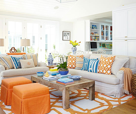
When I saw designer Dimitra Anderson’s colorful California 1950s ranch featured in a recent issue of Better Homes and Gardens, her cheery combination of tangerine and turquoise caught my eye.
She wanted a “neutral canvas” to build color on without committing to any kind of permanent color scheme. Pick up this month’s edition of Better Homes and Gardens to read the story and see all the photos!
See the photos on BHG.com
(photography by David Tsay; story by Kristine Kennedy).
Check out Dimitra’s website Evars + Anderson to see more of her house
and other projects she’s worked on with her design partner Nancy Evars.


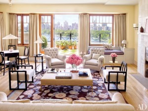
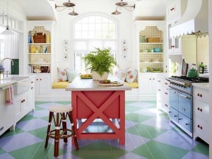
Just love the splashes of color the stylist Scott added to each room. A few changes in the positioning of certain pieces of furniture were right on the money. Subtle changes made such a huge difference. A very cheerful & happy home……Well done…..
You betcha! Our dutch door to our backyard is black on the exterior and yellow on the interior. I have been thinking of painting the interior black… so I am now heading to the garage to get the black paint. Thank you! I have been itching to do a simple no fuss project. Besides, this way I can put off the continuation of my wallpaper stripping project in the bathroom. Lani
How fun that you have a Dutch door like that. I’m jealous!
I shall now add more pops of my accent color in my décor.
Do we think that the magazine re-painted the tween’s room?
That seems like going beyond + above, doesn’t it?
I can’t imagine they’d repaint the room for the magazine, but who knows. Maybe she has changed it since then herself? I’m not sure which photos were taken first.
I think the green paint is the same just taken at a different time of day and without the benefit of professional lighting. Also in the living room they removed a heating vent on the ceiling and it looks like they removed an accent colour on the coffered part as well. I often get frustrated by up close pictures in magazines because I want to see the whole room, like the layout of a kitchen. I want to see the fridge because I am trying to figure out my kitchen layout but they think you don’t want to see real life things. I think magazines would be so much more interesting and helpful if they showed the houses as they found them, and then what they did to take them to the next level. Also many things they do don’t work in real life such as shoving seating arrangements closer together to take photos but would make living in the room difficult and leave too much empty space around them when seen from farther back.
I guess it could be the same color in the bedroom now that you mention it. They could have lightened it in editing for the magazine, too, I guess. I hadn’t noticed the vent being removed in the green room — good catch, Pamela!
I agree, it can be frustrating when all the photos are really close up, which is why I was excited to see wide shots of some of these rooms.
I agree, I think it is the same colour but the photos for the magazine look lighter (and better I think) because of the lighting setup the photographer used. You will notice the blue on the curtains looks like a totally different colour too.
I stopped subscribing to Better Homes and Gardens for that very reason. It was just too frustrating looking at all those close-up photos and trying to figure out the layouts of the rooms. I felt like I could get through an entire mag and not really have seen all that much. There is so much more available online! Like this blog that I love 🙂 !
I agree, Pamela. In the built-in desk room, with the glass-fronted cabinets, Dimitra’s blue and white vases are beautiful and calming. The stylist’s take on the room with all the busy-ness of adding the orange and yellow looks great in a magazine, but would look too cluttered and frenzied in real life. Same with the tangerine and cornflower blue family room. All those pillows look good in pictures, but in actuality, a guest would think “Explosion of pillows . . . where am I supposed to sit?”
So true. And I love how the coffee tables are styled in magazines, but they don’t work in my house because people want to put their laptops and books and feet, etc., on them, so there’s not that much room for decorative stuff.
This was such a great comparison. I think lighting and professional photography is really important. Dimitra is really talented (we have a similar aesthetic). When BH&G styled our house, they added more color, too. It does make it really pop.
Thanks for all the inspiration, Julia!
Mary Ann
This house is gorgeous!
LOVE the jungle room!
I’m finally taking the plunge with white, yellow, gray and black; in my master bedroom and master bath. I’m very excited!
I hope you’ll post pics on your blog when it’s finished. I’d love to see how it turns out, Gwen!
I wish I had an eye for mixing colors and prints. I love the way it looks when done so well. I would never have thought of adding the blue chair and the hydrangeas, especially to a green room, but it does make a wonderful difference.
I thought the same thing, Bev. The blue/purple they added to the green room with the chair and flowers was unexpected, but it worked!
You have a good eye for color and pattern.
owww 🙁 not really my thing. I like some of the furnishings and country influences, but that’s about it……I’m just not a fan of primary (in this case secondary) colors, just reminds me of my daughter’s preschool LOL!
I’m actually also getting a bit tired of that currently fashionable pattern on the rugs and curtains, I see it everywhere now. Went to buy some curtains at Target the other day and about half the selection had that exact pattern…..
Stick that magazine with your retro home design collection, and dig it up in about 10-20 years, it will be dated, and we can all laugh about it when you repost 🙂
I find the styling in magazines fascinating!!! I go nuts seeing the same pieces used in different rooms with different accessories! I find myself studying rooms to the point where I could go insane!
I do the same thing, Patty. Glad I’m not the only one! Ha.
Fantastic article Julia! I have always loved that home tour since it appeared in print especially those rattan chairs with that tulip table (writing about rattan tomorrow!). And I adore the palm print window panels! Isn’t it fascinating how lighting and photography also play a role?! Wonderful styling by Scott!!!
xo
Kate
It really is fascinating to see how small changes — like throwing a yellow purse on a chair — can make a big difference in a photo. I love that palm print, too. Wish I had somewhere in my house I could use it. Love how fresh that green and white combination looks! 🙂
It’s lovely to look at but I’ve always wondered how people that have white everywhere keep it so clean?! Between husband, pets and kids, I want to know the secret to keeping whites so white! lol 🙂
It seems like a paradox but for some reason I find white doesn’t show dirt as easily as dark colours and there is bleach for everything else. 🙂 I have always found that with our car choices as well (darker cars are much harder to keep looking clean). I have a lot of slipcovers but I am not cleaning them every week (or even every month – just a couple of times a year) and they hold up well (we have two kids and a dog). I do have some rules about what can be eaten where though and we are a family who takes off their shoes at the door so maybe that helps.
Catherine, your comment reminded me of something a car salesman told us once. We were afraid to buy the white one we wanted because we’d have to wash it too often, and he said, “Actually, the darker the car, the more dirt it shows.” When I worked as an interior designer’s assistant, a frequent complaint we got was about dark rugs we put in houses because people swore they were harder to keep clean.
I have a good bit of white in my house with kids and a dog, and it’s far from pristine. But I just live with it and don’t stress too much. It is what it is. Ha. We also have a no-eating-in-the-living-room rule, and take our shoes off at the front door, so I think you’re probably right that that helps, too. 🙂
Hmmm, maybe it’s time I start using some white here and there then. 🙂
I really enjoyed this article! I loved seeing that home in BHG as well and it is fascinating to see how they styled it a bit differently. I do think there is a big difference in the quality of the photography as well here. Both the original and the styled shots are gorgeous although I find the styled ones a bit cozier to think about living with I think.
Key Word here: CONTRAST!!! I just looove the green living room and the simple addition of contrasting colors (blue-purple hydrangeas). I would have never thought to play with colors like that or make so bold of a choice in the living room. I now finally have a game plan for my dining room!! Wish me luck!!!
Oh, good! I love when a plan comes together. Good luck! 🙂
Wonderful mud room! I’m a fan of white everywhere. The blue-teal chair against the back wall in the living room, *swoon*….I wish I could find a chair in that color!
I can appreciate splashes of color, but this was a bit too much for my taste. But whatever ‘floats your boat’, right?! 🙂
Gosh, they DID remove a vent……talk about attention to detail! In a way, though, that reminds me of photoshopped models who look so much better (and thinner) in their pictures. Most of us do have ugly things like vents and light switches in places that would “ruin” a photo but we are left wondering how to make our houses look as good as the ones that have had those blemishes styled away. I would rather see a house in all its imperfect glory, to see how those elements are either minimized or ignored and show that it can be beautiful without being perfect.
Definitely think the green is the same paint, just different time of day/lighting, and also think the same about the living room. The paint on the walls and flat cceiling bordering the coffered areas is a very light beige that just looks darker in one of the photos. And I like the homeowner’s leopard bench in front of the sofa much better than those ubiquitous garden stools, which make terribly uncomfortable seating!
Agreed!
Both versions of this home are nice, but I actually prefer the homeowner’s decor, as opposed to the magazine staging, which I find rather cluttered.
I prefer the extra colors and “clutter” in the magazine staging. It’s a little stark before, at least in the photos shown, for my taste. But then, I’m not a white + bright colors person. I love color, but prefer muted, dusky colors (not neutrals!) to these eye popping shades.
A Dutch door! Swoon! One day, I WILL have a Dutch door in my laundry room! I love the use of color in this ranch house. That Kelly Green room is refreshing for a teen room. I never get tired of the orange and blue pairing. As a matter of fact, I have a blue sofa and two orange leather chairs in my family room!
I love this house. Thank you for showing the before and after images of a photo shoot. As a designer I have set up photo shoots and it hours and days to prepare and photograph a space. I love magazines and have many subscriptions but your article brings the reality of the space to your readers.
Great post Julia! It’s fun to see how different the houses look in “normal” photos vs. styled, and get some decorating ideas in the process! – pk
It was really enthralling when I came across this beautiful house.Oudoors brings a cool environment in your dwelling. What a completely charming space. It is incredible, thank you for all the time you put into researching and sharing your posts Julia. This was an interesting post.