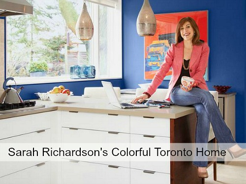
Designer and popular decorating-show host Sarah Richardson opened the doors to her eye-poppingly colorful home in Toronto for HGTV Magazine last year.
According to the article, “Walking into designer and HGTV host Sarah Richardson’s house feels like opening a box of crayons — nearly every room is a different hue.”
It wasn’t always this bold and bright, though, as an old 2004 issue of House & Home shows.
Let’s look at how her style has changed since then by comparing the old photos to the new!
![]()
Sarah Richardson’s Colorful House in Toronto
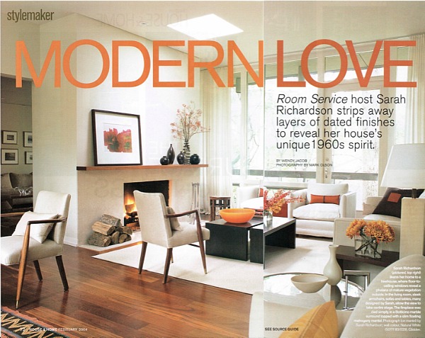
The living room was very neutral when it was featured in House & Home (above).
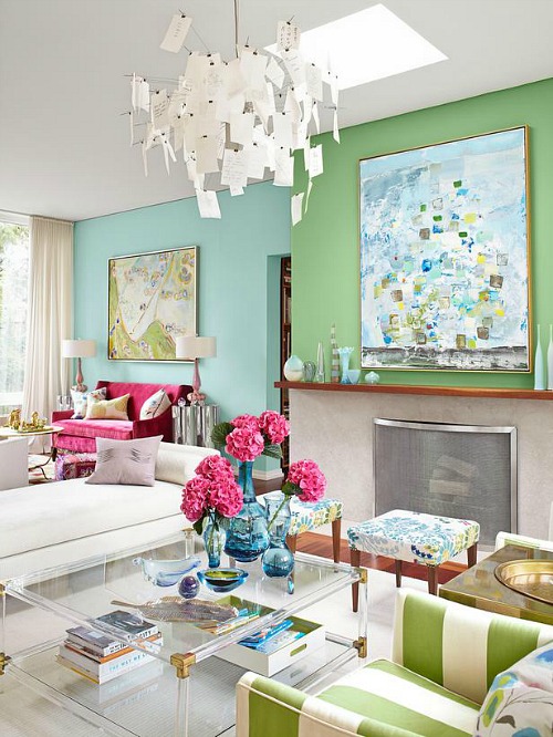
Sarah gave the two areas of the living room definition by painting the accent walls different colors
(Jardin by Sherwin-Williams and Hazy Blue by Benjamin Moore):
She told BC Living, “My house is vividly painted. I repainted it before choosing my new designer paint collection for Para feeling that, if I’m going to tell people to embrace colour, I’d better do it myself. I was a little terrified, but I’m thrilled with the results; it’s fun and exciting.”
She told the National Post in an interview titled “Going Taupeless” that she’ll “never ever use browny taupes and beiges” in her house again.
Sarah says, “Because every room features a bold color, you’re not caught off guard as you move through the house.”
HGTV Magazine has all the photos and details (Photography by Paul Costello.)
Special thanks to Tim at Design Maze for finding the old magazine spreads
from House & Home. Visit his blog to see more.




Hmm. I understand why she felt that with the paint line she had to paint her home and embrace more color. But I honestly prefer the “before” pictures. The home feels more relaxing and timeless. The colors now are fun, but I would tire of them. The decorating is more trendy, less timeless.
Totally agree, Anne! Before pics are beautiful. After is gaudy and would get realy old, really fast.
Oh, gosh.
I was all set to ramp DOWN the color in our soon-to-be next house.
This has me rethinking that!
I love Sarah!
I’ve done the opposite. I used to change my wall colors as easily as I changed clothes! After a decade of changing so much I finally went to neutral walls and add/change out color with accessories. So much easier!
Wow! Really interesting to see the switch. She has a great eye for color, and I particularly like her living room. (Love the blues and greens that she also used at one of her vacation homes that was in BH&G.) But I think most people are afraid of color, and you do have to carry it through – note her switch in fabrics, artwork, and accessories – to make it work. So it involves a wholesale approach that many aren’t prepared to commit to. I do think the former bedroom looks soothing and restful, and though they have been overdone for at least the last decade and a half (ever see a builder’s spec house?), I still think there’s a place for beiges and browny taupes. I also think the modern palette of stark white, gray, and black is bound to get tiresome and people will be starving for color again.
…i just love it!…color makes me happy…and when marmee is happy…everyone is happy!…blessings laney
I like bright colors in other people’s houses. In my house I like color too, but toned down. We painted the walls in our rooms different dusky, lightish colors years ago and I’m not tired of them yet. I find all beige very boring, especially with modern, simple furniture – yawn!
Much better now! Though I think the living room will have more staying power than the bedrooms or kitchen. But then, I don’t think it’s part of her plan to choose colors that have to last over the long haul. That would be a nice luxury.
I think the kitchen looks terrible now. That backsplash is painful. Usually I love all her stuff.
I don’t think I could relax in that much color. It is interesting, but just too much for me.
I have often thought that if I ever come into some money, I would like for Sarah to decorate my home. She has impeccable taste!
Been there, done that. She’ll change her tune in a few months-year. I LOVE turquoise, painted my living room/dining room that, and now can’t WAIT to go to a nice greige like BM Balboa Mist. It’s fine for bathrooms/laundry rooms. Large rooms, not so much…at least not for many. Maybe an accent wall…maybe.
I actually can’t believe it! I had to scroll back and forth also. It is fun and exhilarating, but quite different…possibly a little disjointed, but Im a color girl, so Im all in! xo Nancy
This was neat to see. Makes you wonder if that’s really the look she prefers, or if it’s all just to advertise her paint line. She did pull it off really well- think how hard it would be to balance the color from room to room and with the furniture and accessories. She’s super talented. I liked her daughter’s bedroom better before, though, with the hand painted flower design. https://www.sarahrichardsondesign.com/portfolio/design-inc/sarahs-nursery-season-3
That really was pretty. Thanks for the link, Vicki!
I am of two minds on this one. While I really like the bright and energetic colors, they are a bit bright for everyday living. I think these colors might suit a warm climate/vacation home a bit better than a year-round Canadian home. I really liked her home before. She was ahead of her time ten years ago, as her former rooms would not be out of place in magazines or on Houzz now. She is amazingly talented! Like Wendy said above, wouldn’t it be nice to have the luxury of trying something daring and then just changing it all up if it wasn’t perfectly to your liking!? 🙂
Not for me. If I’m true to myself, it’s all the colors she left behind. It’s so much easier to accessorize then paint, at least in my house. A couple years ago we painted the fireplace wall in my family room red and the rest taupe. I wish it would have been painted all taupe. I’m tired of the red and my accessories have to be thought out to show against the wall color.
Just call me traditional! LOL!
I am happy for her if she and her family like it, but it is not my style. I really like the colors you have used Julia in your house so much more that these really bright colors. Color me happy that everyone gets to choose what they want on their walls!
The color is AWESOME! So cheery and makes everything feel more personal. All the beige and white everywhere looks like a hotel and a very generic one at that.
I think the color infusion looks wonderful, especially how some very strong colors are pulled together in the bedrooms. (I especially love the polar bears in the kids room). Full disclosure — I have a lot of taupe. But, I just don’t think that kitchen wall color works with the backsplash and floor. One of the less intensely saturated blues (like on the chairs or in the living room) or greens would work better.
Definitely the before… and that kitchen–Oy Vey! It looks like a rental that’s suffering from too many random updates executed over the years. I’m not familiar with this designer, but if this is indicative of her work, it’s not for me.
Sorry Sarah,not a fan,especially that master bedroom.I think this was to test out her colors.I believe she will be changing those rooms within a year.
I am a big Sara Richardson fan. I am all for people using color, although I am a white wall let the artwork be the star kind of girl. I really did like the before pics better. It did look more peaceful and classic. I love all her “Sara’s House” episodes, my favorite by far was her own Lake House. I am all in on the coastal look! Which is how I found you years ago Julia on your “other blog”. 🙂
Oh, wow, did you really? That WAS a long time ago! Wish I had time to keep that one going, too. 🙂
Julia I have been stalking you, I mean reading your blogs for years. Back when I would zip in and read an zip out because I was at my desk at work and did not want to get caught 🙂 , no time for me to post comments back then. But now I a semi-retired. I loved your coastal blog and was very saddened when you posted you could no keep up with both but I understood. We will begin renovations on our new/old brick house soon and it will be modern-coastal. Will keep you posted as I plan on taking lots of pictures.
Ohhhhhh, that sounds lovely Gaynell!! I’m up in the frozen north, but our house reno’s are showing I love coastal. I hope you can post pics 🙂
I love, love, love Sarah, she is probably my all time favorite designer. She is normally known for light colors not bold like this so it is nice to see her try bright bold color.
Yikes, my style icon has gone off the rails! Did she change her style in order to sell paint? I love color, but that is waaaayyyy too much for my taste. I’d get tired of looking at those bright shades. I prefer the before pictures.
I like it. We have lived with our home having rooms painted different colors albeit more in the warmer tones. I do like the infusion of color on the walls, less sterile and more home-like, to my taste anyways!
I like color, but I’m not sure I could get any sleep in her bedroom. That’s just way to bright.
I wonder how often she changes out her furniture… She’s either reupholstered it all or replaced it with stuff that goes with the new wall colors.
I have to agree with the majority of the posts, I like her work and have for a long time, but this not so much. I don’t like all that color everywhere. Im a soft nuteral pastel kind of person. Same as above I couldn’t sleep in those rooms. I dont like all the bold fabrics either. The post about her daughters nursery , I have to say I did like that but the walls are soft . I think i would tire of all those colors everywhere very quickly . I love her work tho! 🙂
Personally I prefer the neutrals myself. I like colors too…in other people’s houses, when I visit 😉 Sarah’s esthetic can change and change and change because she has all the necessarily elements at her disposal (eg. designer fabrics, professional painters, large budgets, access ‘to the trade only’, etc.) And let’s face it, as a well-known designer, she outta be on the cutting edge of what’s going on in interior design. However, most people don’t have the luxury of making changes so frequently. We have to get by doing a lot of “use what ya got”. So keeping the big pieces neutral and adding in different colors of accessories is a less expensive way to go. Paint? Sure they say it’s the cheapest, easiest way to change up a room’s feel. And it can be. But even paint can get pricey depending on how big of an area one has to paint. It gets even more pricey if you feel you have to, or need to, hire a professional painter.
I think Sarah is loving these colors …. for now. (Doesn’t she pretty much have to say that since she’s developed a paint color line? 😉 ) I think at heart she’s a neutrals gal and will eventually start getting rid of at least some of the bright colors. It’s fun to see them in her house. Some of the colors I love; others are ‘meh’…
Let’s all keep tabs on how long this look will last 😉
Like another poster said the kitchen looks terrible. Like a bad Do it yourself remodel. the back splash is awful against the blue.
I prefer the befores the colors distract from the beauty of the original architecture and are just overall way too busy.
It is a strain on the eyes and really awful. Its unfortunate because i really like a lot of her designs but dont like the direction she is headed
Really like the living room now, but everything else is just too much, especially the master bedroom. I think she has sold out in order to market her new paint line.
I love color and could never live in a beige or gray house. I like her aqua/green living room with the punches of hot pink a lot, but no so much the navy blue kitchen wall..I like sapphire blue but it seems harsh there.
It’s interesting to see the changes. As much as decorators like to say, “It’s only paint”, I hate painting, and once I’ve spent the money, I know I will be living with it for awhile. I think I would tire of all that color quickly, but it looks like a happy house and obviously she is in a position to change it when she likes. My own tastes have changed and morphed over the years as well. The older I get, the more I realize how much my tastes and preferences are influenced by my phase of life. When I look back, I realize that about the time my life seemed to explode in the hectic, craziness of keeping up with pre-teens and teenagers, I started being drawn to the calm simplicity of a more minimalist, modern look and a calm neutral color palette. Now that my kids are approaching college age, I notice my pins on Pinterest are of more “layered”, cozy rooms. I’ve definitely added more pillows, trays and cozy throws! Perhaps it’s because, for the first time in years, I can actually sit on the couch and relax, which also means I have more time to dust and maintain all the stuff that drove me crazy a few years ago! It will be interesting to see how Sarah’s homes change as her family grows. She is crazy talented, so it’s always fun to see what she is up to!
Is this a home or an exercise in decorating. I couldn’t find furniture that had been reused in the new rooms. I like a home that looks collected over time. Sarah’s home looks like all the furniture was moved out and replaced with new everything including artwork and collectibles. While I like both versions of her house neither seems homey to me.
its not as bad as I thought when you said colorful
but I just don’t know about it
I love Sarah’s designs. I am also thrilled to see color being promoted again. I am tired of beige and white. I love to se trends but want to live with my own style without being chained to the ever changing styles. This is is inspiring and fun.
i like both the before and after. totally different, but both lovely and creative. plus, she’s a well known designer and can easily transform the space again if she gets tired of it.
on a superficial side note, wow!! sarah looks great! 🙂
First of all, I think Sarah Richardson is absolutely brilliant with how she manages pattern and colour! This post shows again how amazing she is. I haven’t loved everything she’s done, but totally admire what she’s able to do. The kitchen colour, well, let’s just say I prefer colour that bold for a jacket or accessory. It isn’t something I’d want in my kitchen.
I really like the colorful look! The colors are soft and pastel, which really gives a warm feel! My favorite is the blue and green walls! That’s brilliant!
I’m pretty sure I recall her doing the original living room on one of her shows some years back …
I like them both, but love the latest looks – wow!!
I love all Sarah’s work. There was one bathroom that especially stuck in my mind – it had hues of mint green and was almost 100% tiled … it was just stunning.
I remember that bathroom, Tina. It was beautiful!
Color really affects the life,mood in each every ones life.When design and color com together then no doubt the house gonna be so so awesome..just in the same way how she had made her house..Awesome combination of color!!!!
Love! I am so tired of all the advice being to go for neutrals and only use color in accessories. It all ends up looking the same to me. I love seeing color on walls. Its inspirational to see something like this. Good for her!
I love all of it except the kitchen. Something is off in there; the backslash, cabinetry or something.
But I like it when a house has energy. I feel energized and happy, like I can get moving and get stuff done. I don’t want to be stressed out when I’m home, of course, but neither do I want to instantly curl up and go to sleep. I love the colors and the changes she made, even if she did just maybe make at least some of the color changes to advertise her new paint line.
Totally loving all the color. Beige is the opposite of color in my opinion.
I’m all for color. I think that living in a beige house is like renting. If you are afraid to treat a house like it’s *your* home, then what’s the point of buying it? I’m not going to make my decisions based on what everyone else will like. Unlike the folks on HGTV, my whole purpose for redecorating/redesigning is *not* to up resale value. There is the chance that I’ll like a color, but cannot actually live with it, but that’s why I get the large paint swatches and stick it to the wall for a few days.
Funny as I was googling sara, one of my favotites, I come across your blog. I never miss her Christmas specials.
*Waving Hello!* 🙂