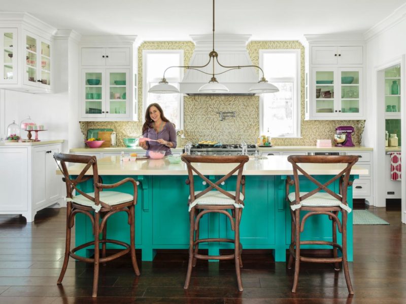
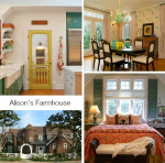
When Jeff and Michelle were building their house in California, he wanted neutral white rooms, while she was leaning toward gray and burgundy. But designer Alison Kandler encouraged them to try “happier hues” like purple and turquoise.
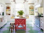
Michelle was pregnant with twins at the time and agreed that the rooms called for more “fun, kid-friendly colors.” It was designer Alison Kandler’s job to pull those colors together, which she did by keeping the furniture “classic” and most of the walls white (Dunn-Edwards “Whisper,” to be exact). Then the shades of purple and turquoise were added with fabrics, tile, and accessories.
Keep scrolling to see how the rooms turned out and see what you think of this colorful mix!
![]()
Decorating with Turquoise and Purple
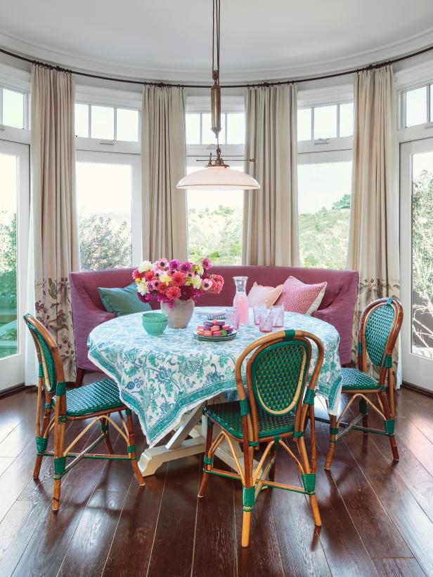
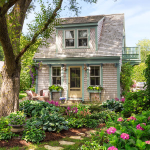
Homeowners Jeff and Michelle said, “We were surprised at how the house ended up,
but you can’t argue with the awesome results.”
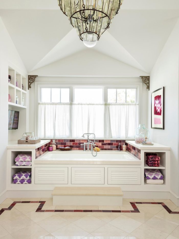
The shades of purple continue into the Master Bath, as well:
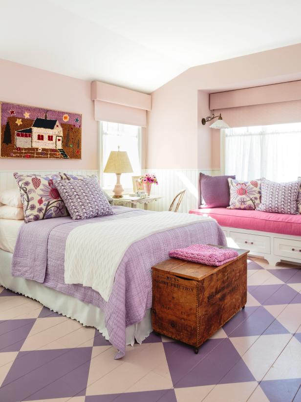
The Guest Room has Painted Purple and White Diamond Floors:
What do you think of the mix of colors they used? I’ve got to say I’d never think of putting turquoise and shades of purple throughout a house, but they made it work. It’s always refreshing to see something a little different.
Thanks to Designer Alison Kandler for telling us about her project!
For more photos and information, check her design portfolio and HGTV Magazine
(story by Kathleen Renda and Jennifer Berno; styling by Liz Strong; photos by Mark Lohman).



Fresh and comfortable! I really like this designer. IMO she’s like the Mary Englebreit of her time, with all the playful use of color and pattern.
I hadn’t thought of that, but you’re right, Alie. Definitely a similar vibe with the use of color and pattern. She often uses wallpaper, too, although there wasn’t as much of that in this house.
It’s refreshing to see color used so exuberantly without being overwhelming. Nice antidote to the gray and white we see everywhere.
Love that bathtub nook. I need that.
And the kitchen…. though I think I’d want a different sink, from what I could see.
Love the color in the decor.
Hooray for color!! I love the laundry room and I really like that tile in the bathroom as well, but I really love the exterior. So pretty and not a spot of snow or ice anywhere. Very, very jealous here in New Jersey.
That is a great house! Wonderful use of color without it being overwhelming!
I, too, think it is so nice to see as opposed to all the neutral and grey out there!
Well, I’m not a fan of the purple, but I’m glad the house didn’t end up in neutrals or gray and burgundy! It is cheerful!
What a lovely and unique house! My favorite rooms are the guest room and the laundry room. Pretty house!
I love the colors and patterns. The house itself is too suburbantastic for me, but what she has done with the colorful touches is spot on.
So much color! I love it. The bright pops of color against a neutral/white background are so pretty and fresh. I see that is kind of the new trend in recently decorated homes. It seems like there’s a lot less greige these days, although our house is still mostly greige. 😀
Wow! What’s NOT to love? Everything looks perfect! I love the bathroom tile! Great idea with the mostly white walls and the colorful fabrics. Love it!
Okay. That does it. I’ve been suffering from color remorse ever since we painted our front door black (on a gray + white house) . . . this helps me opt to switch to something more colorful, come spring! Hurry, spring!
Overall, love the feel of this home. Cottage-like, family friendly and inviting. Love the color of the front door and island. I also like the laundry room, although maybe not that wallpaper for me. Painted wood floors concern me, but maybe that’s my age as I know there will come a day when you will tire of it and then the pain of having to re-finish. Really though this is a very “happy” home and I love that!
So cute and comfy! The use of purple and red is unexpected but I really like it. And that island and front door … WOW!
This is a great house. It feels great for a young family, full of life and energy. I had initially planned to do calm colors and not much patterns when decorating my home. I was not sure I could handle lots of color and pattern. But, I took the plunge and combined light colors with some fun pops of color and texture. I think too much light or one color is boring. Have fun with it!
I think every single room is my favorite. What a happy house! The family room is really that–a place that draws the whole family in. Workspace for Mom, craft and homework space for kids, and comfy, inviting conversation area. Don’t know how this home could get any better. Alison Kandler just became my favorite decorator.
Hi Julia this is such a lovely home. Love the kitchen, bathroom tiles, painted floor and everything in between. Thank you for sharing beauty. Till next time. Regards Esther from Sydney. PS they have been advertising Fifty Shades Of Grey over here it starts at the cinemas tomorrow it kind of reminds me of 9&1/2 weeks I did go to see it a long, long time ago, now that experience made me uncomfortable but you see my friend loved Mickey Rourke in his good looking phase.
Love it, love it, love it!
So refreshing and charming!
BTW, we have the same ‘outdoor’ green shuttters framing windows inside like the ones featured in the farmhouse bedroom. Nice look!!
Love those green shutters! So pretty. 🙂
Hi Julia, So glad your blog’s still going strong! I have long periods offline, but yours is one of the blogs I always enjoy when I do log back on. It’s a constant source of guilt-free joy!
What a fresh, vibrant home you’ve showcased here! She’s got real flair and confidence and it shows in how she’s managed to combine so many elements, blending playfulness with elegance, cosiness, comfort, practicality and artistic expression. Lots there to inspire, like the wee workspace in the hall outside the bedroom. I especially love how the touches of black (or dark, contrasting colours) throughout her rooms make the colours really sing!
Hi Janice! Always nice to hear from you — thanks! 🙂