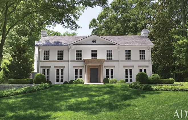
Interior decorator Suzanne Kasler opened the doors to her beautiful home in Atlanta for this month’s issue of Architectural Digest.
It’s a Federal-style house built in the 1930s, but she added the limestone portico and cream-colored paint on the exterior to give it the appearance of a Regency-era mansion in England.
Kasler has a a signature line of home furnishings and accessories sold through Ballard Designs, and you can definitely see the influences on it throughout her house.
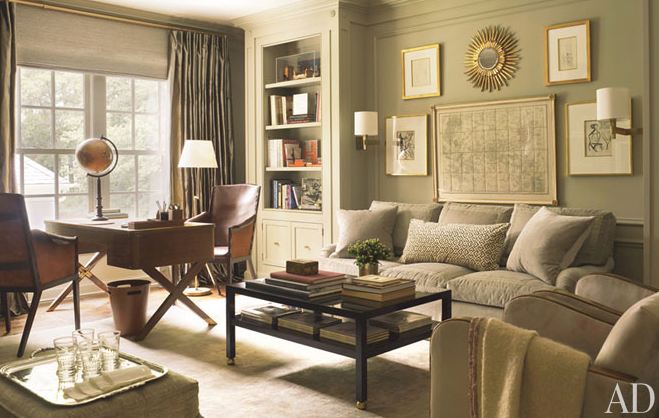
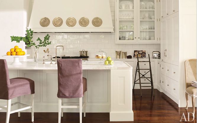
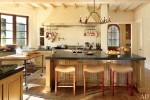
She designed these kitchen barstools (and the coffee table above) for Hickory Chair:
Pick up the April issue of Architectural Digest to read the story by
Jen Renzi and Howard Christian. Photography by Pieter Estersohn.



At first, I thought those were pictures from Ballard Designs! I love her style. Gorgeous!
I’ll have to pick up this issue of AD. I actually dropped my subscription because I wasn’t seeing a lot of ‘real life’ designing. Now I may have to reconsider.
I have the privilege of living near Blackberry Farm in the foothills of Tennessee. Her work there is incredible!! Look it up if you haven’t checked it out yet.
I do love it! It is just the right mix of updated traditional.
I’ll have to check out more.
Thanks,
Laura
Gorgeous! Thanks, Missy.
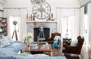
Very soothing colors… not somewhere that I would get excited, but somewhere that I would go to feel calm and peaceful! Is that a map on the living room wall? Gorgeous!
Love her style, the home is gorgeous, a bit too monochromatic for me. Adore her designs in furniture…
xoxo
Karena
Art by Karena
So neutral — but not too boring for me, just very calming.
Ballard Design catalog is my decorating bible! Love the look – thanks for sharing the designer’s home with us.
Boring beige.
I agree that these look like pictures from an advertising spread. Neutal decor has a wide appeal; most people would feel comfortable in a space like this. The bedroom looks quite restful and welcoming. The overall feel of the house is bright and spacious, though I would prefer some pattern here and there, a bit more color, bolder art…
I agree…very boring. Inside and out. There is such a thing as too much of one color.
I love Suzanne Kasler! I just recently met her at one of her book signing events in Minneapolis!
I was a little sad to see the negative comments above but I can understand why they wern’t very impressed. But I think the photos shown in Architectural Digest were poorly chosen because she showed us other photos of her home and I was soo inspired! Her foyer and living room is absolutely gorgeous!
Also I just thought I’d mention that I would consider Suzanne an interior designer and NOT an interior decorator. As an interior designer myself, I think that she could be somewhat offended by this title. Just as any doctor would be offended by someone mistaking them as a nurse.
Please note though that there is absolutely nothing wrong with being a decorator or a nurse but it is important recognize people’s correct titles.
Oh my… this home is a dream!! I love it !!
Happy Easter darling!
ETta
P.S Julia, I thought I’d also mention how much I love your blog!!! I came across it a few weeks ago and ever since, have been completely addicted to it! I had no idea that there was someone else out there that had my same obsession! I am totally hooked on houses!!!
I like the neutral palette (that is not white or ivory or beige or greige!) and the textures in each room. BUT, it appears indiscernable in decorating style from a Pottery Barn catalog. Not that I think that is necessarily a bad thing . . . in teensy doses. I could almost move right in here, although the ubiquitous sunburst clock/mirror/whatever would have to go. That’s a trend that has seen its day and stayed too long at the ball, to use a couple of cliches in emphasis of its own cliche-ness.
She must simply be on overload with color, prints, and quirky accessories used in decorating other homes; this is more ordinarily ordinary than any other designer’s home I’ve seen.
I may be in the minority, but I have never cared for those sunburst mirrors. Ha
OHHHHHH! I need to read better! I kinda thought it looked a wee bit TOO Ballard Designs! Well, there you go.
Yup. They have a certain style. And this is it. (Although there seems to be a lack of black and wicker and metal and grass green.)
Very pretty house! Suzanne did a nice job designing her home.
Very nice! You’re right…I can see that how she influences BD with her designs. I like to see more color, but it is a beautiful home! 🙂
Hi Julia must say I love this lady’s style. I used to buy AD when I worked in the city many moons ago now its very hard to find in the burbs. Anyway would be nice if she added a splash of colour – more flowers please. It is a beautiful home thank you for sharing. Regards Esther from Sydney.
The furnishings look a bit dated and staged to me, but the house is a classic. I especially love the casement window in the dining room.
Lovely. I’m desperate for a house with that kind of natural light. Sigh…
The thing I noticed is that she has white window frames on the front of the house and bronze on the back. I’ll have to show my husband. He insists that they all must match. I guess not.
My favorite house so far, looks so and inviting without the over decorated look of some homes. At first the neutral palette gave me pause but there are not only a variety of textures and wood tones but those who want pops of color could take the basic decorating scheme and make it their own, even changing wall colors. Bravo to Kasler!
Her house is beautiful! Julia – your blog is so much fun to read. Keep up the good work!
Beautiful! Considering it’s now the season to begin moving our lives outdoors, I was especially intrigued by the simple and elegant hedges and bushes in the front. Why is it that on some houses (like this one) it seems to be just enough and on other houses without any color things just look “blah?”
I thought the interior reminiscent of Ballad Designs and now I know why. It is however a calming mix of neutrals. I love what looks like a map in the first photo of the living room. Nice!