
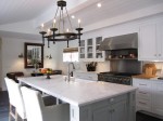
When I saw this kitchen remodel featured in Southern Living, I thought it was pretty dramatic.
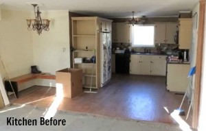
Now everything is bright, white, and cheery, but when the family bought the house was dark and dated.
They knocked down the walls that separated the kitchen from the breakfast room and family room and opened the whole space up.
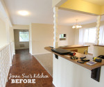
Here’s how the breakfast room looked when they moved in:

And the eat-in area as it looks now, with the banquette seating
(the benches open up for more storage underneath):

Go to Southern Living to read the article.
Photos by Laurey W. Glenn and decorating by Tyler Colgan.

Hello Julia,
Funny, but I read about this kitchen yesterday! I was looking at my Southern Living magazine from Feb ( I think) and I saw this kitchen and felt in love with it. It’s truly inspiring reading and seeing their kitchen.
Great post.
Enjoy your day!
xo
Luciane at HomeBunch.com
Just gorgeous!!!
OMG, I think I’m in love!
Ooo… love this kitchen! I especially love how fresh and updated it is without being too perfect. It looks as if someone actually lives there and uses it!
I loooove the bench seating!! I like having a window above the sink too….gives me something to look at while I wash dishes. 😉
I agree with you on all points. A soft blue would be gorgeous in this space.
When we were first married we bought a fixer-upper and vaulted the living room ceiling. We did all of the work ourselves and it was intense…..but the results were so worth it!!
What a great transformation! Although the 5 big white lamp shades are a little much.
Very tranquil family kitchen. Think the dark floors are a good contrast to the soft white rest of the room. The muted neutrals with the wide variety of textures really welcomes my eyes. The rugs are great. Never saw an Oriental on top of a sisal before. Wonder if that works when walked on? If they lived with that dark old and ugly wood very long I could see them wanting for white and light! Not always a big fan of …so-much white…kitchens, I’m liking this one.
Amazing transformation! It’s really impressive.
What a pretty kitchen! I’d also like to have a window above the sink, especially if it overlooked the garden or yard (which would allow me to keep an eye on kids or friends outside)
When we redecorated our kitchen, I did the same thing (I painted our walls Benjamin Moore’s Super White). Our cabinets are white, we have creamy white and tan limestone floors, white ceramic and travertine backsplash and lots of windows. Our pretty woodwork disappeared, but I like white walls because I am constantly moving art around…..so…..I painted our island Benjamin Moore’s El Cajon Clay and our trim a pretty, creamy color (Benjamin Moore’s Mannequin).
I *hate* our granite, so we might be replacing that soon. I would like distressed walnut, but it is very expensive.
I agree with you, Julia. I would probably paint the walls something neutral (perhaps a cocoa color) to really make the white cabinetry and such stand out. It would look amazing on that tall end wall, and the banquette benches and cabinets would really “pop”. Jamie would add color with bolder colors in the accessories.
Maybe my eyes are playing tricks on me, but looking more closely at the “before” sink photo, it looks like a garage on the other side of the window — do I spy a car in the lower left corner? Does anyone else see what I’m seeing? If the window did look into the garage, I would have removed it, too!
It’s a lovely kitchen. I admire people who can turn undesirable living spaces into magazine-worthy ones!
I can see the car too. Maybe they have a carport right outside the kitchen. I would have removed the window too, if it looked out where the car parks.
What a difference by vaulting the ceilings and “whitening”! I agree that I would have added some color to the walls. It needs a kick. I am also not a fan of the “lampshade” lights that so many designers do today. (Too many lampshades in the landscape phototof this room, agree?) There are so many beautiful pendants available why resort to just lampshades. If you want to keep them simple use recessed lights so they disappear!!
Are you the Barbara J Wright formerly of Livingston Manor?
I would really like to hear from you if so.
Wondering if you are coming to the 40TH reunion.
I could never part with the window over the sink — for any reason. I like breakfast nook with built-ins. Vast improvement overall.
WOW!!! What a transformation! It’s amazing…
kisses
Etta
Wow, what a difference. I have just finished lightening my kitchen up. Changing to brighter cabinets really does make the difference. I wish I had the budget for a make-over like the one above! Lx
Jess- I thought the same thing – there is SOMETHING on the otherside of the former window. Plus with all of the other windows in the area I don’t think that one window being gone darkens the space.
Ricky Jill – what do you hate about your granite? The granite itself or the color? We’re thinking of redoing our kitchen and don’t know what else to use besides granite.
Otherwise I really love this kitchen space. I do not think it is too white at all, because I think all of the lightness makes the whole space seem much larger than it really is. We’ll probably go with all white everything when we redo our kitchen, except for black or dark countertops, because our kitchen/breakfast area is huge and needs something to make it more interesting.
It is beautiful! What a great reno! I love the opening of the kitchen and the family room. I agree with you 100% though, I have to have a window over the sink and the kitchen needs a color on the walls to make the cabinets pop more.
Lovely! It takes great vision and a lot of gumption to make such a drastic change, but my, isn’t it worth it? I would leave the wall color as they have it — no need to make the cabinets stand out more. The unifying colors make the room(s) look larger and more airy. What pops? What’s in the open shelving. The beautiful wood floors. The funky chair coverings. If everything pops, nothing pops, you know? Love it.
js — you have a ton of other options beyond granite. Check out Silestone, Cambria, Corian (making a comeback), Swanstone. We’re getting ready to build a home and are having all-white woodwork with dark brown, matte-finish ______. Haven’t decided which surface yet, but we’re staying away from granite, as it has too much movement (pattern) in the surface. We (meaning I!) prefer the cleaner, simpler look of the solid-surface, solid-styled Corian or Cambria. Or Silestone. Wish I could make up my mind. But there are other viable options that are hassle-free and beautiful. 🙂
Wow! I could never be a decorator, because I just don’t have the vision that would take a space from a before like that to the after it became! Beautiful!! I do like the white – so clean and fresh looking!
I kinda like the white on white, but I would have just added some more colour in lamps etc. but it does have a nice tranquil look.
I thought the same thing about it looking like there was another room behind the kitchen sink, but the photo was taken at night and it seems to just be the reflection of the wall behind the photographer (you can see the flash). Maybe the window didn’t have a great view!
WOW – that is impressive. Before photos take me back to the 1970’s!! I’ve been eyeing those Ikea rattan chairs for MY kitchen.
-Trish
Nice! I adore those cute, tiny white tiles 😀
Beautiful! All it takes is $$$!
I LOVE your kitchen make overs – more please!!! I find them so inspiring. I like this one – what a difference – although I enjoy my kitchen being a room of it’s own – I can happily get lost there for hours! – but maybe that’s just me!
Mary
I think they did a nice job but I agree with you about the paint colors.
Absolutely gorgeous! Totally agree though… I would paint the walls to make everything pop!
What a gorgeous kitchen! I love everything about it. I like how they went with simple cabinetry instead of something too nice or over the top. The kitchen looks like it would get used a lot too.
Thanks for sharing this with us Julia. I love kitchen makeovers.
That is a lot of white and beige…yes…it could do with a little color. I like it a lot but I’m with you…why would they take out the window? That was a stupid choice unless the are adding another room on behind it but doesn’t look like it in the photos.
WOW! That is such a drastic change. I think the old, dark kitchen would be a pretty depressing place, great change!
Julia, you are so right – it looks so much friendlier and much more cheerful than before. I am often astonished how dark people like to have their rooms – I personally cannot understand this, living in a country where the winters are long and quite dark….
Although if I had spare cash laying around, I would vault my ceiling too, although I have an indented space for all the lights and the ceiling fan, but I always wonder why just not buy another house rather than go through all this.
Hi Julia! What kind of light is that on the ceiling? Are they the one with LEDs on it? I’ve been planning to have this type of light on my dining and kitchen areas but a friend told me they’re not cost-effective or practical.
If it’s possible, I would like to see how your dining room (fifth photo) will look like if most of your lights are turned on. I think it will look great and stunning.
Hi Julia – it’s a beautiful kitchen but I like your colour vision better and I have a window above my sink I could no t do without it – helps looking out onto the garden while washing dishes. Regards Esther from Sydney (very very cold brrr).
I love the nook! If it were my house, I’d want the window over the sink and some exposed beams on that ceiling.
: )
Julie M.
Love, love, love what they’ve done.
Best,
Susan
I don’t get closing up the window! It’s not like they even put cabinets there for storage. It’s still the same space but tiled. ??? That said, it’s gorgeous. Love the bright, white space. And the breakfast nook is calling my name something fierce (as my grandpa would say!)
What a dramatic transformation! The before is so antiquated and depressing, the after is so bright and cheerful! Lots of lovely inspiration in that kitchen, I love the vaulted ceiling and shelving for cookbooks. I do like the white, but a soft celery green or sky blue on the walls would have been pretty as well. Great post!
I love! I so love Southern Living every single month,my heart skips a beat when I see it in the mailbox.
Hard not to love this kitchen. . . but I’d probably want a little more color on the walls, too. The one time I had all-white kitchen cupboards and counters I had apple-green walls! 🙂
I thought of you today when I walked past a house under construction. One of the charming features is what’s obviously going to be a screened-in porch or a sunroom. Made me think of you and your sunroom. Hope you’re enjoying it!
Holy crap, I can’t believe this is the same house! The designers did a fabulous job with this one.
Wow, what great before and after shots! Transformations are so inspiring!! Thanks!
I just LOVE this! The color combinations are so warm and inviting without diminishing the great light. I’m a huge fan of vaulted ceilings too. This way is a bit more “formal” I guess than having beams and joysts exposed, but I like it anyway. Gotta LOVE an open floorplan!
looks lovely … love it all 🙂 le xoxo
It’s a very nice redo overall, but I agree with your idea of putting color on the walls. I really like the mix of traditional, modern, and vintage-y furnishings and decor of this space. Looks easy to live in and very comfortable – – a far cry from the ‘before’.
I love this kitchen. It’s what I would like to do to mine. I’ve got natural maple cabs with granite tile (yuck). I’ve always loved white cabs and I want black honed soapstone on the perimeter and carrera marble in the island with the island cabs painted out black.
I think they did a great job with the neutrals and the use of texture, they biggest change I would make would be the island pendants. They could have added some glass pendants to bring a little more reflective surfaces in.
Good job.
Very nice!!
the window looked out to a garage thats why it was removed….