After my post about House Beautiful’s Kitchen of the Year, a reader told me she needed “an antidote to that dark, cold and mod room.”
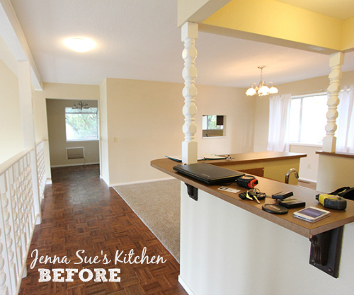
So today let’s take a look at Jenna Sue’s kitchen, and how they knocked down the walls between the original 1970s bar, dining area, and kitchen to create one big, sunny space…
![]()
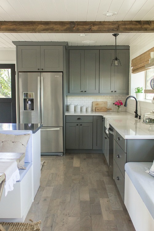
Jenna Sue’s Kitchen Makeover
When you see how it turned out, it’s hard to believe this new kitchen is in the same house!
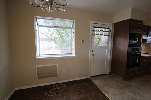
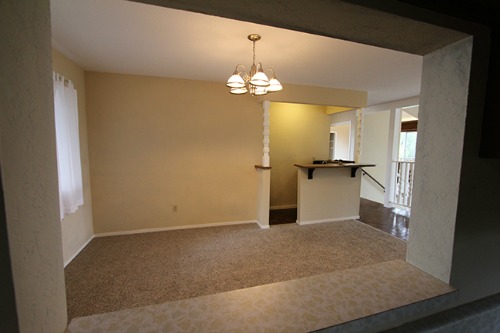
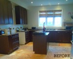
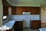
When they bought it, there was a “funky ’70s bar” in the dining area and a small pass-through window to the dark and narrow kitchen behind it:
So they opened it all up and started from scratch.
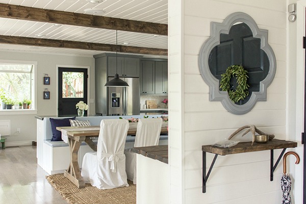
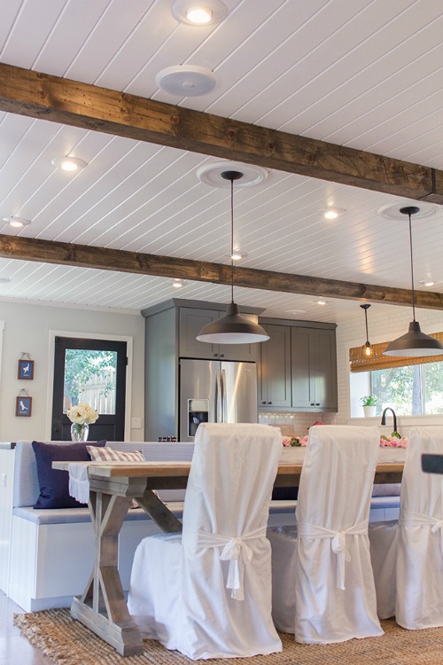
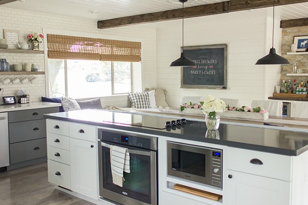
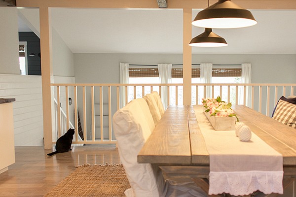
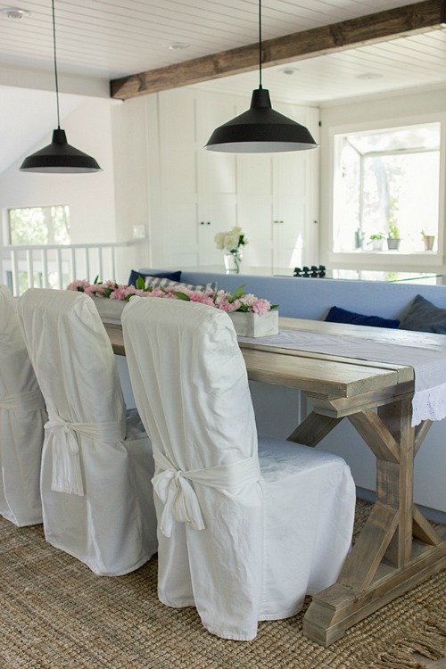
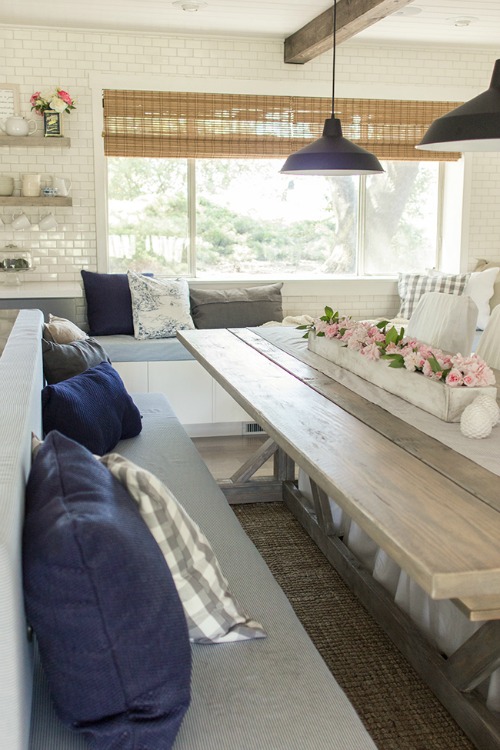
They spent five months on it and did much of the work themselves: “We trimmed the windows, planked the ceilings, built beams, planked the walls, added recessed lights and speakers. Built bar and bench seats and built our dining table.”
How fabulous would it be to have a big window seat like that in the kitchen?
Not to mention the big windows themselves!
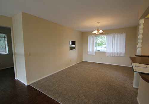
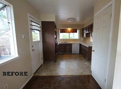
Here’s how the kitchen tucked away behind that dining room wall looked before:
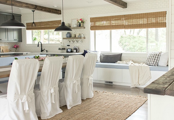
Here’s how it looks now with the table and bench she built for the space:
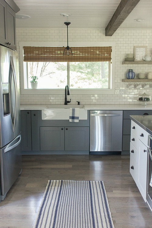
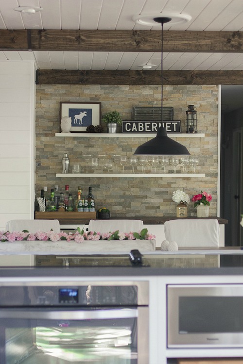
They went with dark gray cabinets and white subway tile.
Another look at the small kitchen before:
And that same corner today:
I really like the blue and white accents they used throughout the room.
It looks so fresh and friendly.
Looking from that old kitchen pass-through into the old dining space and bar:
They still have a bar, but that wall now has beautiful stacked stone on the wall:
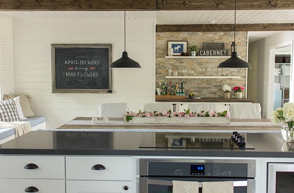
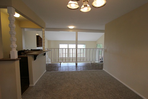
That railing on the other side of the room overlooks the living room below, and they updated it, too:
She says that their “five long months of countless hours, days and nights, blood, sweat and tears have finally paid off. And it truly is our dream kitchen.”
Thanks to Jenna Sue for sharing her kitchen makeover with us!
Visit her blog for more photos and details about the project:
The Kitchen Reveal and The Source List Breakdown.


Now THAT is a beautiful kitchen! I love everything about it.
Exactly what I wanted to say. That kitchen is a lovely place to cook, hang out and have a party!
Now, this is more like it, light and bright and up to date with lots of texture—very nice antidote to that dark and brooding “kitchen of the year.”
Oh yes, that’s what I’m talkin’ about! 🙂 Very nice job! Love the bench seating. The only concern I would have is the white slip covered chairs. I think I would have a heck of a time keeping those clean. I have visions of cat fur, spills, chair bottoms scraping on them, and so on. I suppose they would wash though, and being white, bleach could be used.
Me thought too!
Fabulous, uplifting and spectacular reno.
Love the airiness and relaxed feeling throughout. The wooden table with the bench seating is wonderful. The wood floors, rustic brickwork and plank ceiling add a farmhouse feel that is so warm and welcoming.
P.S……After that depressing “kitchen of the year” this is a true breath of fresh air.
Wow — what a transformation! I would never believe it was the same home. Fantastic work Jenna Sue!! It’s perfection.
Wow. Nailed it!
The gray cabinets, the beautiful wood floors, the ceiling with the wooden beams and the white subway tile…my heart skipped a beat.
*high five*, Jenna Sue!!
It’s so pretty and there’s not a bit of chain mail anywhere.
You don’t think she needs to hang some chain mail in the room? Ha. I’m still scratching my head over that one…(from the HB Kitchen of the Year, if anyone missed it).
Well, I could see maybe just a touch of it draping across the beams…as if! Thanks for sharing that article though, Julia. It was definitely something to talk about
I was actually thinking “ho-hum another gray and white subway tile boring kitchen make over” But I have to say I really like this one. It is functional and pretty. This space makes me want to putter about with a cup of coffee, baking bread, tending plants with a kitty underfoot. Good job!
Also, interesting post following the high dollar kitchen of the year monstrosity in your last post. I bet Jenna Sue’s budget was a fraction of the kitchen of the year’s budget and way more livable and I imagine more re-sellable too!
This is beautiful! Much more liveable than yesterday’s depressing Goth look. I notice there’s no vent hood. I can understand the concern to keep everything open, but with my husband’s “super nose”, that doesn’t work for us! He can’t stand smelling yesterday’s meals. I really like the planked ceilings and beams. Just perfect!
Incredible transformation. That table is amazing!
Hi Julia, now…we…are…cookin. Now this is one pretty kitchen. Thank you for sharing beauty. Regards Esther from Sydney.
THIS should have been ‘The Kitchen Of The Year’….and in my book, it is.
It’s light, welcoming, comfortable, not overdone or pretentious, yet still elegant, more importantly it looks to be very functional with a great layout and good storage and plenty of seating.
Well done!
Gotta agree with you, Aaron. I’d much rather cook (and eat!) in this one. I think I’d look out of place (okay, not glam enough) in the other one. Ha.
Thanks so much for sharing Julia, and thanks to everyone for the kind comments! 😉
Your kitchen makes me happy just looking at it, Jenna. I think I could live happily in that one room if I had to. 🙂
This is my kitchen! So cool that it’s being featured here, thanks hooked on houses! Jenna did a great job designing it.
She DID do an amazing job, and I know you both worked hard bringing her design to life. Love it! 🙂
THIS should be a House Beautiful kitchen, not that one from yesterday’s post! Nice job!
Wow!! LOVE IT!!! Definitely more like a “Kitchen of the Year” for those of us who like comfort and unpretentious style. Just love love love love it.
The kitchen is beautiful but with a closer look I noticed the bench against the counter with the stove top. It could be an accident waiting to happen if there are pots on the stove.
Nice kitchen, looks like a beach kitchen to me…I see that they live in CA and moved from Florida. 😉
That’s right! When I featured their sunroom two years ago they were living in Florida (link at the end of the post if anyone missed it). This is their “new” house in California. I love what they’ve done with it so far. You should all click over to her blog and take the full house tour!
What a gorgeous kitchen! I usually like only all white kitchens but the grey cabinets look awesome. How gorgeous is that bench dining seat and window seat?? I would buy this house in a heartbeat just based on this kitchen/dining area. Now, THAT should be the kitchen of the year!
Now …..That’s a KITCHEN of the year!
You hit the nail on the head when you said this kitchen was “fresh and friendly”! I was having trouble deciding what I didn’t like about the black kitchen besides the fact that is was black. But what it didn’t have was a “friendly” vibe to it. This kitchen does. I love blue and white kitchens and this kitchen is so pretty. I approve of this kitchen!
Kitty!
Okay now THAT kitchen is welcoming, bright, warm and that window seat is fantastic. Very jealous and House Beautiful needs to rethink what should be considered a “Kitchen of the Year”.
Wonderful job. Nice colors, great use of space, and super material choices. So lucky to be a talented DIY couple. You saved a lot of money, and probably did a better job than a professional!
Now that is lovely! Much brighter and easier on the eyes!
No kidding, eh?! Indeed, the other was rather assaulting on the eyes.
Beautiful kitchen!! Love the gray cabinets, apron sink, window seat, and the ceiling is GORGEOUS!!!
Well, it’s official. I’ll have to break it to my husband. I’m in love!
Love it ! This is definitely something easier on the eyes. Your site is terrific.
Wow! It’s lovely! The cabinets are so refreshing to see a color other than white cabinets. This is a perfect kitchen, I’d be in it all day!
I was going to post the other day about that “Kitchen of the Year”… but I couldn’t, you remember your mom teaching you about “if you don’t have anything nice to say…” lol
I follow Jenna Sue’s blog, and this kitchen is 500% better than the kitchen of the year, JMHO. And I’m going to assume that the Kitchen of the year also had an astronomical price tag that went with it.
Absolutely beautiful. All of it works. I am also in absolute AWE of the railing re-do… I really like the open space that the 70’s/80’s split level homes have, but haven’t seen anything really “modern” to update the iron railings in a lot of those homes (other than boxing them in and eliminating some of that breezy open feel). What they did is absolutely perfect. Really beautiful.
Beautiful job on personalizing and making this an open, cheerful space. For our family my one concern would be the stove top right behind the bench dining seating and at the same level (am I seeing that right?). Seems like that could pose a huge safety issue for any little people on the bench and the view of pots and pans on the stove right behind the bench as viewed from the chairs……not so good.
Oh my goodness! How did I miss that Kitchen of the Year? It’s definitely a “niche” taste. To my mind, it says “Whatever… who the hell are you?”
Now, the updated kitchen in this post is positively lovely. It says “Welcome! Make yourself at home.” just like a “good” kitchen should.
THAT is some crazy talent! Beautifully done!
Wow! I love that!
Hi Julia,
What a lovely space. And so nice (and encouraging) that they did the work themselves. I’m sure they have a sense of satisfaction at every meal.
And yes, much needed, after the black hole from the previous post.
🙂
Donna (Australia)
unbelievable. i bet she walks around pinching herself!!!
I know! I would be. 🙂
It’s like the ikea show rooms! Very nice and very Scandinavian…