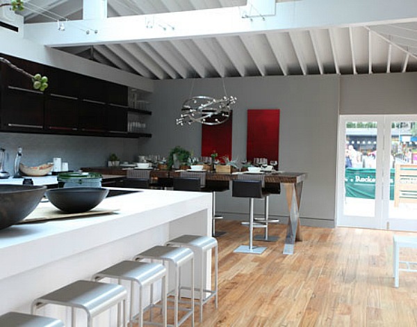
Jeff Lewis from the Bravo TV series “Flipping Out” was chosen to design House Beautiful’s Kitchen of the Year 2010.
If you’ve been watching his show, then you followed along as he worked on it from start to finish. I was sweating right along with him when he had that impromptu meeting in front of about 50 executives and had to explain his vision for it.
The season finale was Tuesday night and they had the Big Kitchen Reveal at Rockefeller Center in Manhattan.
Jeff calls the style of the kitchen California Modern.
“It has a tremendous amount of glass and natural light. We put in as many doors and windows as possible.”
He was a little worried about how it would be received because it’s much more contemporary than usual for an HB Kitchen of the Year.
The kitchen has open shelving, a CaesarStone island, and a table made from wood that, Jeff says, was “salvaged from the old Vanderbilt polo barn.”
It was definitely in the Jeff-Lewis-Style we’ve all come to know and expect from him.
The kitchen was open to the public in July. Did any of you get to see it in person?
What do you think of the Kitchen of the Year? Do you like his “California Modern” style?
Read more about it at House Beautiful. Photos by Tzirel Kaminetzky.


Nah… not for me… a kitchen should be the heart and the soul of the house… This screams flash restaurant… I sure some folk will love the clean lines and monochrome colour pattern… and to them I say ‘to each to their own’! Lx
.-= Laura´s last blog ..Getting to know me =-.
I like those stools… they could really go in any style decor.
.-= Merry´s last blog ..An Impromptu Pumpkin Party =-.
It looks just like the kitchen in his Valley Oak house! Well, very similar, anyway. You’d think he would’ve gone in a little bit different direction just for his own personal interest.
.-= Kelli´s last blog ..Tuesday Truth 30 – I’m a freak =-.
I thought it was a beautiful kitchen, for HB..I think that you could love if from afar, but to live in it is another question. Real life takes alot of “reality” to live in..My kids would have used the wine bottles for bowling pins and given them a shower in FRONT of the sink with that faucet.–not really, but I like a tad bit more warmth in a space where I live. Now if I was a swinging single, wait..take out the swinging..
I love to watch flipping out, the neurosis of the human condition never seems to let me down..
Lisa
Coastal Nest
.-= Lisa´s last blog ..When one really needs to just FALL ON THE FLOOR =-.
It’s a beautiful kitchen but just looks kinda cold and impersonal. But then I like a more cluttered lived in look.
.-= Mel Mel ´s last blog ..Meet Lucy! =-.
I wasn’t really too impressed either. Very basic and nothing that just really “wow”ed me! Would have loved maybe just a little color also (I am a huge fan of neutrals but the black/white/grey theme is getting a little too boring for my taste.
I like light and airy kitchens. This one is a little cold and plain for my taste but it’s attractive, neat and functional. It’s better suited for an office suite than a cozy home but some color and flowers could help brighten and soften it up.
Also, I’m not fond of wood floors in the kitchen – too high maintenance. I prefer a nice tile floor.
I’m an avid viewer of the show and I thought the HB kitchen was about par with what we usually see from Jeff. That’s not a bad thing, even though it’s not really my aesthetic. If I have a “complaint” about Jeff’s work, it’s so obviously masculine and not particularly warm or inviting, I have a hard time picturing it as functional for most families. It’s better adapted to the kitchen of a single guy who doesn’t cook.
.-= Abigail Prescott´s last blog ..Paging Oceanburger =-.
I didn’t see the episode, but in viewing the pictures here, I have to ask – does anyone else think this looks a little too much like the kitchen in the Valley Oak house? It’s not very inspired. It’s nice, but I see too much commonality with the kitchen in his house.
I agree, I normally really like his designs but this one just seemed a little off. The blinding white island, super modern/super dark cabinets and the rustic light flooring just confused me. And the backsplash looked too much like ceiling tiles. And I understand this was supposed to be more of a ‘green’ kitchen (I hate that term) but did they really need 97 plants on the dining table? It was all a little dissapointing.
.-= liz @ bon temps beignet´s last blog ..I Give Myself a Big Fat F on My C =-.
“Maybe you can keep your canned foods and First-Aid Kit somewhere on the wall, too.” This made me laugh out loud! I agree it is typical Jeff Lewis aesthetic, this season was kind of yawn inducing {I didn’t watch it religiously let’s put it that way} but it is a clean, modern kitchen. Not sure how I feel about the kitchen faucet…modern or ugly? Can’t decide. If you squint a little it sort of reminds me of Ina Garten’s kitchen. I prefer Ina’s. Hers probably has a lot more butter in the fridge than Jeff’s.
.-= Bre´s last blog ..Q & A with BB- The Art of Shaving =-.
I wasn’t loving this season either. Sarah needs to go. I do love his style and would have him redo a house for me if I could afford him. Ps, his house sold
The other day 125k under asking.
I hadn’t heard that it sold. Thanks, Josie! -Julia
The backsplash is similar to that in the new show Ordinary Family. So love that home. This is a great kitchen. A bit sterile but a homeowner would add life and color. It’s very well done.
Do you happen to know what the tiles on the back splash were? I was thinking Daltile ceramic or concrete.
I’m having a hard time finding anything remotely close to this look. It’s very subtle but gives a modern touch without being way out there.
I don’t, but you might find some answers over in the House Beautiful article I linked to. Good luck! -Julia
Total man’s kitchen! And who would put water in the biggest wine rack I’ve ever seen? Criminal!
.-= Lauren´s last blog ..How much do your dry towels cost =-.
It’s too cold and modern for my taste. Oh, all the drama for nothing!
.-= Maya @ Completely Coastal´s last blog ..Rate this Living Room Chandelier =-.
i LOVE jeff’s kitchen! i am not really into a sleek modern kitchen, but his style is such that i would consider bringing that look into my kitchen, in fact, i have! he likes to use sleek, stainless hardware in the kitchen and i have incorporated those into my own!
.-= Lisa´s last blog ..meet pepper =-.
I thought the kitchen was nice but all of his work looks the same. I know designers often have a “look” that they’re known for but each space should have a bit of a twist to it. Jeff seems to have a formula for all houses he does. He even said in one of the episodes that he usually used the same color palette in all the houses he does. I’m sure that comes from flipping houses but if you’re going to sell yourself as a “designer” (which I don’t think he is) you should at least try and be a little creative. Bottom line is if you hire Jeff Lewis you get a Jeff Lewis house. I saw most of the season but I don’t know why. I’m always so frustrated at how he runs his business and treats his employees. It makes ok television that is not how you run a “design” business.
.-= Pamela @ Atmosphere ID´s last blog ..Virtual Home Tour Part 3 =-.
Meh…I appreciate the clean lines and all, but it doesn’t look very inviting. It’s funny, I’ve lived in California all my life but still don’t get “California” style.
.-= Cheri@IHeartOldHouses´s last blog ..Indian Summer Blues =-.
Hum, yes, I would echo your thoughts of wanting more of a surprise or an interesting new idea. Beautiful though, I’d take it! My TiVo crashed and missed all the last episodes, sounds like I didn’t miss much but would have loved to see the last episode of all those projects he was juggling…made me stressed thinking about trying to make all those clients happy! Janell
.-= Janell Beals´s last blog ..Adding Nail Head Trim to Upholstered Furniture =-.
I was really expecting more of this kitchen. The colors bored me…the light wood floor? really, with the dark cabinets? and white tile? I just felt underwhelmed by it. It was very Ikea-showroom to me–which is fine I happen to love Ikea don’t get me wrong– but he spent what,like a bazillion dollars on this? The table attached to the wall really didn’t so it for me either, nor did the huge shelf separating the big window from the rest of the kitchen, nor that huge ugly light fixture. I guess I just wasn’t feelin’ it on this one. Sorry Jeff.
.-= ann´s last blog ..Curtain panel decisions =-.
Just hate it…all of it.
The ‘Flipping Out’ show is snooze worthy this season, but he is talented at putting California style spaces together. I love the sleek island justaposed against the gorgeous contemporary dark cabinets. The backsplash is perfection. The faucet is strange, but OK. The industrial stools are a bit cold to me. A little fabric would have been nice.
And that room divider is *cough* ridiculous in my eyes. No one, not even us Californians, stores that much bottled water for display, and you’d never use it for wine. It might be OK in a restaurant, but not a residential kitchen. A pony/half wall may have worked better. Both the pendant light in the sitting area and the fixture over the dining area are simply stunning.
Re: wine storage. Sunlight spoils wine.
A little chilly. A little “Jeff”.
Some great aspects. I like the faucet, the shelves the backsplash…the appliances.
But…chilly.
And the wine/water thing is dumb. With a capital duh.
.-= linda @ Lime in the coconut´s last blog ..Jewel of a garden… =-.
There are parts I like (the reclaimed wood table, the lighting, the huge island and barstools) and things I don’t (the wine wall, the backsplash, the faucet) – but mostly I think it comes off as too sterile for my taste. Even with all of the plants to try and soften and warm the space up – it didn’t work. I think he still has a flipper’s aesthetic – nice finishes but no touches of personality that might detract buyers.
.-= Kai´s last blog ..Whats Wrong With This Picture =-.
I like the colors they used on the walls, and the wood floors and cabinets are great. Other than that… I’m not in love with the space. Things seem a little chunky and oversized to me. I’m short (5’4″), and I’m pretty sure I would never be able to use the shelves above the sink for dishes… because I would not be able to use them. There’s also something just a little off on the size and proportion of the bottled water/wine cubes… I’m not loving that dividing wall.
I’ll end on a happy note though… I love the dining area! The light fixture and table are amazing. 🙂
.-= Ashley W´s last blog ..Not so Green Thumbs =-.
Hmmm….It’s not my style, but I can certainly see beauty in different aspects of the design. It wouldn’t work for my family, and I can totally see my kids ripping all the bottles of water down, but to each his own, right? 😉
.-= Amanda @ Serenity Now´s last blog ..McKenna Layne Designs Giveaway! =-.
I like that see-through bottle/wine rack. I haven’t seen this; guess I’ll have to find it!
.-= Love Where You Live´s last blog ..Hurricane Fence Gets Striking New Look A why-didnt-I think-of-that-makeover! =-.
Although I think it’s tastefully done, it looks like a kitchen for someone who doesn’t actually cook or hang out in the kitchen. The open shelving is nice, but I wouldn’t want my bowls up that high. The stools are cool, but look really uncomfortable. Etc.
Like others, this kitchen doesn’t really impress me much. Too contemporery for my taste, but thanks for sharing it with us.
Who is the new blonde girl? Not Sarah, but the tall one? I saw that she was at Trace’s graduation, but we never got introduced to her.
I think that is Jett’s wife/GF.
Oh, and I do like the kitchen. It wouldn’t work for me or my family of 5, but I think it would work well on the coast or in the city.
Boring. No one without a maid lives neatly enough to live with this style.
The man has a highly inflated idea of his abilities…notice all the credits to others…he’s a shopper.
My take is that flippers rarely do great quality, they’re in there to present a facade (as cheaply as possible) and get out. Superficiality!
Um, is there a fan for the stove top? Did I miss it? I’m a serious cook and that stove did not look serious. I also would not want to clean/dust that wine rack wall. Previous poster was right about it not being appropriate to actually store wine.
It looks kinda pretty though.
They talked just a little about the stove top in the video clip of the kitchen. It’s down-drafted, so there’s a little vent built right into the stove top that sucks everything down into it… then it’s vented out usually out under the floor to the outside. I’m not a big fan of putting stoves in islands, because I really like the big traditional stove and hood. 🙂 I agree with the fact that it doesn’t look very serious either!
I never thought about cleaning that wall and all of the bottles in it… yuck.
Hmmmm….wouldn’t have picked it out as a “kitchen of the year.” It’s nice, but not impressive. No new ideas, except maybe the wine rack/window/display. Not practical for a family, it wouldn’t look good with the normal kitchen clutter that happens in reality. I agree with Ann, it’s Ikea-ish looking.
I don’t care for the kitchen at al, except for the table. Nothing like having something from the Vanderbilts property, it’s good for conversation!
The season’s been a bit blah for me. I’m tired of seeing Sarah chomp on her gum and I’m surprised that it dosn’t bother Jeff.
I say give me more of Zoila and less of Sarah! LOL!
.-= Pat´s last blog ..Packing My Luggage =-.
I really do love that show. It’s one of our favorites, but I always feel stressed when I watch it. I can hardly stand watching his behavior with the people who work for him. I think I would last all of two minutes. That being said I do love to see how the process works and I think he is a great designer. Not too impressed by the kitchen though. A little too modern for my taste:)
.-= Becky @ Farmgirl Paints´s last blog ..clean slate =-.
Not something I would want to cook in….I liked the HB kitchen of the year that Ina Garten did a few years ago better. Although her kitchen was also monochromatic (very neutral), it had more of a casual and welcoming feel to it than this one.
I have never seen House Beautiful, so I just enjoyed the pictures you shared.
I thought the kitchen was tastefully done, but don’t think I would do it in my own home. I don’t care for open shelves-although I like that the dishes were white, which matched well.
The chandelier was neat too!
.-= Josanne´s last blog ..A Super Cute Chocolate Bouquet Fall Garden to make! =-.
Nice, kind of glamorous, but not my style. Every time I see open shelves like that in a kitchen, all I can think of is having to wash the grease off the dishes all the time!
.-= Loribeth´s last blog ..It’s been a while… =-.
Too black, too white, too cold for me.
I’ve never seen this show before….and I am starting to appreciate the modern look as long as it includes some white…whether it’s in the dishes or paint on the walls. Interesting….thanks for sharing
.-= Desiree´s last blog ..Urban Beauty Inspired by Somethings Gotta Give =-.
I love Jeff, but this season was much too short for me. Mas Zoila was muy bueno.
The kitchen design was whatever, but I haven’t really seen any in the last few years that are particularly stunning, either.
.-= Alycia´s last blog ..Go Big or Go Home =-.
Meh. The only thing that I liked about it was the criss-cross wine rack as a room divider…. that is pretty cool, and makes me wish I had something fun like that in my house… other than that? Colorless, cliche, and too modern for me.
I removed Flipping Out from my DVR list. It was just too boring. Also, I can’t stand to look at his assistant chewing gum with her mouth open.
I don’t know who’s doing her makeup but sometimes she looks like a clown with the lipstick emphasizing her mouth. Her mouth is probably normal sized but it looks huge with all that lipstick.
LOVE your site! The photos are great. Can I please request you do the house on “Failure To Launch”?! It’s amazing and deserves to be added to your list!
The season finale was Tuesday night?? My Tivo didn’t pick it up. Sigh. It’s not online yet either.
The only thing that I really fell in love with was the “table” and the chandelier. That table is made with savage wood and the chandelier is very modern. I like the contrast.
Luciane.
I liked Ina’s kitchen from 2009 better also. It was lovely and designed for someone who actually cooks. Jeff admits that he doesn’t cook but hangs out in the kitchen. I love the table though.
Love Jeff Lewis – I know he’s crazy…but. We at MyDesignGuide are big succulent fans too.
It’s too sterile! Over all I am not a fan but there are some features I do like, such as the chandelier. I thought that was interesting at least. I actually could have gone to see this in person but now, I’m so glad I saved myself the trip! I would have been disappointed.
.-= A Vintage Girl´s last blog ..Stanford White =-.
Love it. And the Sphere Chandelier is gorgeous. I adore Jeff and all his craziness.
Does anyone know where he gets the open shelves for his kitchens and the ones that were in his office? I love them… and can’t seem to find them.
I do highly dig the sphere chandelier as well. Very Lady Gaga.
I’m over the stainless steel and granite. Everyone has it and as usual, it gets boring, no personality. I prefer the warmth of several textures and not so sleek. Most of the designers I see do the same thing every time. There is nothing that’s “wow”, it’s just same-o-same-o.