When I got this month’s issue of Country Living magazine and saw photos of Bethany Herwegh’s bright and colorful Manhattan Beach bungalow, I dropped everything and ran to the computer. I couldn’t wait to visit her blog, The Glamorous Housewife, and see more.
And then I had to tell you about it in case you missed it, of course!
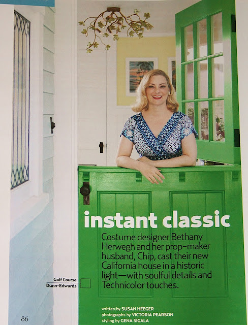
How fun is that kelly-green Dutch door? The paint is “Golf Course” by Dunn-Edwards.
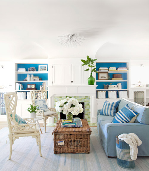
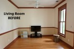
“The stylists thought the living room might make a good cover, so they changed a few things around to make the look cleaner,” Bethany says. “You don’t want too much clutter on your magazine cover.”
She adds that they replaced a lot of her furniture and stuff with things they brought with them. Interesting!
On her blog she shows what her living room looks like when a camera crew isn’t there. I love seeing that kind of real-life behind-the-scenes stuff.
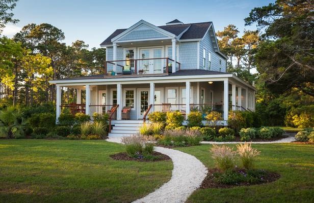
When she and her husband Chip built it a few years ago, they wanted their home to look like a “vintage California beach house.”
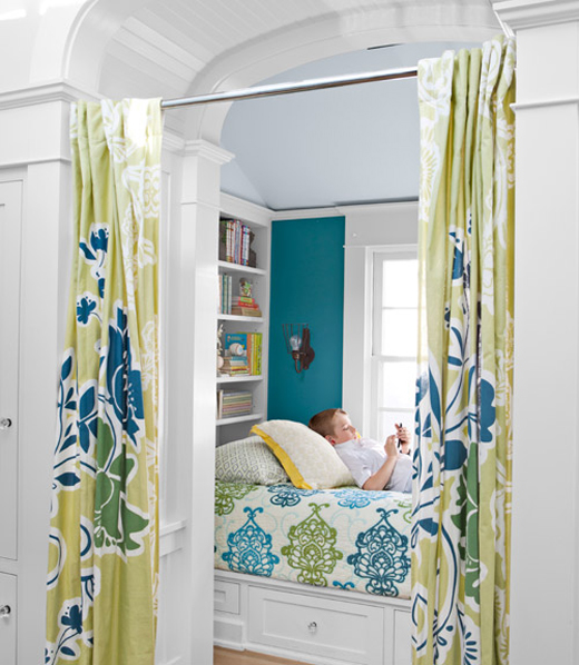
There are so many great nooks and built-ins in this house, it’s crazy (in a good way).
Check out the June issue of Country Living to read the story by Susan Heeger.
The house was designed by architect Lewin Wertheimer and photographed by Victoria Pearson.


I know I squealed too 🙂 and now read her blog – my fav is the dinning table with the birds on the ceiling – how inspired 🙂 le xox
Oh its so lovely,
I love how serene and fresh it looks
Are you kidding me?? I want this woman to come to my house and tell me how to replicate this look. I could never hope to be an interior designer but, if I could, this is what I hope I would create. I love the colors, the open feel, and especially the not-so-subtle homage to an earlier time. Thanks for sharing!!
I would love to help! Just contact me at [email protected]. Seriously!
Thanks doll,
The Glamorous Housewife
Julia, this is a beautiful home! Thanks for sharing it. But… help me understand this concept, please. What is the point of Country Living coming to her home to photograph HER house when it’s not even HER stuff? Seems sort of like a left-handed compliment. (“We love your decorating style, but really… not so much. But, your COUCH can stay.” — HUH?)
Yes, I agree. And I actually like her stuff better! I can see a few accessories brought in/taken out and some rearranging, but rugs and furniture changed makes it not look the same at all.
Hi Sally! Thank you so much for your kind words about my home. I think the reason they changed so much in the front room is to keep the look of ‘Country Living’ and to keep a cleaner look for a potential cover shot. Also the topic of the article they used my home for was ‘pops of color’ not color on top of color! LOL! They kept most of the other rooms the same and only changed a few items in the two areas they were considering for their covers, which was the living room and the kitchen nook.
Thanks doll,
The Glamorous Housewife
GASP!!! Every. Single. Light fixture.
I’m in love.
This is the kind of house that feels like summer all year round.
Great post, Julia! Thank you for preparing it for us.
xo
Luciane at HomeBunch.com
I AM IN LOVE!
Uh-oh… staged photos in a home decor magazine! I feel another scandal coming on!!! 🙂
Ha!
Ha! Of course I thought the same thing! I get that magazine and was a little upset they would change her obviously awesome, unique home, that I like BETTER than their picture. Okay, maybe more of last week is making sense to me know. I can see the emotions it invokes :).
…love her wonderful bright and beautiful home!… what a happy and welcoming place to live…but…i am confused…why do magaznines want to photograph and feature homes…and then “bring their own stuff”…and change around all the true artist’s (aka real homeowner) rooms and decor… i am reading more and more of this…and it does not seem to be a secret… i feel very very gullible for thinking otherwise all these years…
Julia, I think that Bethany’s house is one of the prettiest homes that CL has featured in a long time (I am a subscriber). I adore their dining room! LOVE it. Love the whole house, actually, and I have been inspired to paint our front door green. ;P
Great feature and post!
Love the house and homage to the Fifties…and Sixties and Twenties.
Went to her blog and like her own chairs with the vintage print much more than those fussy wicker objects staged by the magazine. Enjoyed the great photos of fresh interiors. (The editorial bits with her studied use of cool vintage pronouns like “dolls” and “kittens,” not so much)
Yay! I am so happy you noticed that I used my three favorite decades when designing my home. I too like the vintage chairs in the living room. As for my lingo, I find it more amusing than cool. I actually use those words when I speak, along with ‘cowboy’ and ‘gentleman’ for men. I have a very hard time remembering people’s names so I started calling people by ‘doll’ and ‘kitten’ and ‘sweetie’. I guess we all use little tricks to helps us through the day.
Thanks doll,
The Glamorous Housewife
I love your lingo and your style! The world is too stuffy, but your style is stunning, fun and light hearted. Perfection!
By the way, you should write a book on decorating. I would buy it in heart beat!
I have the magazine, and I love that turquoise kitchen! I have always suspected that CL brings their own stuff, seems no one is honest anymore. Going to check out the blog! 😉
Hello,
Thank you for sharing….can’t wait to get my Country Living copy. Love her house and that color!
Thanks again.
Claudia
So I woke up this morning, got a cup of tea and went to check my blog and saw a horde of people coming from this wonderful blog! What an unexpected surprise! I have to say I now have tears in my eyes after reading all of your amazingly kind comments.
My background is in costume design, and I have worked on a few design shoots before, so I thought it was common knowledge that magazines bring in some furniture, tzchokies, and other items to keep the continuity of each magazine’s vision. In addition I am not a professional interior designer, so I considered their restyling as a fun way to see what the house would look like if I has actually hired someone instead of doing it myself. For three days I got to see my house in a slightly different way, and it was crazy fun!
From the bottom of my heart, thank you so much for sharing my home.
Thanks dolls,
The Glamorous Housewife
Your house was one of my absolute favorites that they’ve featured in Country Living. Just love your style. And I was thrilled to find your blog! 🙂
Back in the mid-60’s, our living and dining rooms were featured in one of the Milwaukee newspapers. They brought a bunch of accessories and one of those stair-step end tables, but I think that was pretty much it. We lived in a regular ranch house, and my mother was more into rustics and antiques. I think the story was more on how she and the decorator brought her style into that space. And we had an oatmeal, blue, and bittersweet color scheme which was pretty radical for that time. One of the main things they showcased was the dark orange braided wall-to-wall carpeting, which was really unique. I have never seen braided carpet before or since–rugs, yes. Carpet, no. And they did move things around, but that was so they could show more stuff in each shot. And does it really matter if they put pouter pigeons on the coffee table where we had a pile of magazines or fresh flowers on the piano instead of a picture of my grama? Whatever media, they want to show you ideas and possibilities, not necessarily reality.
I love all the blues and greens and turquoises. So relaxing and fun!
What a gorgeous beach styled home! I love Bethany’s actual living room so much better than the one featured in Country Living. I especially love her 1920’s chairs. Her living room has more personality and style, whereas the staged room is so sterile.
I’ve bookmarked this – it’s just gorgeous – It will be nice just to look at and dream 🙂
Mary x
I especially love the built-ins, like the “booth” and the hutch in the dining room. Gorgeous!!!
I loved this post and look forward to visiting Bethany’s Blog. You KNOW how much I love color and pattern. I especially admired the lovely built ins and a homage to a particular era. There was such a warmth and charm in past periods and styles and i feel that the cool austerity of a lot of today’s decorating lacks that special grace. Bethany’s home invites right you in and I’m sure you would enjoy a marvelous time!
Bethany and her family are pretty darn precious, too!
My favorite picture is of Bethany and her lovely family on that inviting front porch. Those children are precious. Great, great family shot.!
The interior of the house…the style, the woodwork, the breakfst nook, are charming. But…the colors are 180 degrees opposite of what I like. What is it with the current crop of designers that they can’t get off teal?
No insult meant to Bethany or anyone else…it’s just a color palate that leaves me cold.
Dutch doors are very romantic to look at, but not always practical to live with. My childhood home had one when we move in, but it was soon replaced. The upper half always seems to get in the way and it’s especially hazardous for children.
I just loved looking at this when I got the magazine in the mail. I still love it. Those floors! I would have never thought to stain them blue. It’s giving me ideas. Thanks for posting this.
I think it’s fine to stage a photo. Just think if someone posted what my house looked like on a normal day. It’s not good most of the time. Think of it as when company comes over.
lovely, lovely home! I’m with you – that green dutch door is to DIE for. Yum.
Interesting to see the changes the stylists/magazine made for the shoot. Looks good both ways, I think. But it definitely got the Country Living-ified!
What a great home. I love how everyone seems really taken by such a splendid use of color. The turquoise hutch/cabinet is awesome. There is no reason not to be fearless with color!
Swoon! I could not get to Bethany’s blog fast enough, so thanks for sharing! Am I the only one who would love to see a floor plan of her home? I’ve started going through her blog, so maybe I’ll get to one eventually (hoping). I kept wanting a perspective on how all those great areas connect. I’m enchanted completely by all the vintage touches & nooks…and a guest nook- genius- no wasted space on a room which is used a few times per year!!! I feel like I’m being teased with an appetizer and I just want to greedily swallow every detail! I’m also fascinated with the idea that they built a home with such character and with only one bedroom for their children! I swear I would do the same thing if we were ever able to build custom. To me the best houses are not the biggest, but the most thoughtfully designed for everyday living, and this house appears to be just that! Love it!
I never thought to post our floor plan, so thank you for the idea. Of course I have to hunt down our blue prints……
Oh, and I forgot to mention that the one large kid bedroom can be split down the middle with a wall to create two smaller bedrooms. We figured they might want privacy as teenagers.
Thanks doll,
The Glamorous Housewife
Wow! That is a beauty. I wonder what the difference is between a bungalow and a cottage? They’re both small. I’m going to check out her blog now..
Yup this is definitely everyones dream house! I love all the whites and bright colours that are so nicely incorporated. But i had to ask, where did she get her hands on those gorgeous pastel mint and yellow chairs that are paired up with the vintage long picnic table?????
I purchased them from Modernica.net
Thanks doll,
The Glamorous Housewife
Swoon! Swoon! Swoon! Um, yeah, I love it! LOL Can’t wait to head over to her blog to check it all out.
Thanks for sharing such a great space, Julia.
Wowza! Gorgeous house. Can’t wait to check out her blog. Thanks for this post, Julia.
I love everything about this house, especially the booth seating (the color combination! stools! flowers!).
Thank you for sharing your home which is lovely. It is bright, colorful and I just think what a wonderful house to live in.
I’m just so happy to see some color! I get so very sick of white on white on white, and the bold use of color in this house just makes my heart sing.
I loved your home!! Very beautiful! I had never felt one way or another about gnomes until I saw the gorgeous green and blue gnomes you have on your porch!! I want them badly!! I was wondering if you could tell me where you found them? Thanks so much.
What a fun looking house! They have done a great job.