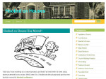
Hooray! My new blog design finally went live this morning. For the last few weeks you may have seen things moving around as my tech genius Zalary helped me reorganize, remove the clutter, change the header, switch sidebars around, and get everything running more smoothly.
It’s been 3 years since my last blog design, so it was time to freshen things up! More than just giving the blog a new look, though, I wanted it to be easier for you to find what you’re looking for.
Hope you like it! Many thanks to all of my loyal readers who have stuck with me for the past 4+ years through all the evolutions of my blog. Hooked on Houses wouldn’t still be here if you weren’t!



Congrats on the new design. It looks fresh and lovely 🙂 I’m sure the change is nice too. It’s fun to jazz things up!!
It’s beautiful, Julia!! So clean and fresh and happy!!
I DO like it! Congrats on the new look! Keep up the great work! 🙂
The new design looks great! Great job!
Looks great! I like this much better!
What a lovely, clean look! Autumn feels like a good time for change, I think. Looking forward to lots more tantalizing content 😉
I love the new site, it looks so crisp and clean! I thoroughly enjoy reading your blog and often get house envy too! Congrats on the redesign!
This looks fantastic! Love your blog!
Yay! Looks great! So fresh and so clean!
It looks fanstastic! So fresh looking. Love it!
Oh yes! Very fresh and clean!
Love the new blog. Congrats on the new design.
Groovy new digs, Julia!! Me like. i need to freshen things up a bit too…
Love what you’ve done with the place! 🙂 It’s been so fun watching you grow.
I love it, Julia! Such a clean, fun look. Kudos! 🙂
The new design looks great! I love the light and modern look and feel. Give yourself a big pat on the back!
Looking good!
I love it, Julia. Any idea what the name of your info box is? Is it a plug-in or a widget?
My tech person referred to it as a “tabber widget.” That’s all I know! 🙂
The new design/layout look great, especially the new typeface. I miss the little house graphic that used to be incorporated with the blog name though.
It’s still between the posts but I had to remove it from my logo because several other house blogs were using it (or something very similar), and I thought it was creating confusion. I kept getting emails from readers saying, “Did you know ___ blog is using your house logo?”
Too bad there’s not another house graphic you can use. If I knew how to make one I would. It’s ok your blog is still very welcoming.
Well, it still looks great with the revisions.
I noticed that too – it’s unfortunate, but you made a smart decision to recreate your design. Your “brand” and content are so strong, I think they stand on their own without the little house logo!
I really wanted the content to be the focus of the blog and not my header. The original logo was so big that it pushed all of my posts far down the page and you had to scroll to see the first one. So that factored into it, too. Also, every house blog has a house logo, and since I have “House” in my name, I figured it might not be necessary. I might work one into the logo later, but I designed this one myself and have limited graphic design skills. 🙂
I agree with Dean. But, understand! Nothing could make me not read and enjoy your blog! Love the color combination. As with everything, well done! So is this “Fall Cleaning” instead of “Spring Cleaning” ;-).
Clean. Neat. Pretty. Light. To the point. Easy to find things. Perfect.
Your tech person should take a bow. It’s not easy being the person behind the curtain.
The orange and yellow make me think of fresh citrus like lemons and oranges, which is one of the happiest combos I can think of. So nice!
Looks wonderful~congrats! I can certainly appreciate all the hard work that goes into re-vamping your blog, my is a work in progress…Keeping blogging, your such a great read!
Changing anything always has a big profit! Congratulations,Julia!
I love the redesign. It looks so clean and simple, fresh and inviting! The colors are so vibrant. Just beautiful Julia!
Simply put…you’re my favorite site.
Sorry, I’ll be the stick in the mud… I really liked your old header/logo. It seemed to say more about the blog, than just the sunburst behind a name. But don’t worry, I’ll soon get used to the new one. The blog, as always, is fantastic and I do appreciate the time and effort that you put into it.
What a nice new design. I love the colors. They are so cheerful.
It looks fab… xv
Lovely reno!
Love the new site design! Everything look streamlined and clean! great job!
Has it really been 3 years?! I remember the last one and how nervous you were about the new design. I love the new look. The sidebar is very easily navigable, and I love the “profile” box at the top with your photo/social media stuff. Nice work!
Much less cluttered-looking. I am looking forward to many more great posts.
–Road to Parnassus
LOVE the new blog design! it’s so chic and really easy to find what i’m looking for! great changes! (:
It looks lovely!
I love the new design, Julia. It’s so cheerful and nicely organized.
Very clean! Hope the new look works out well for you. I have to admit that your blog jump-started me back into the stuff I love: interior design. As a designer it’s easy to just get wrapped up in the design necessities of work and forget about just having fun. I finally got my blog up and running last week (right after we bought our first house together!) and I’d love to share some of your posts once in a while!!! Again, best of luck and thanks for relighting my fire =)
That’s nice to hear! Glad I could inspire you a little. Best of luck to you on your new blog–and house! 🙂
It looks so much better!
I love it! And … you’re stuck with me!
I noticed yesterday that your banner header was different. I love the entire new look. It is fresh and clean as so many have stated already. There is also a lot less clutter.
The new design looks fabulous, Julia! I love the simple yet classy design. I’m ready to spruce up my design, especially seeing how great yours looks!
Love your new site! It has a sleek, tasteful feel about it …
Great job!
Love it, looks so fresh and clean!
Love the new look, Julia! So clean and fesh!
Way to go girl! Love the streamlined look of your new design! Here’s to 4 more (and then some!) years!
Kelly
Love it girl…so clean and classicly you!
Love your new, clean design!
Looks great!! 3 years is a long time to live something in the design world. I really like the little box with the tabs – very handy! And the color scheme is cute too.
Hi Julia – great new look…. love the happy colours. Regards Esther from Sydney. PS I’m here to stay….
Change is the only constant thing. Nice new look. Love your site.
Awe~~SOME !!!
Love the re-design!
Yes, I did notice and I got all excited about the new design! It is very clean, sophisticated, and eye-catching, and… well, very optimistic! I love it! Much cleaner on the sidebar and easier to navigate. You done good!
Congratulations! Miss the house, but once you explained it’s totally understandable. Seriously loving the content shifted back to the left. I never got use to the main content section shifting to the far right. Love it! Very fresh and clean looking.
Yes! I noticed it right away.It’s like when you rearrange the furniture in a room, and you have to get used to it. I love being your loyal reader! Thanks ..Jodi
It’s certainly cleaner and easier to navigate, only I miss the old banner… so retro and darling— and an image I associated completely with your blog. I don’t like the sun graphic and hope you replace that in your next redesign.
Aw, sorry you don’t like it. This is my sunny, happy place. That house always felt like the sun at the top of my blog with the rays coming out of it. So I wanted something that felt like that to me again. And I wanted more yellow. Also, it just looked too plain with just the words. I’m not a logo designer or graphic designer, so I’m sure it won’t win any awards and may get a professional overhaul eventually, but it makes me smile to see a little sunshine when I open the blog in the morning. 🙂
Looks really nice!
Cute!
AWESOME! I really like the new design. It is really easy to find things and super clean. I love the tabby widget. Wish blogger had something like that. I may have to make the big jump someday. I love your advertising widget things and how easy it is to upload an ad. So super smart. The advertising is cleaner and more viewable. Overall, this is just a really good job.
Love the new changes, keep up the great work! I always look forward to coming home and reading your blog!
Aaawww! I gotta say it. I loved the little house logo. Don’t like to see it go. It represents. Well, the new is simple and clean, yet I liked the charm of the other. It’s you blog so you have to be happy with your stamp.
Love the clean look!
gg
I really like the new design. I’ve been a fan for a while. I’m not sure how long, but definitely a couple years. I discovered your blog somehow and made my way back through your posts until I got to the very beginning, commenting as I went, haha. I remember you replying to one saying I must be nearing the beginning of your posts 😀
Love the new look! So sorry you don’t have the top 10 referrers section anymore – I was wondering why you went from one of my top referrers down to 0!
Best of luck with the blog-
Holly
Yeah, sorry about that. I ruthlessly edited my sidebar down to as few things as possible. I’ll probably be linking to my Top Referrers in regular posts from time to time instead, like I did last month. I think they get more traffic that way, anyway.
I love it!! Its so eye pleasing, not so much clutter ! Good choice Julia! I think a few years back this was how the blogs started out, then it from nothing to so much on a page you dont know were to focus. I hope more follow back this way. I think its more about the blog and what it has to say then all the awards and such down the sides. Thanks for all your time and effort you put into your blog Julia ! Love it so much.:)