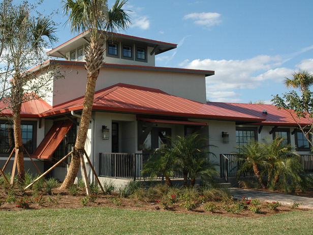
Have you seen the HGTV Green Home 2009 in Port Lucie, Florida?
Raise your hand if you’re entering to win it!
Go to HGTV.com to enter the sweepstakes and take the full house tour.
A Fun Place to Get Your House Fix

Go to HGTV.com to enter the sweepstakes and take the full house tour.


Hello Julia,
I entered but I am not crazy about the home. Don’t like the kitchen and some of the decor was just off to me. The kids rooms were kind of cute. The floor plan doesn’t make sence and a home in that location-no pool? What? I don’t care for the exterior it reminds me of a prison. But I am for green homes. I thought they could have done more to the yard. I hope to buld a more traditional style home that is solar powered some day. Hope you have a nice week!~Tam:D
Tam’s last blog post..Count Your Blessings…
Well, I’m not a huge fan. I’m sure that exterior landscaping is native/low maintenance/low water, but at first glance it looked kind of vacant lot-ish to me. Personally, I don’t care for the orange striped wall and orange striped settee together. I could probably live with the settee, but not both. The kitchen is nice, but a little modern for my taste. I do like the screened in porch.
Holly’s last blog post..Who’s the Belle of the Ball?
OK, I have to admit, the whole HGTV “green home” thing really gets on my nerves. I am no eco-warrior, by any stretch, but I just find this annoying. They build a brand new house, decorate it to the hilt, and call it “green” just b/c they put in some energy efficient windows and appliances?! I would find it much more appealing if they remodeled an existing older home (maybe in a transitional neighborhood?) with found and repurposed items and gave that home away. That would be very cool. But, “green” or not, I didn’t really care for this house. It is just too “decorated” for me. I am curious to hear what other people think about it.
laurel sauls’s last blog post..
I think the outside looks like a commercial building and that orange striped wall is horrible. But the rest of the rooms are really nice an of course I’ll enter at least once. Thanks for reminding me because I forgot.
Amy’s last blog post..Need.Coffee.Now.
I love it. Even the orange striped wallpaper. It’s really a look that I love. Except for the landscaping. There are xeriscape plants with color, and it seems strange for the home to be so vibrant on the inside,yet ugly drab at the entrance.
Sue’s last blog post..PPB
Way too modern for my taste. But I suppose if I won, I’d make myself comfortable 🙂
Emily@remodelingthislife’s last blog post..Self Portrait
I’m still smarting over the fact that I didn’t win the dream home in Colorado a few years ago! I love this house, and I love Port St. Lucie. I’m definitely going to enter!
I don’t like it. I didn’t even enter. I’m sure I’d have to pay a gazillion dollars in taxes for a house I don’t like and in this economy I couldn’t sell it. No thanks.
Mom in High Heels’s last blog post..Being Kind-A Social Experiment
i really didnt like the heavy chair and large lamp next to the little girls closet door. that would be a hassel. the master bedroom was uhmmmmm SMALL…….. and the living room with the tv on the wall…….i dont know it could have been a little nicer. but, all and all i did love it. i loved the stripes. i love orange like i like red…..:) 🙂 and i like the lounge area. and the patio was very cool. 🙂
Is it just me that thinks this house is really big, rather than small? It looks huge to me!
chaotic kitten’s last blog post..Comment Replies (1 of 2)
i really didnt like the heavy chair and large lamp next to the little girls closet door. that would be a hassel. the master bedroom was uhmmmmm SMALL…….. and the living room with the tv on the wall…….i dont know it could have been a little nicer. but, all and all i did love it. i loved the stripes. i love orange like i like red…..:) 🙂 and i like the lounge area. and the patio was very cool. 🙂
Sorry, forgot to add great post! Can’t wait to see your next post!
Can’t say I like the exterior either. Doesn’t it look like every other house in Florida? And the flat screen TV as focal point in the living room doesn’t do it for me either. I’m always all about location anyway and can’t really tell what’s going on around the house – I’ll have to go to HGTV I suppose!
Laura’s last blog post..Historic Buildings of Connecticut
Oh dear. From the matched lamps and tables to the matched chaises and vases this is a house styled with little imagination. What is it with all the furniture piled on the rug in the sitting room? It looks like they’re about to have the floors cleaned. And the mermaid art in the kids room looks very twitter-inspired but maybe I’m projecting here, anyway too much color not enough design.
Jane @ Beach House’s last blog post..I got sunshine
Hi Julia – I really like the exterior, call me weird. I also liked the entry. The other rooms although I liked, seemed impractical. Loved the lounge, but would we really sit there? Looked good in photo, but ??? Liked the kitchen (not deep love), the family room seemed like it was missing something. Master, you are so right, small space, small bed. Child’s room, adorable. But is that chair in front of the closet door? Yikes…
Porch area, disjointed. I’m not sure what happened, seems like rooms were decorated for photos & not how people would actually live with a family. I love the color schemes. Landscaping, although native, is lacking punch. Will enter but agree with Mom in High Heels, how do you afford the taxes?
Deb Milne’s last blog post..Ikea Top Twelve
I LOVE the kitchen and the screened porch. If I win, I’ll be changing up a few things though. Port St. Lucie is beautiful!
This home has “potential” if you know what I mean…
I’m just not thrilled with the home. I do like the palms in the front though. Basically I think it needs a LOT of help and I’m disappointed they didn’t consult with you first.
Blessings – Debbie
Debbie’s last blog post..Deer Speaks
Julia, I agree with you…not crazy about the exterior, like some rooms or maybe some elements in some rooms, not crazy about others. I did notice two things and perhaps it is the camera lens… I don’t like how in the entry hall with orange striped sofa that the floor is on a slight diagonal. That would bug me. The same with the wood floor in the master bedroom.
Susan Lang @ Designing Your Dream Home’s last blog post..Porches, Patios, and Decks: Mistakes to Avoid
Hi Julia 🙂
Ummm… not my style AT ALL and not even something I can appreciate just looking at it, except maybe the master. It looks cheap, not cute and crafty, but just plain cheap, like if you pushed on it, it would fall apart. The whole house, especially the front just makes me scratch my head.
rue
rue’s last blog post..A new light & A little spring
Oh and I have to give an AMEN! to Laurel Sauls. EXACTLY what I thought, but didn’t say.
rue’s last blog post..A new light & A little spring
It’s the land of the giant furniture. The furniture is off scale, it’s all over the place, small beds, giant side tables, etc… Shame on HGTV, bad ID.
Janet’s last blog post..My Path To The UK…
The first thing that struck me on the exterior picture was that middle level thing that reminds me of a big blocky school auditorium/gymnasium sticking up out of the building. What is that?
Other than that, the only room I like is the screened porch, yum. As for the master bed looking so small? Maybe it’s the behemoth side tables that are dwarfing it.
foobella’s last blog post..dada – The Little Band That Could
A second blog? Julia, you keep raising the bar! 🙂
bungalowbliss’s last blog post..Bustin’ Out
I’ll tell you what…I drove by the home for a peek the other day. The exterior isn’t as bad in person. Although it looks small, but sprawling. It has no other homes around it…but WILL have. Then it’ll be yucky (IMHO).
I’m going to go take a tour of it…I’ll take some pics for you too!
Linda@Lime in the Coconut’s last blog post..A Beach home tour…from our little town…
Overall there is more that I don’t like than I do. I don’t like all the orange. I wonder if that is supposed to be the “in” colour this year or something and that is why they used so much of it. I like the furniture in the family room with the TV but it looks all “squished in” to me. They could have spread it out a little more. I went to the website and looked at the floorplan. It sure looks like a pretty huge place. How green is that?
Grace’s last blog post..Bird In The House. A Tutorial!
When they first posted the layout for the house months ago, I couldn’t figure it out. It seemed soooo odd. But now when you see the rooms put together, it makes a bit more sense. That being said, I don’t think I would ever build a house with that layout. What’s with the garden on the roof and another out away from the house in the yard? Why would you want/need two gardens? But I think it is beautifully decorated. That orange/white striped wall?? YOWSA! I have a feeling a normal person would paint over it. :o)
I definitely like the one last year way better (but am partial to South Carolina homes anyway, since it’s my home state!). The screened in porch seems very nice. All in all, I wouldn’t turn it down!
The exterior looks like a “before” from Curb Appeal to me. I do like the screened porch. I am quite sure winning will not be an issue for me!
susan’s last blog post..A Metamorphosis and Blue Monday
There is absolutely nothing I like about this house – and the kitchen is downright depressing:( I’ve never been crazy about their resident designer – I wish they would switch every year.
But of course I’ll enter!
The best part about it is the porch. That bed isn’t big enough for my husband to sleep in alone, much less the two of us together.
Lazy Mom Leslie’s last blog post..Confessions of a Lazy Mom
I enter every year……hey it’s a free home.
I was supposed to win last year but…….they never called. :-/
All of HGTV’s homes are small, broken up, tiny rooms and way overpriced homes. They are always built in bad areas or on speculation property. If I ever won one, I would turn around and sell it and then go build my dream home elsewhere. They are always four hundred dollar homes with a multi million dollar price tag. A multi million dollar home would be a steel if the selling price were dropped to one million……and that is what I would sell it for.
Robin’s last blog post..Granola
Okay….so this years sweepstakes is worth only 750,000. Sell it for 400,000 or 500,000. You’d still come out on top.
Robin’s last blog post..Granola
It’s not a huge house, but it’s a good size. The bedrooms seem very small for such a large footprint. Also, as someone else mentioned, the furniture is completely out of scale. The bed in the Master looks smaller than a Full, but the side tables are huge.
Really odd house. It looks uncomfortable — not just uncomfortable as in “those lounge chairs do NOT look comfy” but also uncomfortable in the sense that it is not inviting looking. Disjointed. Just — well, odd.
Glad it’s not big, but I think taking an older home — something really challenging like the ubiquitous bi-level — and changing it using responsible materials would be a more effective “green” example.
Building new is NEVER green. Ever.
Cass
Cass @ That Old House’s last blog post..Another "Thrifty" Tablescape
Well, I certainly prefer the 2008 Green Home over the new one, but it’s still pretty fine. The one glaring negative for me is the striped-walled foyer/ divider. UGH…it’s the first thing I would change. I’m sure some like it, but it’s just tacky to me. Granted, I haven’t seen it in person, but it’s like a slap in the face upon entering.
LOVE the kitchen and the glass tiles. Love the dark woods and stainless. Also love the back porch/ patio and the master bath. And I think over time, the exterior will look better with some age and weathering.
BUT, bottom-line: I agree with the others here who point out that if they really want to push the green agenda, reconditioning an older home (not building new) is the way to go. **This is what I find ironic about the newest Dream Home in Sonoma; If HGTV is really concerned with the environment and gong green, why wasn’t more attention paid to it with the Dream Home and subsequently all of it’s new projects? **
I like the 2009 green home design – it is unique. Frankly, I like the striped wall and matching seat at the entry, and the sitting area to the left (the driftwood table crowds it a bit, though). I think I’d use the “lounge” differently – I like the built-in storage unit, would probably put the big-screen TV over it and use our own home theater lounge chairs facing the wall; and we’d go a bit more formal, not too much so, in the living room. Love the high clerestory window treatment and chandelier in the living room.
The kitchen is great, and so is the dining room with its view. Love the Master Suite arrangement, its color, and the glass tiles in the bathrooms. The sitting room and child’s room seem crowded, and need less furniture. The child’s room needs some toning down (sorry – we have no small children, and it’s just not to our taste).
The back patio is great, and I like the roof “garden.” Neat idea. As for lack of a swimming pool – if we win that house, I’ll build one! It would look great from the dining room.
I even like the idea of the separate garage and breezeway, and the opportunity to use the breezeway for parking a third vehicle. Good use of land. The siting of the home is wonderful, with a front view of the prime lake in the neighborhood. Nicely chosen.
Anyone know where to find the glass tile used in the kitchen or very similar??