Welcome to the third day in our Homearama ’08 Fantasy Open House series.
The name Pavan Kunj refers to “the purifying influence of the wind.” The home’s design originates from ancient Maharishi Vedic architecture, which requires precise proportions, orientation, and placement of interior spaces.
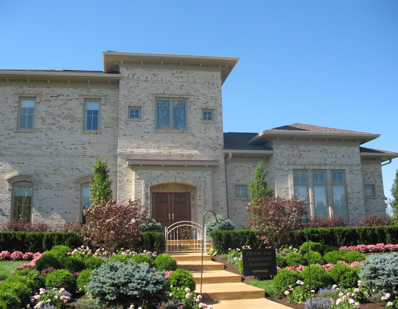
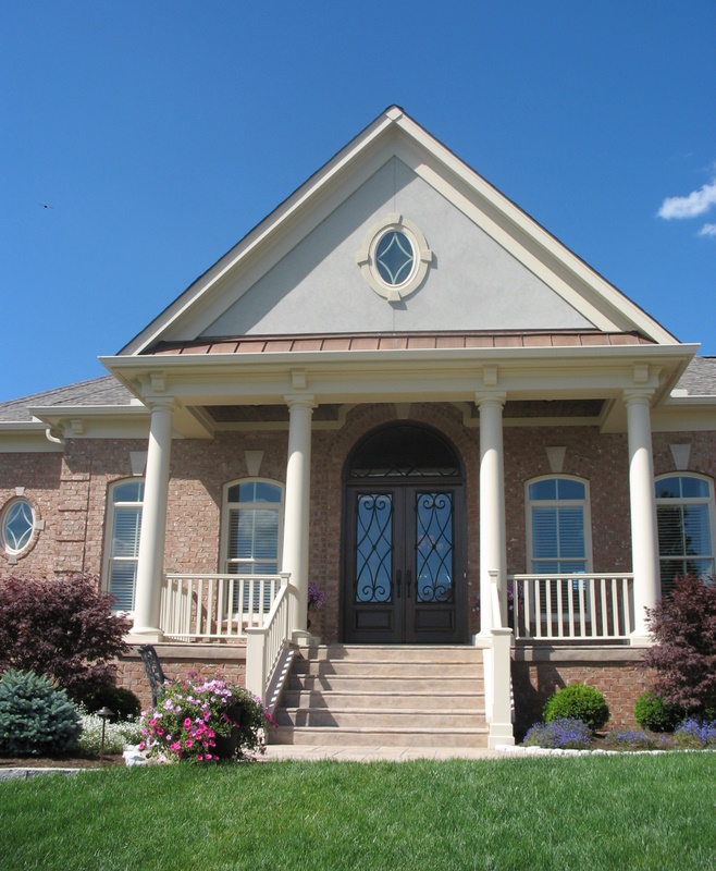
Built by Daniels Homes, the Pavan Kunj has 7,700 square feet and sold for $1.85 million.
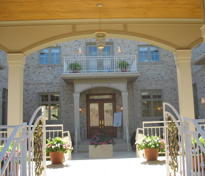
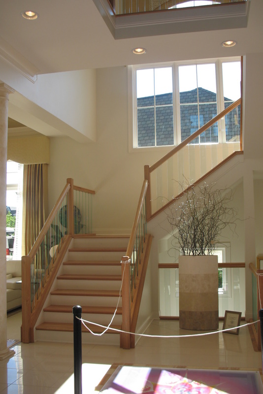
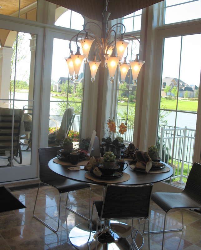
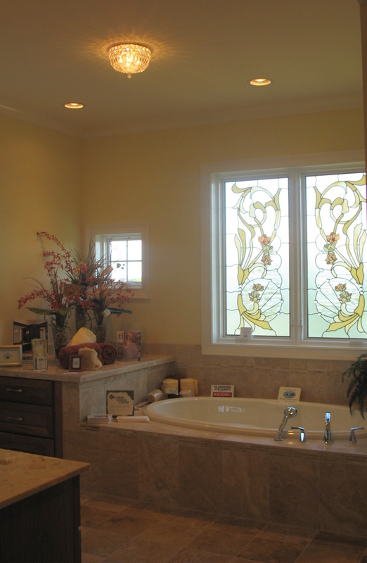
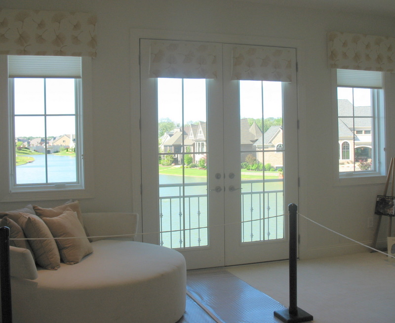
The main entrance to the home is from the side courtyard. You step from the courtyard into a two-story central atrium, called the Brahmastan. Skylights, white walls and woodwork, and pale wood floors keep the home lighter and brighter than the other houses we’ve toured so far.
Well, you’ll see. Go on in!
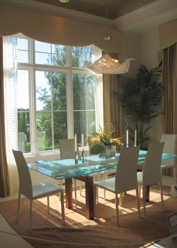
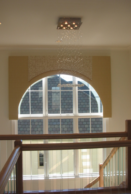
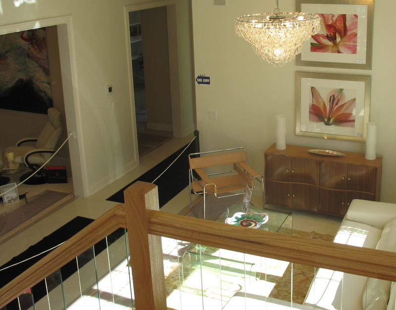


Oh, my gosh. I love this house. I didn’t think I’d like it that much at first glance…it looked kind of cold. But I love how unique everything is. The light fixture over the landing–outstanding. The house is very inviting.
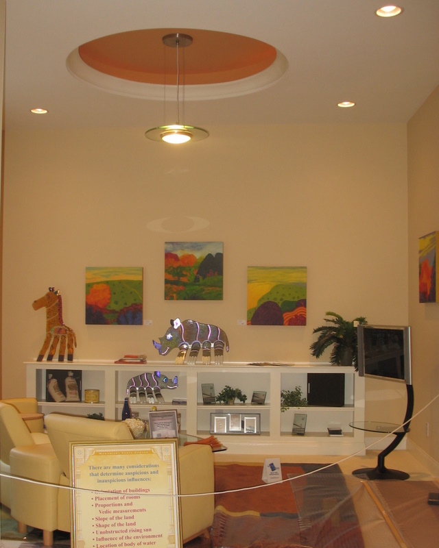
I’m going to bed, to dream of giraffes in my living room and clean, beautiful design.
I soooo wanted to like this house….I mean, come on, it has a courtyard!!! But….I hate it. It is so sterile and bare. And I like bare, but something about this house feels “off”.
I like this one! The lighting fixtures are wonderful. I would love a little more color, but it is a pretty a “restful” house.
This is my favorite so far!
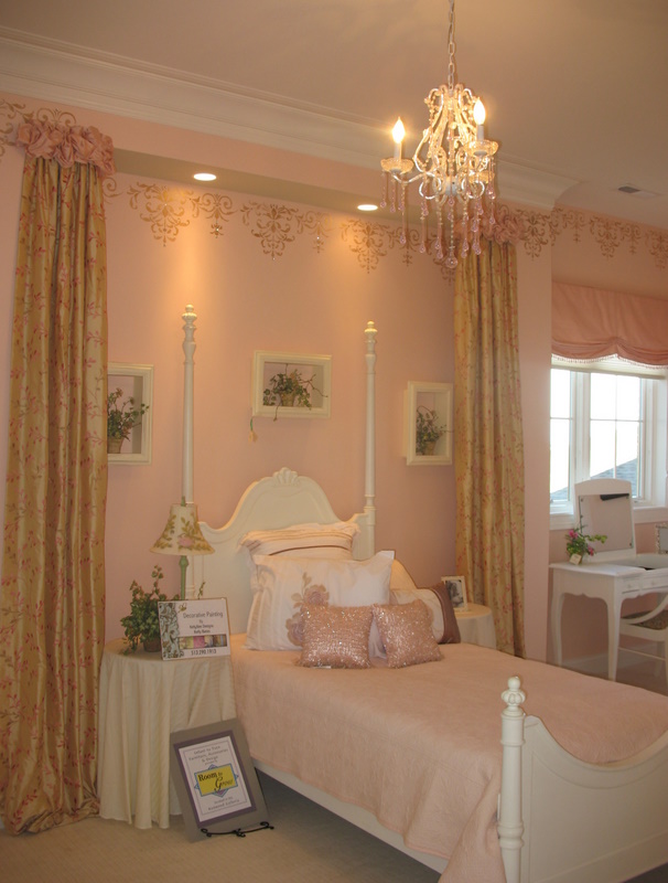
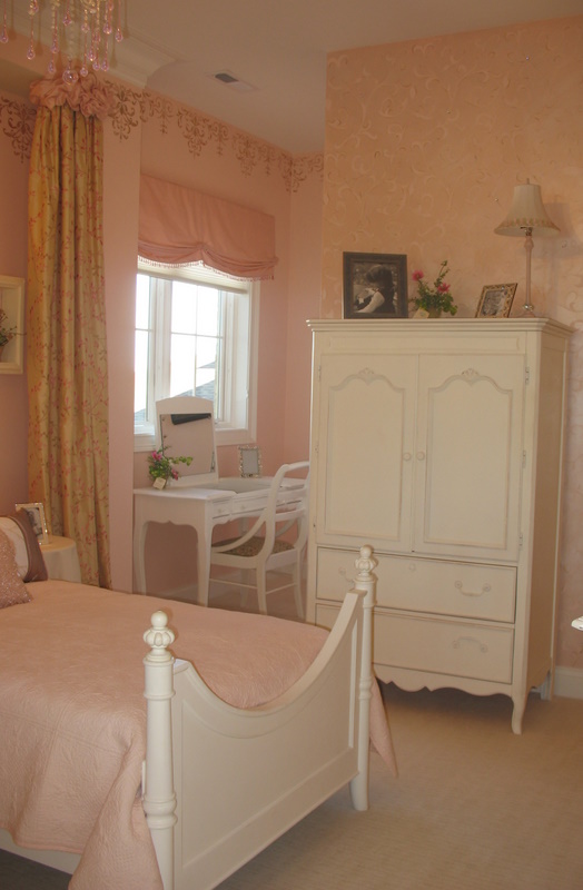
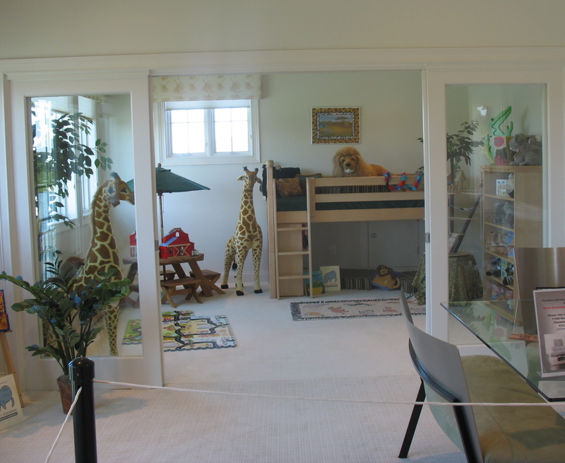
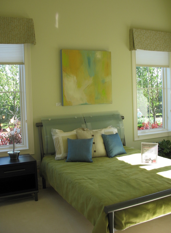
This one was a bit different for me. Love it, yes… I really loved the little girls bedroom. I would have loved a room like that growing up.. still would, smile. I glad I was able to see the cabinets painted the same color as the trim work. I have wanted to paint my kitchen cabinets for some time now… Im still trying to talk myself into painting my ceiling that pretty blue. hope you have a nice day and thanks again for the little peek show! Susie H~
Too many glass tables. I don’t care for glass table once everone sits down all you see is knees. I did like the little girls room.
I love the inside but the outside looks institutional to me. Since when do children need a lounge? They got their own bedrooms and then their own bathrooms, now they get lounges too? Seriously, I liked the clean uncluttered look of this house much more than the previous very ornate ones. This would have been a nice interior to go with the Hamptons exterior. I’m not positive I’d want to live in it, but I will sleep on it.
Nope, can honestly say I hate it. Such a COLD place. Don’t like glass, been there done that !!
Thanks Julia, loving the tours.
Kathy 🙂
I guess I just enjoy ‘smaller’ homes, or at least homes that feel like a home.
Its way to modern for my taste. I walked away. I loved the courtyard but couldn’t get past all the glass. And btw…I hated the ceiling fixture in the master bath. Thanks Julia…loving these 🙂
Wow that house is weird. I like the master bedroom. I like the courtyard, because… who doesn’t like courtyards. I LOVE the house was interesting and kid friendly.
But it was too weird. The flower thing on the floor was strange. I would have LOVED LOVED the lounge and all that kid area, but it looks so institutional. I could see it being a REALLY nice children’s waiting area or rehabilitation center. Hmm..
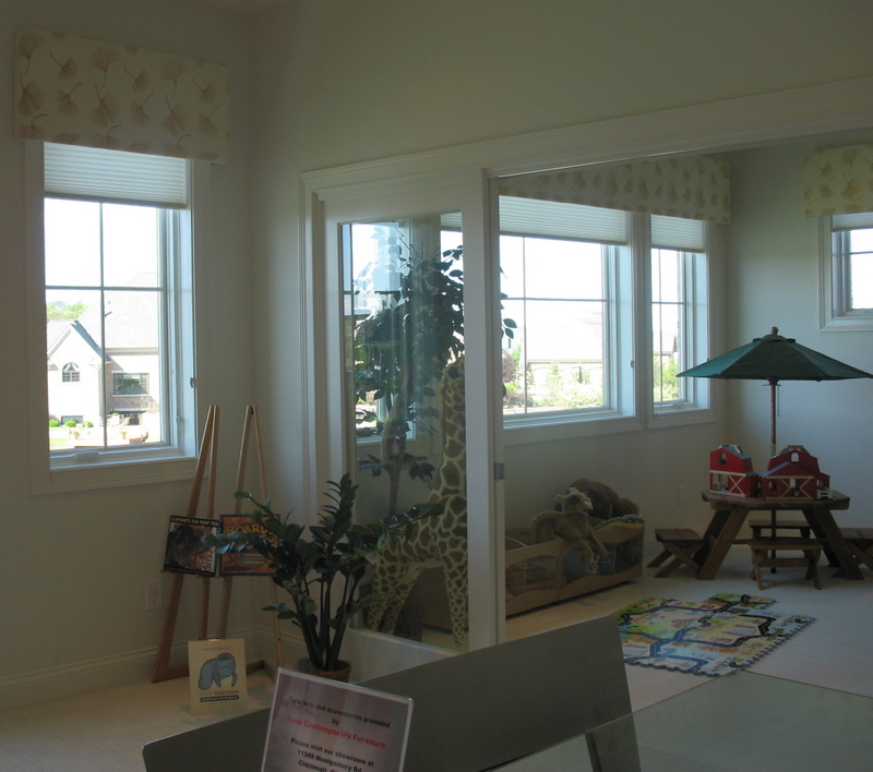
I’m with Tori, really preferring small, cozy homes to these giant houses that leave me cold. But, trying to get past that, I find I do like some of the unusual light fixtures, like the one in the formal dining room and the one in the upstairs landing. Also, the children’s playroom and the little girl’s room with the stuffed animals looks cute and appealing, even if a bit cold.
Um… ok. There were parts I really appreciated. Some of the modern light fxtures were fun. But mostly, it seemed like a nuetral version of the Ruthless People mansion. Did you ever see that, with Bette Midler? Great 80’s movie, but her mansion is chock full of garish moder 80’s style. This reminded me of that.
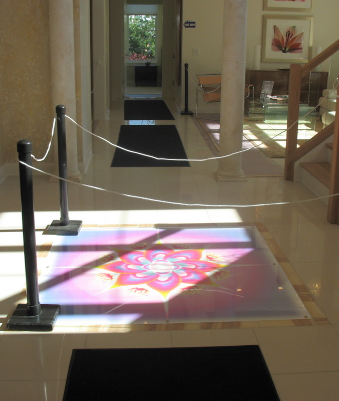
Interesting tour – that lotus flower in the floor is amazing!
This is my favorite of the houses so far because the space is so bright and airy. Of course, the decor would need some changing. Especially all the weird light fixtures and that flower art in the floor and the sort of 80s vibe of the place. But the light and high ceilings are amazing.
I’m with many posters. This house is just off. I hate the curb appeal and I hate (the now common) blending of modern with traditional. It just doesn’t work. I love both, but they have to be done right. This is done wrong.
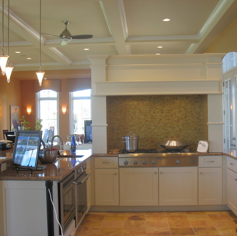
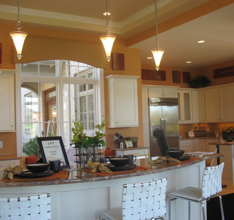
The kitchen looks practical, so they get points for that, but I’m unclear if the design is good.
Overall, I’d walk. It just seems like a poorly designed hotel with something wrong about it besides the obvious.
Mark
Too contemporary for my taste, but I do love some of the light fixtures.
I really like the house- except for those draperies. Ugh. Everything is modern but those darn curtains. Seriously, if you’re going to go that modern your drapes shouldn’t look like a prom dress. And with my pretend millions I’d have to change out all those marble floors. It’s just too much, too cold, and too hard since I have little ones that still trip over their feet and fall a lot. Loved the kitchen and the eat in area over the water. Beautiful!
Hey, Meridith, we had a ‘children’s lounge’ when I was growing up, it was just called ‘the unfinished basement’. lol
I do really like the light fixtures here, and overall, I would say it’s better than the others, even if it’s not my taste to live in, I could certainly appreciate visiting. At least it leaves an impression!
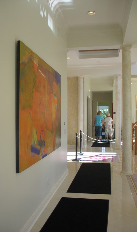
That said, don’t like the glass in the stair rails (use metal instead?), or the ‘lotus’ on the floor (could it have been a mosaic instead of a print? The print looks cheap). And the outside is really bleh. The choice in paintings reminds me a bit of a lobby, but I suppose that’s just taste.
Liked the courtyard, kitchen / family room was okay. Hated the “kite” chandelier above dining table… would like it better if they switched it with the one above the kitchen table. Is it just me, or do all those chairs look uncomfortable? Would not want to be invited to a dinner party there. Lotus flower, I think it was the color… didn’t go with the room. Girls room is cute but does not go with theme of house. Kids lounge not kid friendly…. glass table, white sofa, carpet & floors…. what were they thinking??? We’ll pass!
Karla & Karrie
Too modern. OMG I’m the pickiest person alive. Shoot me now.
hahaha, plantingoaks! I had one of those, too. 🙂 This is the best interior of the lot to me so far, but still too fussy for me. Fussy minimalist — go figure! I also did not like the outside at all.
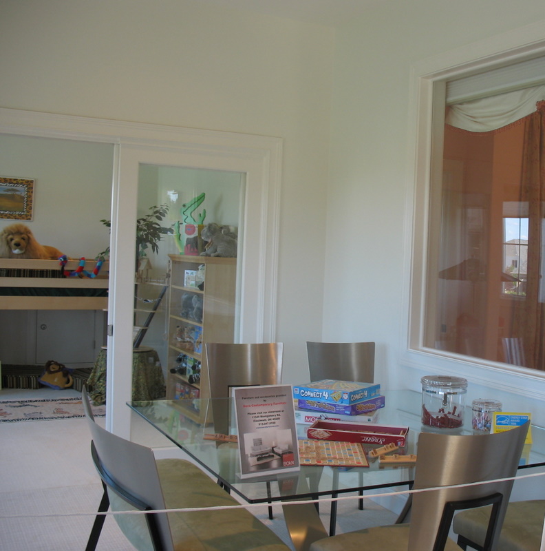
I like most of it. Love the kitchen, totally get the “children’s lounge” – it’s called please keep the plastic crap HERE!
I do not get why there is a glass window from the children’s lounge to the girl’s bedroom UCK!
Not liking it. Something about it left me feeling uneasy. the outside was cold and uninviting, worse than the inside. Didn’t like the layout of the kitchen, and didn’t get that childrens lounge with the glass. Very institutional. I’d have to walk on this one.
Darla, it’s either too modern or not modern enough!
Still, there’s something WRONG about that house. Bad feng shui? I can’t put my finger on it. I can nit pick and point out major problems but those aren’t the things BOTHERING me. Maybe it has something to do with the ratios.
I dunno.
This house is having an identity crisis. I’d change it’s name first. The whole house just rubs me the wrong way. Holding on to my fake millions awhile.
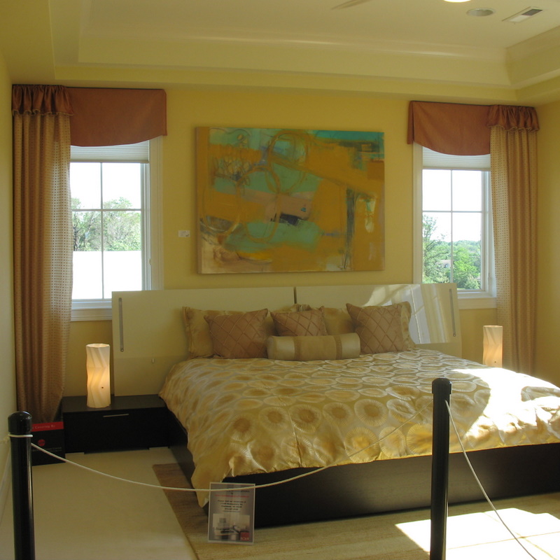
I would be so happy if I could take a lovely hot bath in that tub, and then take a nap in the girly room. The light in the dining room looks like some sort of glitzy seagull concept, and I’m not sure I approve of that.
Hmmm..very interesting! I am not a fan of the cone shaped lighting fixtures hanging throughout. The house itself is pretty. I can’t believe they have a children’s “wing”. I have to say this isn’t one of my faves – the furniture and the way it’s all arranged makes me think of the waiting room at a doctor’s office. 🙂
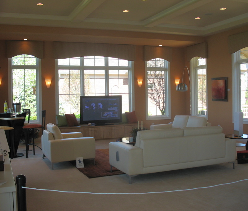
This house doesn’t seem to flow right, I did like the family room a lot but that was it.
Something went terribly wrong with the uptairs stair landing. You glide up the stairs, turn to look out a huge window, instead of the beautiful view you were expecting, egads! you’re staring at the neighbor’s roof?!? What’s that about? If the view is bad, you put in high windows, so the light comes in, and the view stays OUT, and under the high windows you hang a large, modern art picture.
Frankly, I’d keep my pretend millions. Those houses are much too close together. For 1.85 million, I don’t want to see my neighbor’s roof.
Interesting concept.
Pat
That name is the goofiest thing I have ever heard in my life. I was running screaming to get out of this hell-like home until I saw the girl’s room, but then when the picture of the observing room into her bedroom came up I was really running for my life and wanted to take the poor girl that lives there with me….Ahhhhhhhh….
Oh and that chandelier in the upstairs landing is the ugliest thing I have ever seen… yikes!
I think you know my answer LOL
rue
There is a lot I love about this house–surprised? 🙂 But a lot I don’t. Let’s focus on the positive, shall we? Kitchen, love it. Courtyard, love it. Exterior lines, nice; but the brick, hate it.
Who put’s glass in a kids room? Actually the whole house is very kid unfriendly with glass everywhere and white everywhere. Why bother with a kids room when only people without kids would buy it?
Love the little girl’s room though. Actually saved the pics so I can decorate my dd’s room like that.
The art in the “children’s lounge” is by Barbara Young, an internationally known and collected artist.
The one strong point in this house is the art.