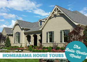
Welcome back, fellow lookiloos. Hope you enjoyed yesterday’s model home tour and are ready for another one.
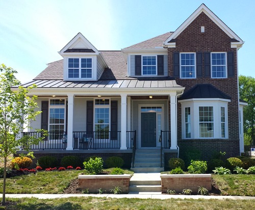
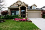
This is a smaller house plan they offer in the subdivision and has the garage in back, so I liked the exterior better.
Take a look…
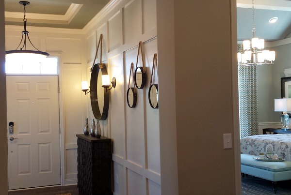
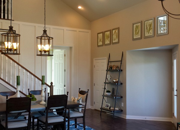
Loved the board and batten woodwork that gave the small entry hall a bit of substance.
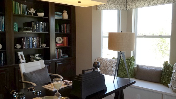
There’s a study off one side…
And the master suite is on the other:
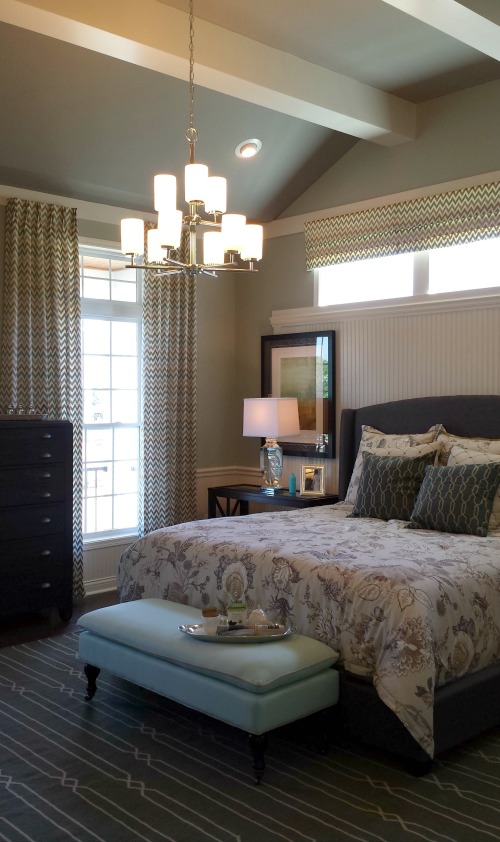
I thought it was interesting how they used some beadboard and trim to frame the bed without taking it all the way to the corners.
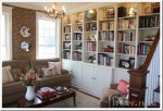
Turning the corner out of the master suite, you see the kitchen and vaulted living room ahead:
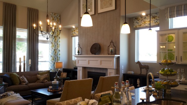
The fireplace wall is planked with bleached wood that gave the tall wall some texture.
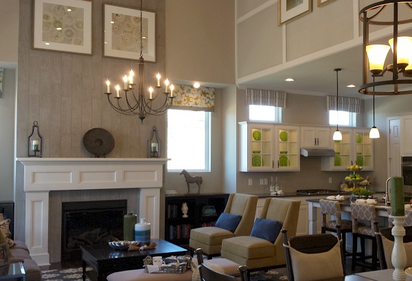
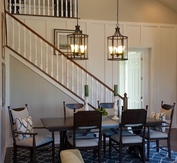
On the other side of the living area is an open dining area:
Because the two-car garage is attached to the house in back in this plan, the backyard is pretty small.
The door to the garage faces the stairs above, and I didn’t like how there’s no transition between the two (i.e., a mudroom).
The neighborhood is in Mason, Ohio.
For more information about the house and how to build one like it, visit M/I Homes.


I could make a career out of touring model homes… Pretty house! I see what you mean about those squatty windows though! I missed the larger one so I am off to check it out!
-Shelley
I like this second house better, the layout and the decorating are more my style, although I’d really want a mudroom. And I agree about the art work being hung so high above the fireplace — how strange!
No “retreat” is that close to the front door! I’ve lived nine years in our house with a master bedroom that can be seen from the front door. Never again. We are building a new house on our farm, and the master bedroom is tucked far, far away in its own wing (not really as vast as it sounds, but you get the idea!). Try being sick in bed for one day and you’ll understand what I mean.
Also, those kitchen windows make everything look squat! It would have been better to have centered tall cabinets on the wall, flanked by tall skinny windows. The other house was bigger, but I preferred it because the choices were smarter all around. And also I love orange!
I totally hear you about the master bedroom. We too built our house with the master bed at the front.
Being sick in bed when the bedroom is right next to the front door sucks. Also, it feels weird that the first thing people see when they come into our home is our bed.
We are building up quite a list of what will be done differently on the next house.
Definitely like this one better. I love the big window over the shower, letting in lots of light, but high up enough for privacy. I actually like having the master on the main floor, and that little corner you go around for privacy. In our current house the master is on the main floor, but the door just opens straight up in the living room, still thinking about how to change that. The planking over the fireplace is awesome. The light fixtures over the dining area are nice, I would probably buy the same ones. That table and chairs in the loft area I really liked, but that’s about all I liked as far as furniture goes. It has potential, but there’s still a lot of things I would pick differently. It’s a good thing I live in AZ where rustic/spanish doesn’t stand out like a sore thumb.
One more thing: hate the windows over the kitchen cabinets. That is the most awkward thing ever, and will look silly no matter what you try for window treatments or decorations.
Having the master bedroom right inside the front door and at the very front of the house gets a big “thumb’s down!” from me. That just seems to be a really odd placement and you can kiss any privacy goodbye.
I also thought those glass-front cabinets looked…weird. And once again, model home designers don’t want you watching TV in your main living/family room.
I could spend all day long touring model homes, design showhouses and open houses. I see A LOT of interesting (as in “what were they thinking?”) design choices in all of them.
Well, if I was shopping for a house neither would get my money. If I had to pick I’d say the first one, but I don’t like walking into the dining room and that it’s so far from the kitchen.
The smaller house has the weird kitchen windows and has entertainment space in the open loft so the sound would travel downstairs or compete with the entertainment space sound downstairs (it’s also right above the master bed) – and the master takes up half the downstairs. So not a fan of the layout of either.
Decoration wise the faux headboard is an interesting idea, but here it just makes the artwork placement look odd. I’m sure it’s an upgrade though, so maybe it could be built to bed size. I see both houses have the mis-matched drapes, maybe I’m biased, but I think I had old sheets that looked like that..
I do really like all the island seating in this one though.
“but I think I had old sheets that looked like that..”
Awesome! Best description of those silly trying-too-hard-to-be-clever draperies. They’re just dreadful.
Neither one would get my cash to be honest. One was too big and the small one had too many odd design quirks. Okay Julia, you have to get us a third house that will be just right 🙂
What is it with not doing kitchen cabinets all the way to the ceiling? You have to dust up there man! LOL If I had my way I would have NO upper cabinets, but that is not for everyone.
I am also of the group that wonders just what is the need to have the master suite at the front door????
I did like the entryway and the shower in the main bathroom.
Okay, I’ll keep touring model homes until I find one that’s “just right.” Tough job but someone’s gotta do it, I guess. Ha. 🙂
I so know you are up to that difficult challenge. LOL
LOL Fiamma. You make us sound like the Goldilocks of house lookers; one is too big, the other too quirky, where’s the one that’s just right? 🙂
I’m with Lily-the best area about this house is the loft- except not a fan of the dark entertainment cabinet – (seems like it swallows the room). I would prefer a lighter – painted cabinet -( maybe a green to pick up the color in the curtain fabric) to keep the area fun and kid friendly! I like the exterior better than yesterday’s home except not a fan of any bedroom in the front- especially the master – and I’d have to turn the study into a sitting room- perfect with the window seat- again, don’t like the high ceilings in the “great room” plus too noisy for any conversation – odd there is no place for a TV – is that why there is that huge gap on the wall above the fireplace-for a TV? Yikes! I hate that idea-neck strain! I used to have a kitchen with cabinets that stopped short of the ceiling- horrible dust collectors!
I think they must be planning for the TV to go over the mantel, but it hurts my neck to even think about watching it up there. Ha.
Totally agree on the kitchen cabinets; that is exactly what I was thinking before I scrolled down and read your comment! I also agree with others that neither home would really work for me, but it’s always fun to see models. We’ve lived in many homes and, as a result, there are certain deal-breaker & must-haves for me with floor plans. It wasn’t just the art over the fireplace that was strangely placed, there is artwork on the wall above the kitchen island (next to the fireplace) that appears even higher, and what is with the prints way up in the ceiling in the dining area? They could have used the same art and made a floor to ceiling grid on the slanted wall by the backdoor and that would have looked better. Weird, it seems even decorators struggle making two-story rooms look cozy, either that or the art is to be enjoyed by giants. 🙂
Don’t mind it, but might make a few changes. I agree that a mud room is preferred — maybe move the door from the garage so that you enter into the laundry room, and reconfigure that a bit.
Someone also didn’t like having a master bedroom so close the entry because people could see into the room, but if you look at the floor plan, it has a little alcove that hides the bedroom entry.
Agree about the kitchen. I think I’d put in some kind of larger hood and then have open shelves on each side under the windows (and make the windows a bit longer.)
If I built this floorplan I’d do just that, Carol — move the garage door so you’d enter into what is now the laundry and then move the washer and dryer closer to the master suite somehow. I like that idea. And you’re right about the master off the entry. It did feel like it was separated enough from the front door that it wouldn’t be too “public”. At least the door doesn’t open right into the entry hall or anything.
But if you look at the 2nd photo, you can see right into the master bedroom from the hall/foyer. Plus the fact that the bedroom windows are there on the front porch would really bother me because anyone knocking on the front door (or a potential burglar) can look right into the master.
True. But you do have to turn and go around the corner a bit to get to it, though, so you wouldn’t see it from the front door, at least.
I like it!
I was bothered before I ever saw the inside. My eye immediately went to the wrong-size shutters on the porch windows and the weird front door with transom window and only one sidelight. The kitchen windows bother me too but perhaps they would have looked better without any valances to call attention to them.
I’m not a huge fan of dens right off the entry. I’m not that neat when working. I do like the way this one is decorated better, and their decorative painter got to shine again with those patterns in the boy’s room. Agree on the kitchen cabinets, the odd art work on the fireplace, and don’t love the tile inset in the bath (why go to the bother to lay herringbone and then interupt it with a mosaic)
This would not be my dream house, but I like most of it better than the big house yesterday. If anyone can find the “just right” house, it will be you Julia! Thanks for sharing your fun time with your mom and Lily with us.
Well… I feel “eh” about both model home options. My heart went atwitter at the thought of playing house in model homes, but then seeing the interiors I just felt totally underwhelmed.
I wouldn’t want either home, but I would choose this smaller version, because maintenance would be cheaper. With this one, I felt the decorating really took away from the home’s potential. It seemed really staged, more than usual; it just wasn’t done with finesse. I feel it’s how *I* would blunder through decorating a whole home. I think the decorators gave it a good shot, but they were in over their heads with this. Buying pillows with “HOME” on them just don’t inspire that warm and fuzzy feeling for me in this case.
Agreed on placement of master bedroom – I’d want it tucked away somewhere, deeper into the house.
And I think the squatty windows should be replaced with one wide window. That would do the trick!
Still, I think it’s just taste. The layout is workable, just not ideal. Get rid of the decor, and making it your own would be fun for anyone. Then it can be just what you want.
I agree with others about the odd window placement in this house especially in the kitchen. However, I do love that walk-in shower and many of the lighting fixtures.
While I don’t like chopped up layouts, I am not totally in love with true open concept houses where the kitchen and family room are one big area with no separation. I don’t want to be making noise in the kitchen while someone else is trying to watch a program on TV in the family room.
Much more charming than the bigger one – but I have to agree with everyone else. Those over-the-top kitchen windows have to go
The outside, tho’ – without the garage entrance – is charming.
It’s interesting how culturally different our floorplans can be from country to country. Here in Australia it is incredibly common in middle-class suburban homes to have a master suite in the front of a house! Unless it’s a narrow-block design, luxury two storey design, or a home designed specifically in a resort-style, the master suite is USUALLY situated at the front (See most plans by builders like National Homes or Commodore Homes or Gemmill Homes – any middle-class builder, really). Also in Australia, at least in the West, a house MUST have a home theatre, and generally a web zone or study for the kids. Formal living and dining is out, as well.
I actually MUCH prefer this house plan to the larger home – the interior feels so much warmer and more cosy to me, and I am loving the full height living room ceiling and the beadboard in the Master!
I’m really not a fan of either, but if I had to pick one it would be the smaller one. It seems with most model homes, there’s practical and unpractical things done with the design and layout. That’s why I could never live in any.
Total squat cabinets! If only they would have increased the height of the cabinet above the range!!
My hubby and I just went on our local parade of homes! Soooo much fun! I mean, I can’t think of a more ideal date night!
Posted about it here: https://anurseandanerd.blogspot.com/2014/07/parade-of-homes-2014.html
and here:
https://anurseandanerd.blogspot.com/2014/07/parade-of-homes-big-one.html
Thanks for sharing!
My guess on the fireplace artwork is there is probably a cable connection behind that basket and there would be a flat screen tv hanging below the art work. Since they were just staging it, you think they would have had the tv there so you could see it.
I LOVE these house tours! Keep them coming!
Glad you’re enjoying them, Patra! 🙂
My favorite thing about this and the other model home is They actually Have some Color ! I’m so happy to see current interiors that are not just grey or white 🙂
Me, too!
My 2 cents–The batten above the kitchen combined with the highly hung pictures, recessed windows in the living, odd low/mini me cabinets in the kitchen takes away flow and calmness. Everything feels a bit off. The fireplace looks gigantic if you compare it to the squat kitchen cabinets.I would prefer taller cabinet as opposed to the kitchen windows which seem to retract from the living area windows.
I too would not appreciate the master bedroom in the front of the house as the others mentioned as well.
I love the way the loft is furnished; particularly the table and chairs.
I preferred the decorating in this home, but was not a fan of the layout of either one. They both reminded me of the HGTV Smart Home, for some reason. I was happy to see the use of color and wallpaper in the bath, and I liked the board treatment over the fireplace. But it was odd that the fireplace feature wall was just a short distance from the stove in the kitchen. Not a fan of the open floor plans…both houses would be really loud, and I know for a fact that every noise and smell would travel right upstairs into the loft and bedrooms. Both houses were lovely to look at, but not too practical for day to day living.
About the only thing I liked about #2 is the kitchen island. 🙁 I am a single story devotee, so neither appeal to me, but with tweaks, I would like the first house. Scale it down to about 2300 sq. ft., switch the den/dining room, and do 11 ft. ceiling in the Great room. But like I said, I’d rather have a ranch or some other one story – I’m getting too old for stairs.
Ahhh.. one of my favorite pastimes.. looking at model homes.
Yeah, here in Texas it’s hard to find them modest in size. There’s ONE builder but other than that company, typically the model homes are 3000sq ft.+ Did I miss the size of this one?
Hubby and I want to downsize (approx. 2000 sq. ft) but want an awesome lot.. trees, privacy, etc. which in our experience is almost impossible to find in the track neighborhoods. So we’ll probably build our own.
I the warm tones in this house coupled with the splashes of color.
~darlene 🙂
I think I forgot to mention that this model (the Armiger) is 2,700 square feet and starts around $414,000. Thanks, Darlene!
Just wow! I really like the high sealings. Keep on posting nice house tours like that.
I just want you all to know that every time you wash your hands under that kitchen faucet you’re going to splash water clear into the “breakfast area.”
I could never have open cabinets because the things I store in my kitchen just aren’t as pretty as those green plates.
Like darling, well named, Lily, I did love the loft, though, so I might prefer this one to the big one.
I think the reason the artwork above the fireplace is hung so high, is that if it were hung lower, the light fixture hanging in front of the fireplace would obscure the view of the artwork. It’s just a guess though, because the light fixture doesn’t seem to be directly in front of the fireplace.
Beautiful house. Definitely, like this one better. I preferred the decor in this home. The interior feels so much warmer and cozier to me. The planking over the fireplace is awesome. The light fixtures over the dining area are nice; I would probably buy the same ones. That table and chair I love the big window over the shower, letting in lots of light. Thanks for nice share.