
Meredith told me about this Mid-Century modern house that her real-estate investment group Heaton Dainard flipped in Seattle, Washington.
She says, “We went for a contemporary look, which is popular in this area.”
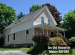
Here’s how the house looked before it got a makeover:


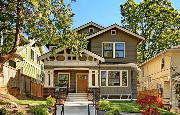
Here’s how this Mid-Century looks now, after a head-to-toe remodel:

The house was meticulously staged to sell, and their efforts paid off.
Meredith says the house sold before it was listed, and above the list price.


Thanks to Heaton Dainard, a real estate investment firm founded
by James Dainard and Will Heaton, for sharing their project with us!


Oh, La, La! This is better than I’d imagined. Unbelievable!
Isn’t it great to meet people that has the “vision” and know how transform spaces like that? Totally inspiring!
Have a blessed weekend!
xo
Luciane at HomeBunch.com
OhWowOhWow. That’s the way it’s done! Gorgeous.
The kitchen is super cool. I can say that I did jump on that bandwagon. All the main living spaces are various shades of gray. It’s a wonderful neutral palette…without being white. Very soothing. Such a departure for me. Our last house was like a spring bouquet.
That before shot of the kitchen is really something. It’s amazing at the difference in the after shots. I’m not a big fan of contemporary design, but they did do an amazing job with the renovations. I don’t care for the kitchen cabinets personally, but it is still a huge improvement over the orange and yellow! The exterior has a lot more curb appeal now. I’m not surprised that it sold before it even listed.
That is amazing! Before and Afters are so much fun to see–especially when the before was that crazy, kitchen!:) It’s a bit too modern for me, but definitely an improvement!
My kind of remodeling! Grey and modern! Love it, love it, love it!
Neat! I’m not sure about the stripey kitchen cabinets – they might grow on me. I’m liking the mid-century look more lately. Love your website!!
Those are stunning! And I love the grey trend!
The after pictures don´t look like a real house though, it seems like pictures made by computer… Do you know if they are the real photos or the arquitect outline maybe??
Kisses from Argentina, I´m in love qith your website!!!!!!!
Wow! What a tranformation! A miracle makeover in my opinion.
Looking at the before pictures of the kitchen, the light yellow “cabinets” is actually a refrigerator believe it or not!
Now onto my third house and subsequently third remodel (all of which we have done ourselves), I appreciate the hard work of the people that were paid to do the actual labor. They did a good job. But….I’m not a fan of the streamlined modern look, well it’s more than that, they made the exterior and the interior too flat, straight, stark, just simply uninviting.
I noticed that they moved the kitchen. (Oh my goodness, that blast form the past had to go!). The kitchen used to be where the dinning room now is – just look out the windows:
Before: orange kitchen windows looked out on to neighbor house with blue siding and white windows.
After: grey kitchen looks out on to trees and power lines.
Now the dining room looks out on to that same blue sided neighbor house with the same white windows.
Mid-Century Modern isn’t my personal style, but I do love to look at it! They did an amazing job!
I love it. As a Seattlite, I have not “gone grey.” I just think it’s grey enough around here. What we did repaint we did in greens.
A house in this condition in a decent neighborhood would probably sell in the $500k, so if they sold it for over a million that’s a nice flip.
I love these interiors. I live cottage style too but there’s just something about this serene look. I think it’s going to be the new timeless classic.
What an amazing make over! I love it! I don’t have a grey room either. Maybe I better work on that.
I have to agree with Dean, as much as I love the makeover, the house was an absolute time capsule! Those cabinets! That wallpaper! I’m a little obsessed. It would be like living in “The Simpsons” house that was built in Las Vegas. I love the mid-century design for those wide, stretched spaces. Every window is a dramatic rectangle. Thanks for sharing!
It’s not my personal style but I think it’s fantastic! I haven’t jumped on the gray trend because I still remember it from the 90’s. Grey carpet and black lacquered furniture…loved it then. Plus Tennessee has a tendency to be gray outside in the winter, I can’t be gray inside and out 🙂
I just love it! They did an amazing job. I loved the bones of this house. It was “interesting” to look at, but who would want to live in a time capsule. Take lots of pics before bringing in the wallpaper strippers and sledge hammers :-).
Their remodel made it a house that a family could live in NOW. I have a super pale gray room in my house that is multifunctional but I have it looking not so contemporary in there. Lots of gold and silver gilt which plays off the pale gray beautifully. It changes in the light and sometimes looks a little blue. I like it a lot.
Hi everyone!
These are real photos not computer renderings!
Thanks for all of the positive comments.
Keep in mind the house was rehabbed and then staged for sale, so we generally keep a neutral look in regards to paint color throughout to appeal to the market. The family that bought the home will make their own cosmetic changes (painting, etc) and move their own furniture in the home, adding lots of their own personal touches and charm to the house. We opened up the kitchen to provide a larger open layout for the buyer. In addition, there is a huge basement that is suitable for a family room, media room or toy room downstairs. The layout is absolutely perfect for a family.
The home was purchased for 530k and sold for over a million before it went on the market. This is located in one of the most sought after neighborhoods in Seattle. The feedback from the neighbors was very positive. Many stopped by during the construction process and were thrilled with the changes. All of the rehabbing was done with superb local contractors, high quality materials and finishes and top of the line appliances appropriate for a house in this range.
Meredith
What a transformation – Colors can certainly make a huge difference. The house looks very modern; I am not surprised it sold so fast. Excellent post!
Not my style, but wow! That is quite the makeover.
Holy Pepto Bismol, Batman, that is one pink bedroom! I admit, I think that orange and yellow kitchen is kind of fabulous. We didn’t have that wallpaper, but it looks familiar. It must have been in the house of one of my friends.
The remodeled house is elegant, but a little stark for my taste.
Wow, what an amazing transformation!!!! Although this home is not my style I’m sure someone will snatch it up in no time! Have a great weekend :o)
~Des
I could swear I saw this house (or one very similar) on the show “Curb Appeal” many years ago. They only made changes to the outside, but I’m wondering if this was the same house?
just fab – too much grey for me but esp loving the kitchen 🙂 le
The use of colour in this redesign is fantastic. My favourite part has to be the mezzanine style balcony area of the exterior, it’s a great space and I bet the view is great!
That looks like a complete different house. Im amazed how they made it look so modern and brand new. Love the simplicity of the interiors.
I had bright orange flowers on my bedroom circa 1969! They did a nice job updating the house but I don’t like grey except in pants and modern is not my thing. Again nice job though!