It’s time for House #3 on our Homearama tour.
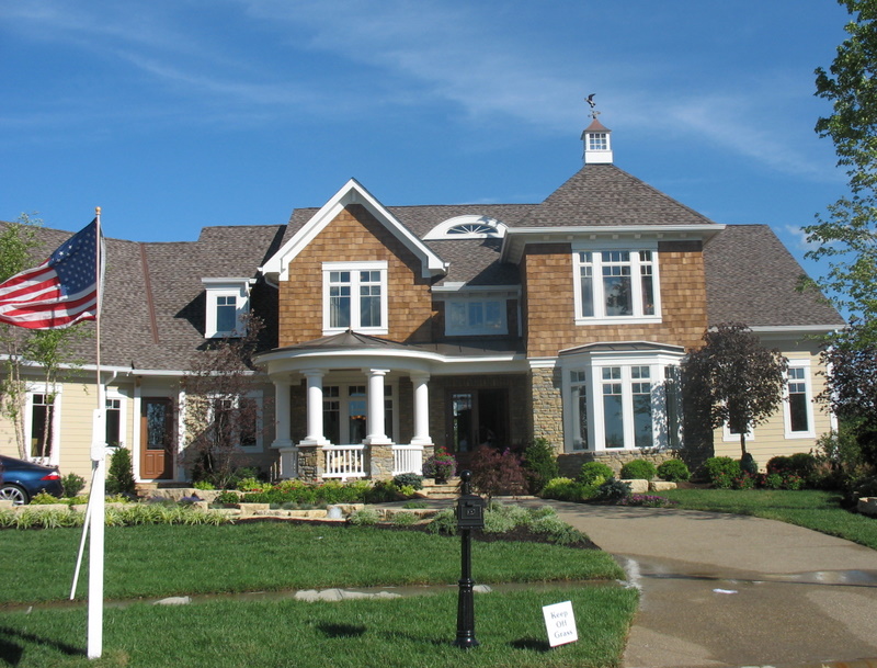
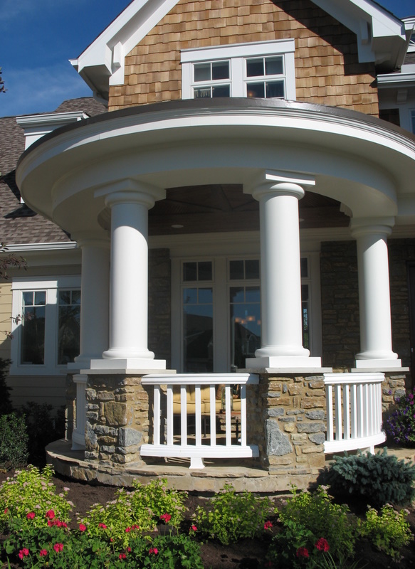
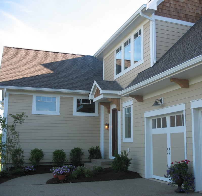
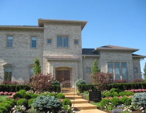
The Hampton, built by Eagle Custom Homes, has 8,200 square feet and is on the market for $1.7 million. Its design was inspired by coastal Long Island. According to the builder, “The shake shingle exterior topped with cupolas immediately sets a warm, inviting tone that flows to an open floor plan that’s a mix of formal and informal.” What it does not have, however, is a water view, since it’s on the opposite side of the street from the others you’ve seen so far. It sits on a larger lot, though.
I wonder what you’ll have to say about this one?
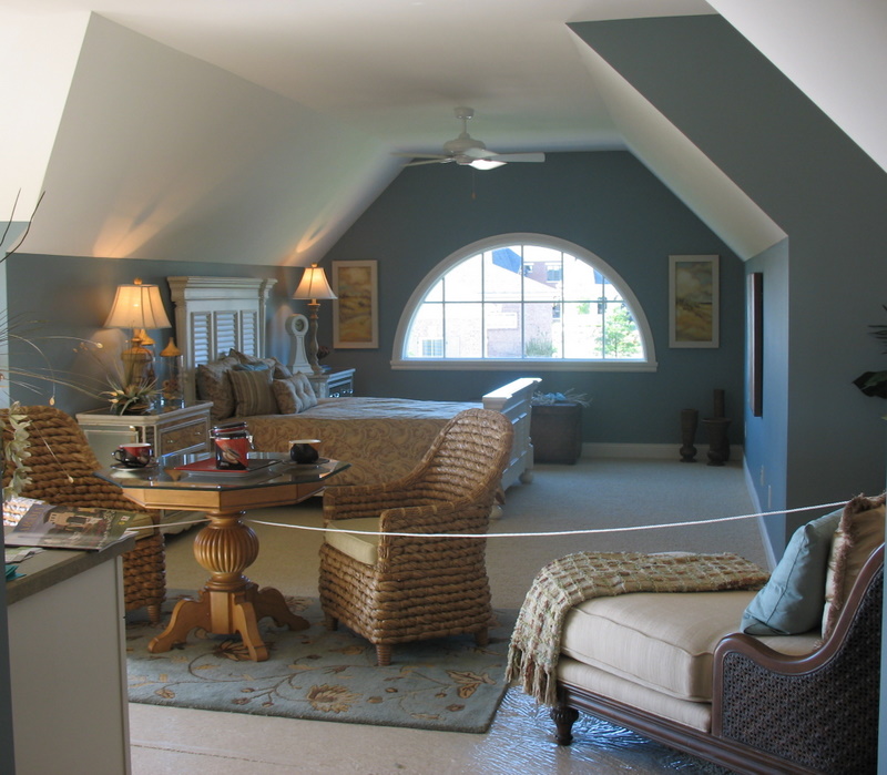
What did you think about The Hampton? I could really go for that au pair suite–especially if it came with an au pair! (The kids are driving me just a little crazy this morning. How nice would it be to send them upstairs to the au pair?)


This speaks to me on every LEVEL, love it Julia. I honestly don’t see one thing I could pick apart.
Just lovely…
Kathy 🙂
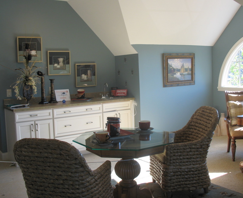
I LOVE the exterior of this home… the cedar shakes, the covered porch, white railings and trim. The Hamptons style (a la “Something’s Gotta Give”) is my favourite house style.
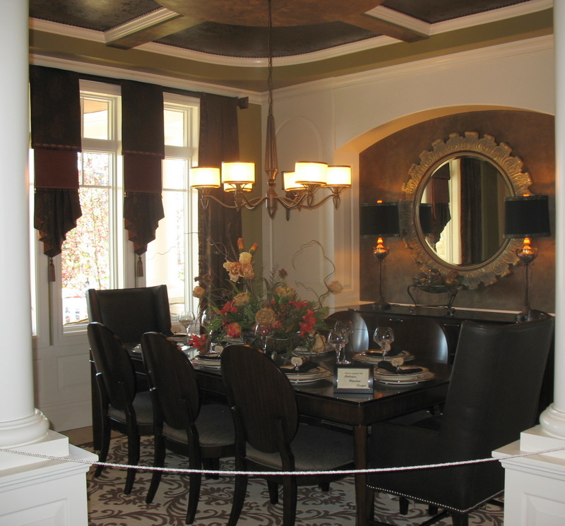
But the interior?? What a disappointment. I don’t think any of the rooms say “coastal style”. Where’s the white shaker kitchen, the liberal use of creams, blues, and pastel greens, the organic wood and beachy accents? I think its nice home but too ornate, too decorated to be coastal. I think I’ll hold onto my $1.7M and pass on this one 😉
I so agree with wanderluster. Every single word. I have to say…did anyone else think those dining room window treatments were just weird? My favorite part of the interior was the upstairs au pair suite. I walked away from this one.
I agree with wanderluster, also. I don’t mind the decor, but I don’t think it matched the house. I’m a huge fan of the exterior style of this house, though. My favorite so far! I did really like the au pair suite! Very cozy! Oh, and my husband would love the room to work on cars!
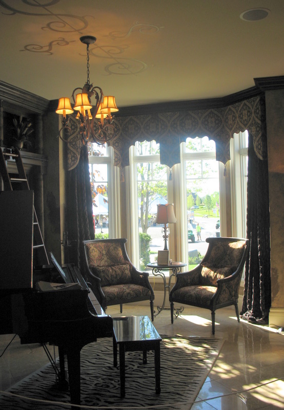
Like the music room… ceiling is cute & appropriate. Au pair suite is… sweet!
Bring on #4!
Karla & Karrie
Well, this is interesting. Over 100 people have already read this post, but only 5 have commented. I wonder what that means? Does everyone like it and have no criticisms to voice? Or do you all hate it too much to bother commenting? (Yes, I sit around pondering things like this.)
I have a question. Has anyone noticed any Adsense ads popping up on my site lately? Someone said they did, but I couldn’t find them. I’ve heard that WordPress will sometimes add them to make money (they’d be profiting, not me, in other words). If you see any around here, please alert me! It’s bugging me to think my blog may be selling things I don’t even know about.
Thanks, guys! -J 🙂
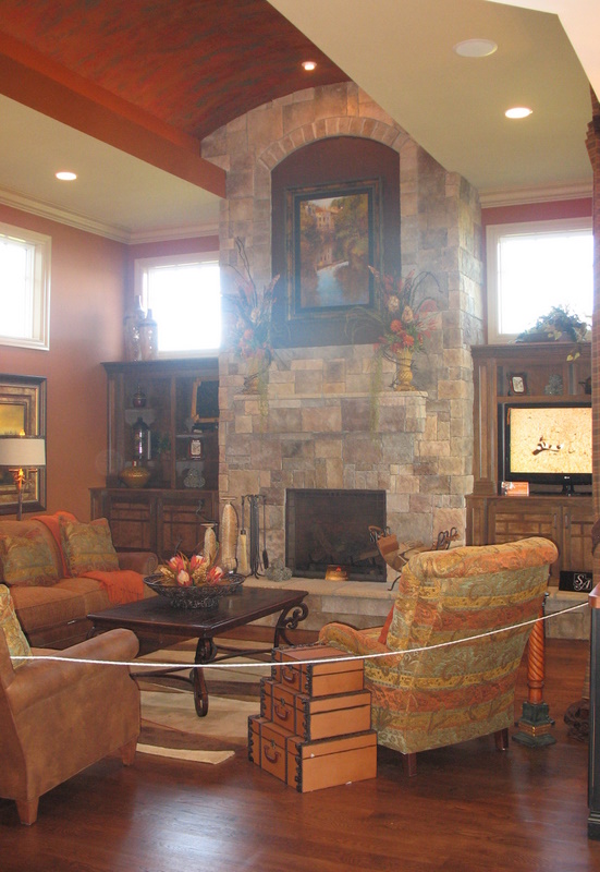
While te interior and the exterior aren’t really cohesive I think it’s lovely. I really like the different ceiling treatments especially the barrel vault.
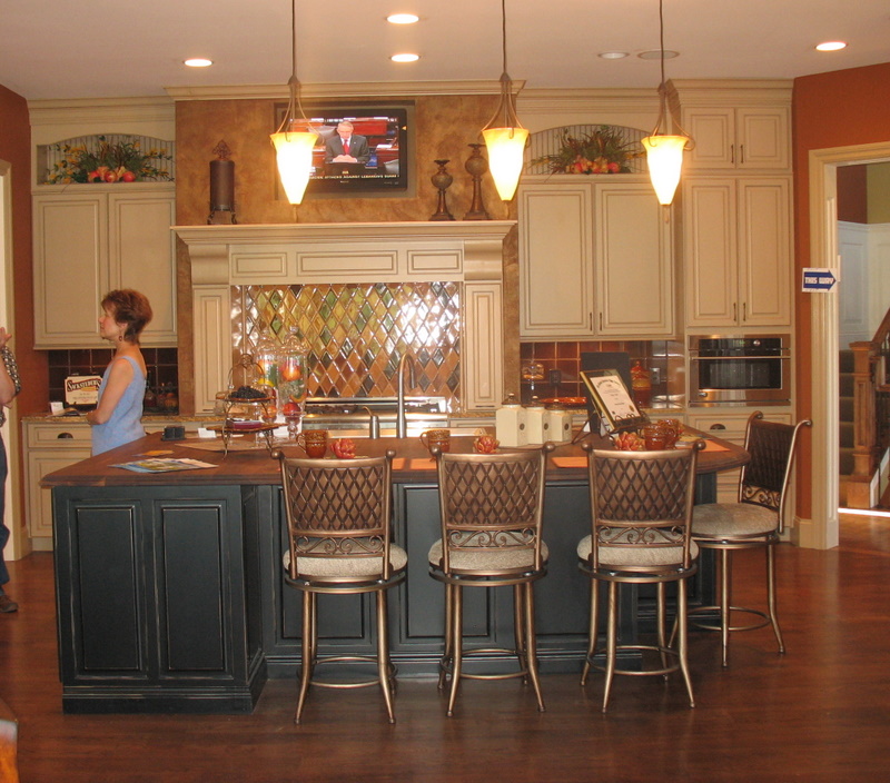
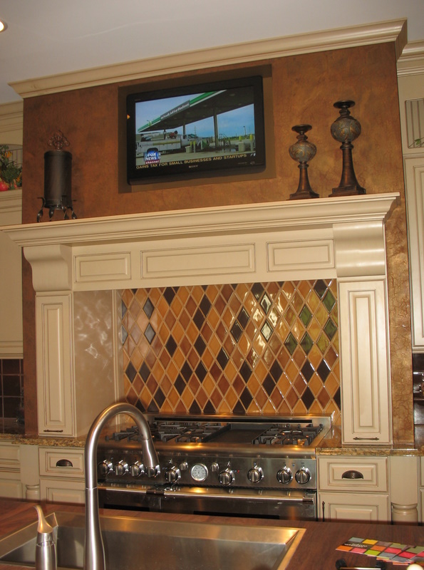
Digging the ceramic tile backsplash in the kitchen too.
And just when I think it cant get better… you show us another! Thank you for allowing me to take a peek. I now look forward everyday to see what you see. Lovely! Thanks, Susie H
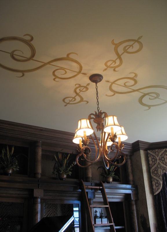
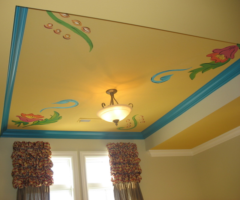
The mural on the music room and the au pair suite are my fav’s.
I am enjoying this Housearoma so much. Thanks for sharing!
OK, weird basement and ugly chandelier in the master bedroom aside- I love this place! I would change some of the decor but I love the music room, the au pair sweet, the kitchen and master bath. What was up with the powder room though? Was it finished?
I do agree with some of the other posters though that the Hampton style should have been more beachy.
I did see this home in person. The interior was too gawdy for the “Hampton” type theme. I am hoping that Julia will show my favorite soon LOL!!!!
When I saw the outside I thought, “This is the one for me!” I love, love, love. But then the front door swings open, and WOW! Total sensory overload. I agree with wanderluster totally. The inside doesn’t match the outside in any way, with the possible exception of the “au pair suite” (OMG. What live in babysitter gets hooked up like that?!) which was lovely, and beachy, albeit still a bit fussy. I didn’t walk away from this one. I ran. 🙂
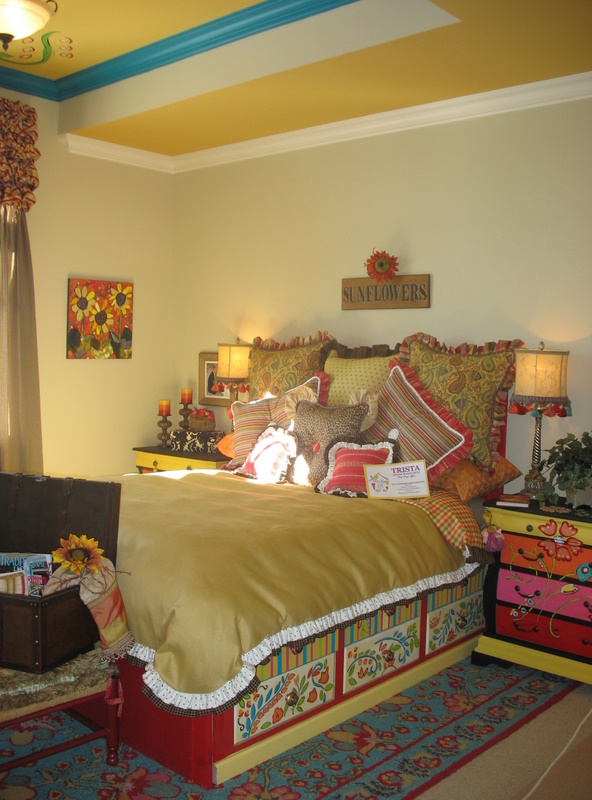
That guest room is absolutely hideous! The painted bed and dresser, the horrid painted ceiling. Gah! Worst of all are the multitude of “fun” pillows and that obvious “Sunflowers” sign over the bed. After seeing the rest of the house, I’d be offended if I were the poor guest who had my retinas burned out here.
While Im sure they intended to put musical ornaments on the ceiling, that reads as dollar signs. Beyond tacky.
Of course these are all beautiful homes but they feel very much overdecorated to me. Like every square inch had to be embelllished before they would open the doors. I consider myself to like a lot of drama in home decor but all 3 of these houses don’t feel like real homes. More like a movie set.
Forgot to mention the exterior of this one had me totally swooning so its not all bad news 🙂
I do love the swirls on the music room ceiling, and the happy flowers in the guest room. But the tiles in the kitchen look kind of harlequin-y.
Loved the exterior, but the only thing that I really liked about the interior was the au pair suite. I think they need to go back to do a little patch work in the powder room:)
Kitchen, cool! Pretentious, overdone window treatments, too much!
Wow! What a gorgeous home…I would probably be happy just liiving in the carriage house! LOL
~Des
The exterior of the house is absolutely beautiful. I loved the interior of the house, with the exception of the guest room. I thought that it had a quirky country feel which didn’t match the rest of the house. The au pair suite was incredible.
Are you kidding me? I couldn’t live there. I’d have to walk
around in a gown holding my pinkie up.
Lovvvvvvvvve house. Quincy, I’m sorry the $1.7 mill house isn’t nice enough for you to be a guest in. I wonder what kind of homes your friends live in!
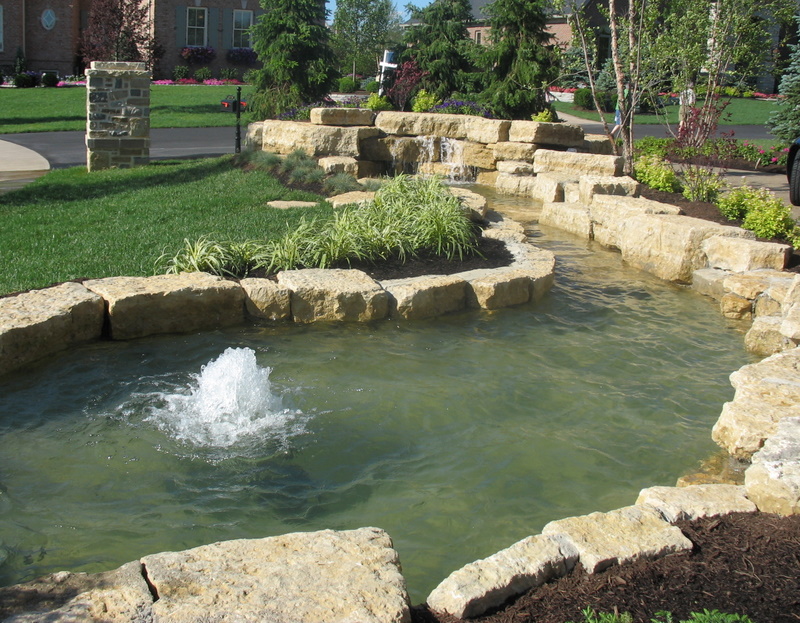
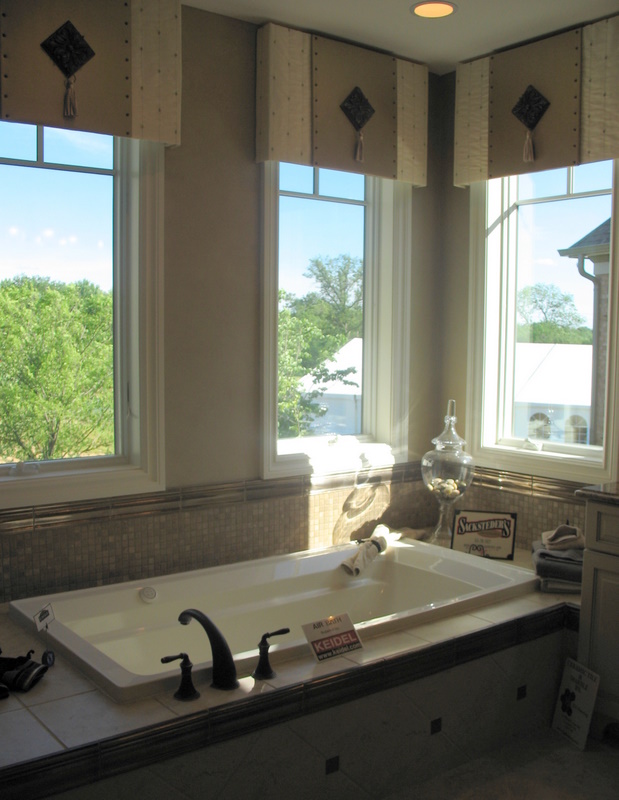
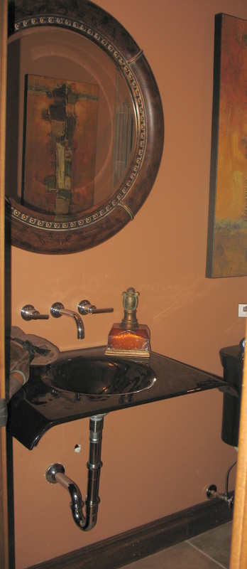
The powder room – what in the world. The black fixtures are bad. And I don’t like how you can see the pipes under the sink.. And it looks like there’s a whole in the wall. LOL. The stream thing in the front is cute. And I think it’s funny that they have that ladder thing in the music room even though the bookcases aren’t very tall.
hmmm. I’m gonna sleep on it. I was surprised to see the black in the kitchen, but I could probably paint right over that while the kids are napping. I’d have to call the contractor to fix up the powder room and switch out the sink vanity. Then I’d have a fantastic garage sale with all the decorations I’m going to take down off the walls and sell for $5 each.
oh my gosh mrslimestone, I was thinking the same thing! ‘hmmm, I think you were going for treble clefs, but you ended up with dollar signs…’
At least they’re being up front about things I guess!
I do love the shade of blue in the au pair room.
I think it’s a little bit too country for my liking. The guest bedroom kinda did me in.
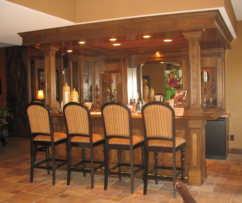
I kinda liked this one. I’d have to redo the kitchen (standard reservation-making kitchen with multiple grease/dust traps, but it just seems more livable to my eye. Problems mainly with the powder room (what’s up with that?), and the oversized porch on front–Scale is wrong.
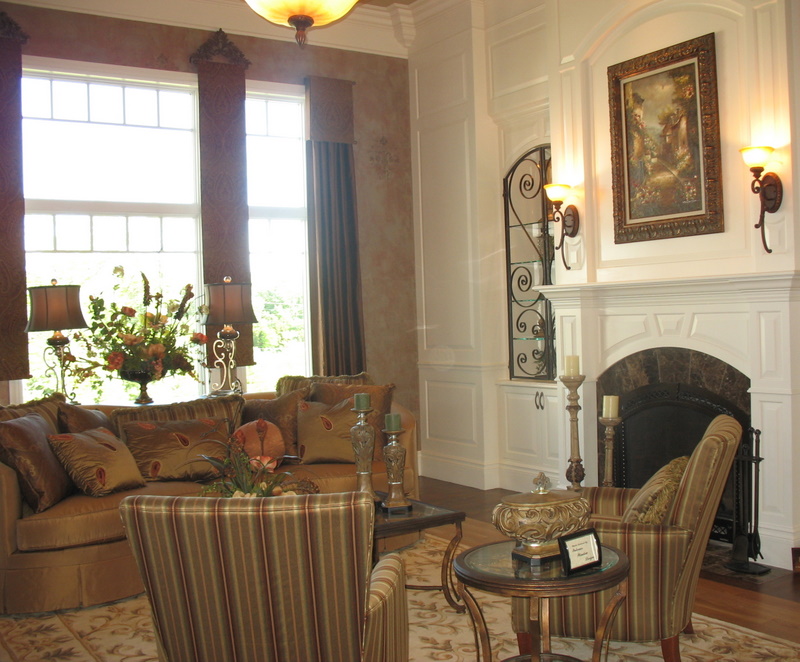
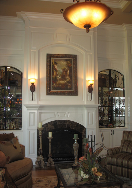
Love the music room and the warm feel of the entire place.
Maybe not my dream house, but the best of the tour so far.
I’d buy it, I suppose.
Wow, this is the most over-decorated show-house I’ve ever seen! Looking through that, it’s not a bad house.
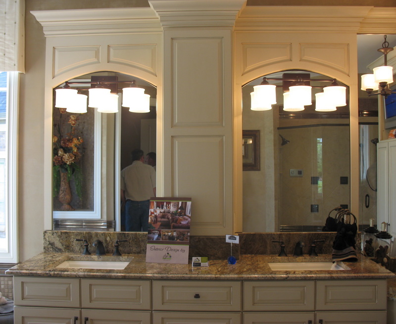
Although, as others have mentioned the inside doesn’t exactly meet the inside style. I liked the stove surround, it is pretty and not something you’d find in every other house. But, that black sink in the powder room? You should have another “what room is different than everything else” post.
This totally reminded me of a bachelor pad – it looks very nice, but has a very masculine feel to me. The au pair suite was neat – I’ve never seen one of those. But I’d have to pass on this one. It doesn’t have to be girly, just not so masculine looking.
Oh, the music room was a cool touch!
Love this exterior but the interior is unexpected with the style of the exterior. Didn’t care for that.
Pat
Hi Julia 🙂
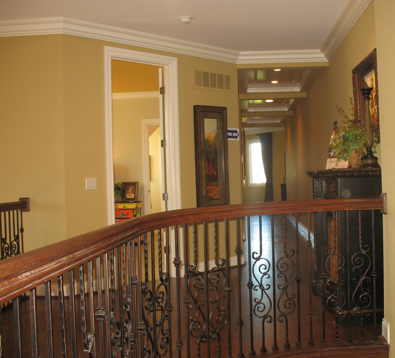
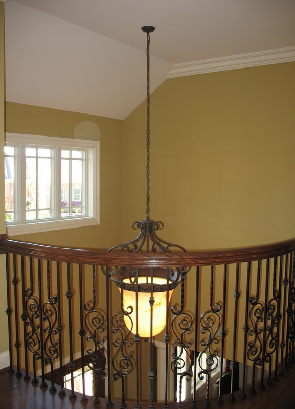
This house was NOTHING like I thought it would be inside. What is with all the new home having the same iron staircase railing?? How does that even go in this house? The guest room was cute and I liked the hearth room fireplace, but I would probably take the range out of the kitchen and run 🙂
Pass!
rue 🙂
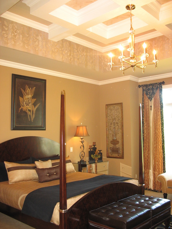
Does anyone happen to know the paint colors used in this home, particularly the gold in the upstairs hallway? Love that color!