Hooked on Houses
A Fun Place to Get Your House Fix
Home
TV & Movies
Recent Houses Onscreen
Search Entire List A-Z
Celebs
HGTV
Cottages
Farmhouses
Before & After
Real Estate
About
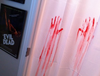
6 of the Scariest “Trading Spaces” Makeovers
5 Very Scary Real Estate Photos
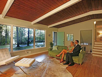
Staging a Mid-Century Modern House the Don Draper Way
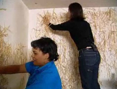
Remember When Hildi Glued Straw to the Walls?
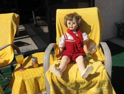
Be a Doll and Buy This House
About Me
Privacy Policy & Disclosure
Contact Julia
MENU
Home
TV & Movies
Recent Houses Onscreen
Search Entire List A-Z
Celebs
HGTV
Cottages
Farmhouses
Before & After
Real Estate
About